Five tips for UI/UX Development of Fintech Products

In the age of social media, people are more exposed to visual content than ever before. So it needs to be compelling. If whatever they see on their screens doesn’t catch their attention in the first couple of seconds, they will scroll down and forget about it the next second. So the visuals are important. But if users can’t really figure out your app, you can forget about growing your audience. Steve Jobs once said, “Design is not just what it looks like and feels like. Design is how it works.” And he would know.
UI/UX Design Requirements for Fintech
When it comes to developing applications for fintech – for digital banking, online trading, betting apps, or e-wallets – the UI/UX design of every fintech product should be easy to understand and to use. But of course! you may say. Every design should be simple and easy to use. But the world of finance isn’t easy – neither for people who work in it, nor for its clients. Most fintech users can’t make sense of field-specific terms or names of fintech solutions, or don’t understand the meaning of certain data. Or some elements of the interface may not work properly in the mobile versions of certain fintech apps.
All this brings us to an important conclusion: when creating a design, you should always understand and think of the people who are going to use it. And if you’re creating, let’s say, a UI/UX design for fintech, you’ll know you did great when your grandmother uses your app to send you money for Christmas – and does it easily.
If you’re committed to thinking of your target audience and how they’re going to use your app, you’re ready for these five tips, which will improve your UI/UX development for fintech. Each tip is drawn from our own experience and practice.
Read more: The Latest Trends in Fintech.
UI/UX Design: Challenges and Best Practices
So, what does any fintech UI/UX design consist of? What is important? What are the pitfalls? On a basic level, fintech apps have a lot in common with apps in other industries. But with financial services, you may face the challenge of transforming something complicated into a tiny, simple tool that fits into an average person’s phone. Thus, our fintech software development company advises you to be especially careful with the following things:
Copy and microcopy.
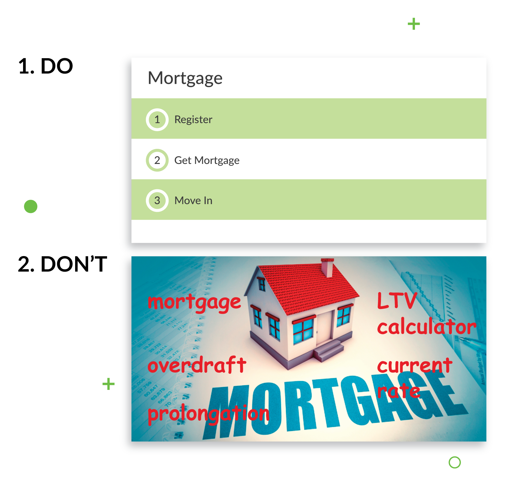
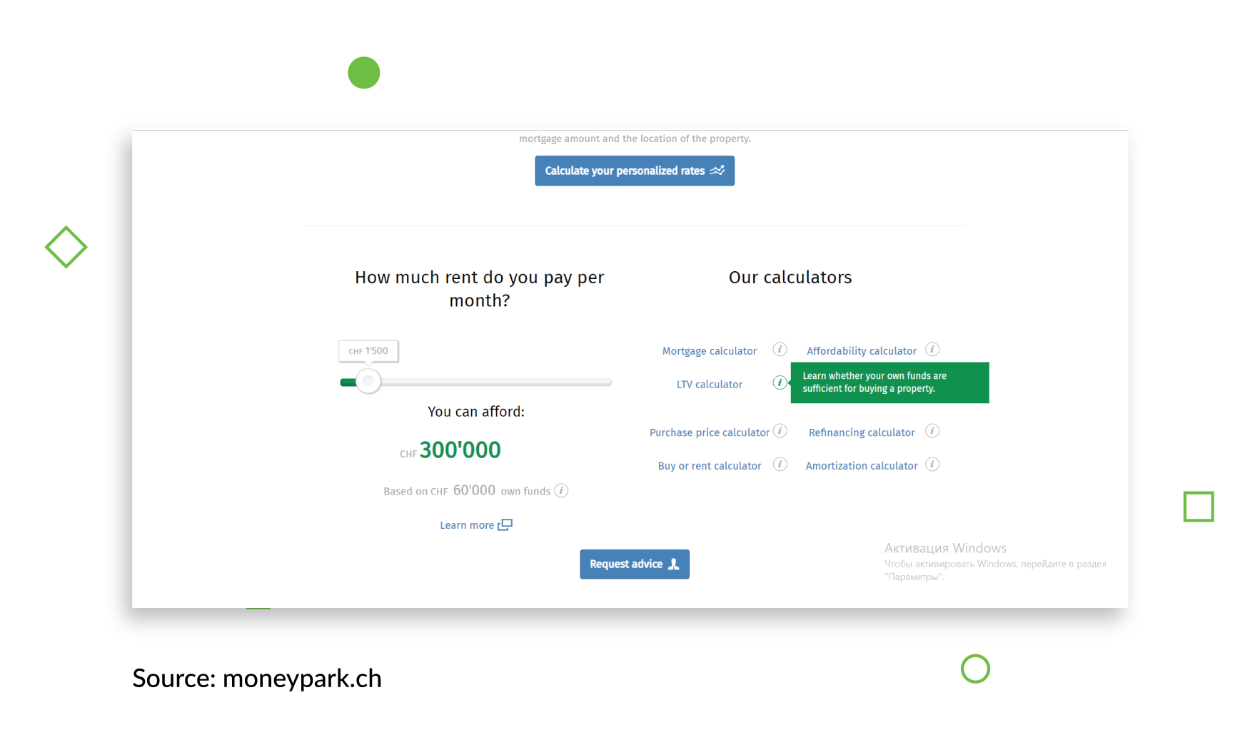
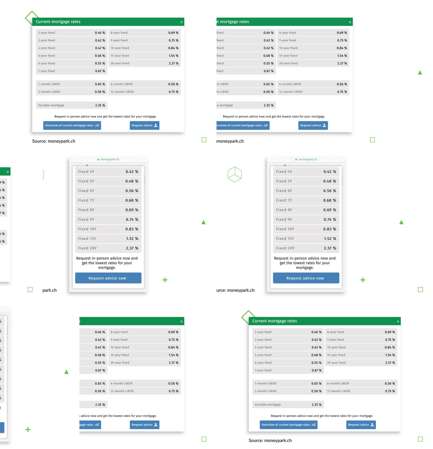
These two terms describe all the text in an application. The text within the product should be understandable for everyone, no matter their financial and educational background. Remember, as we said, finance is a rather complex field, which means that all the text you use in your app should be clear, simple, and straightforward. However, at some point you’ll notice that some hard-to-understand terms – like overdraft, prolongation, or LTV Calculator – are unavoidable. Think of a simple way to explain these terms to your users without overloading the app with text – like we did for Moneypark, a Swiss financial advisory firm.
To make sure everyone’s on the same page about the UI/UX terms your app is using, compile a glossary with all the definitions and related terms in the app. Make sure the UX developer and the UX writer are constantly in touch – if your app uses multiple languages, some translations may need more space or larger fields than the original language required.
Flow.
Considering the complexity of most financial services, as well as the large amounts of information they use, it’s important for all fintech developments to keep the flow as smooth and simple as possible. Try not to overwhelm your users with tasks, and use a more gradual structure.
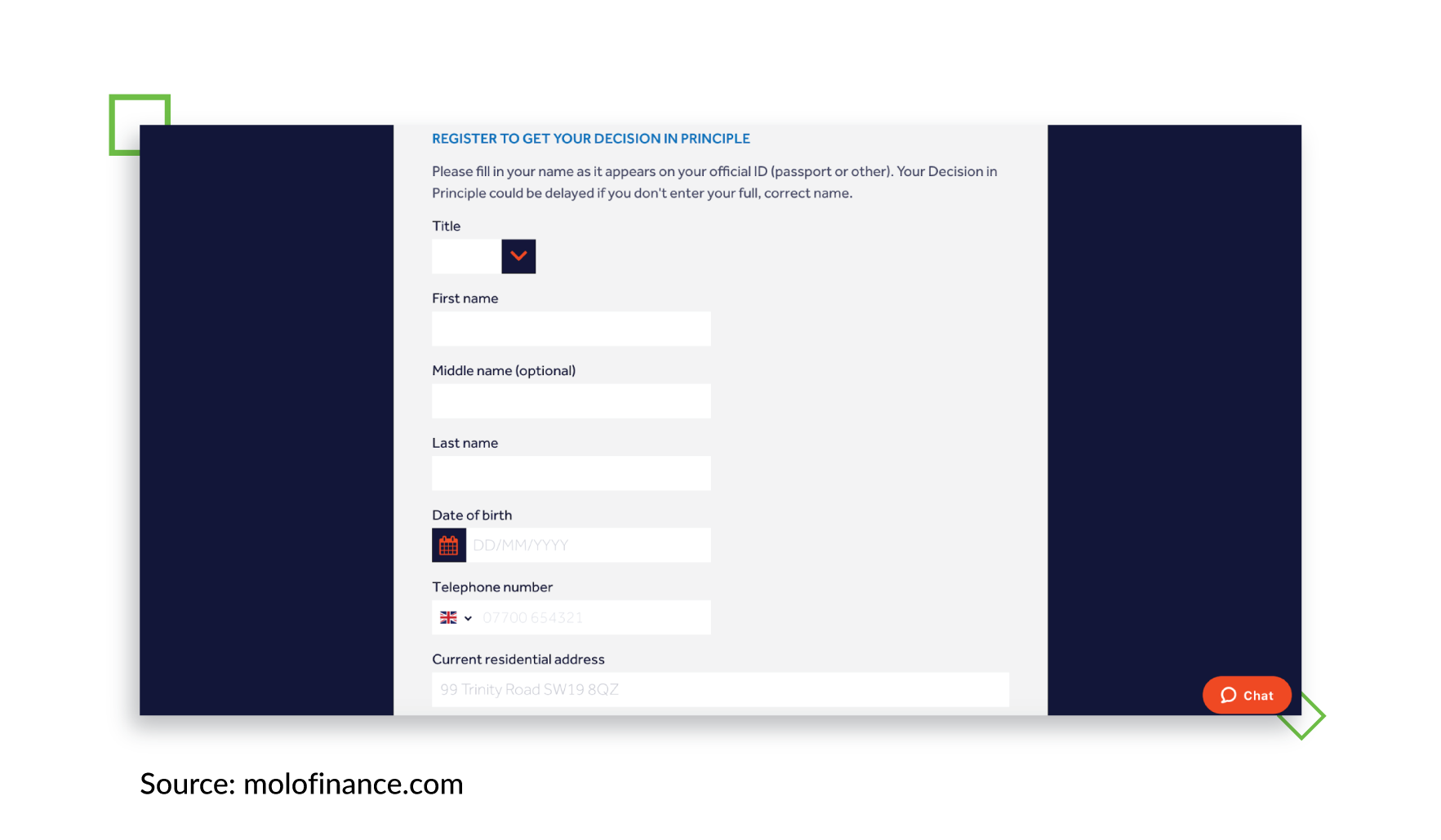
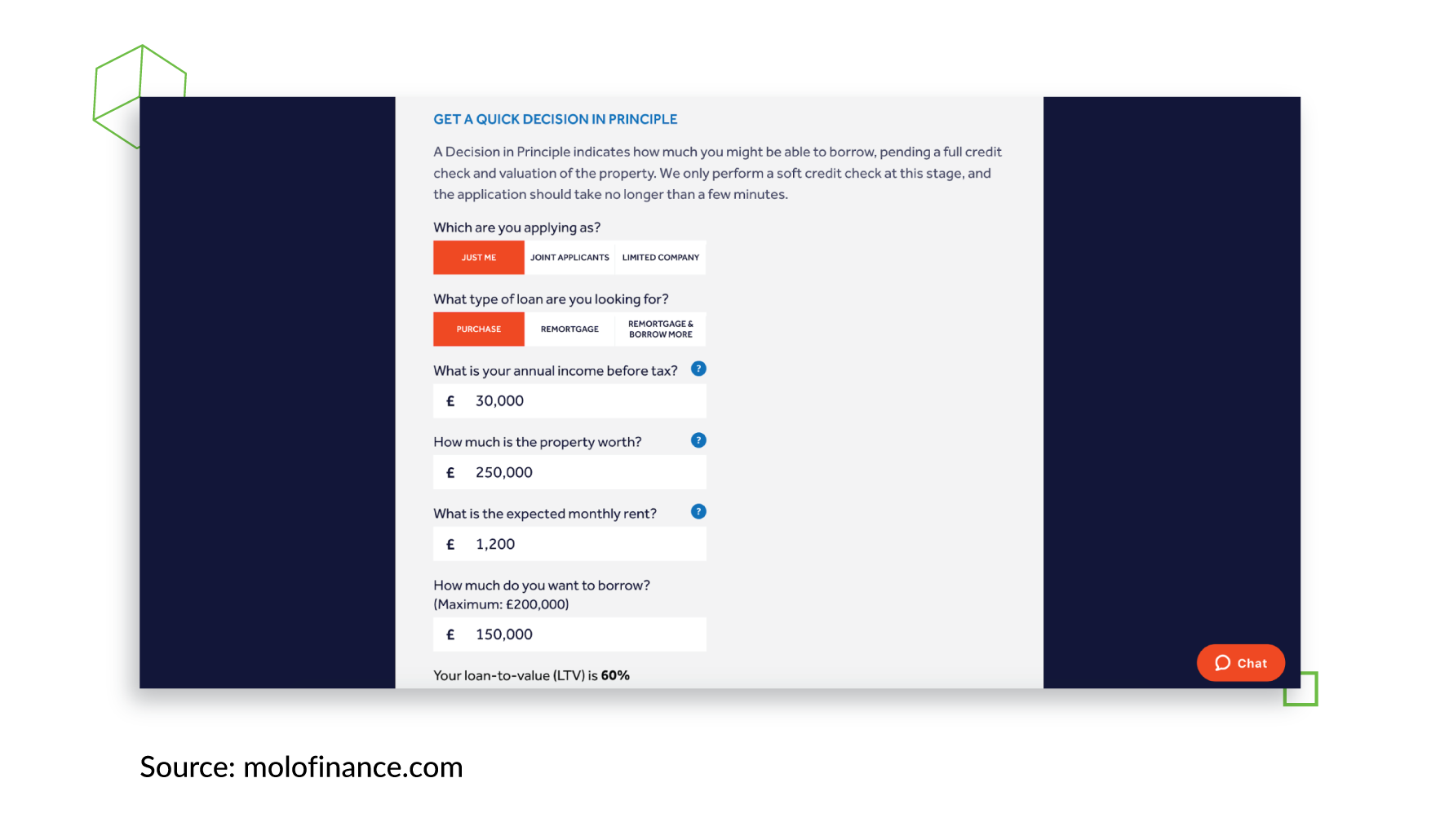
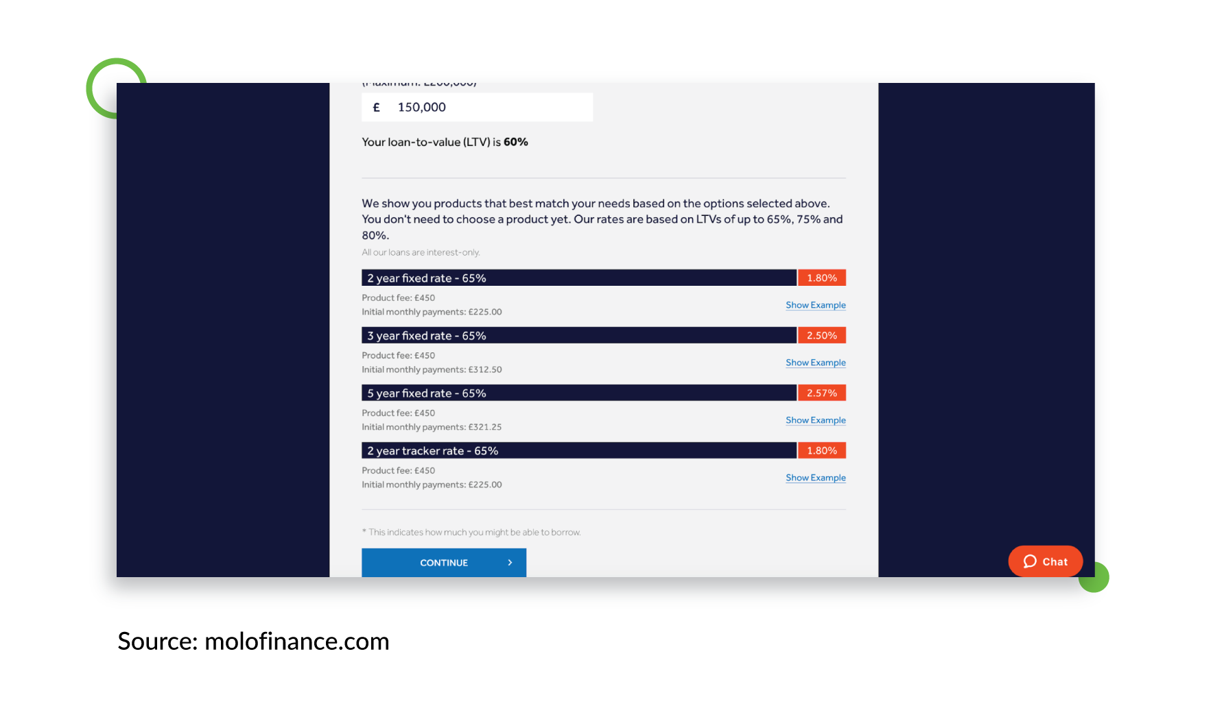
For example, you can divide the user registration process into two parts. In the first part, ask the user for basic personal data like their first name and last name, birthdate, etc. After this, provide the user with a draft of the service you’re about to provide – like a preliminary mortgage calculation on a mortgage service website, for instance. If they like what they see and decide to accept your suggested calculations, then you can move on to the second stage – asking them to provide all the financial information you need to get them a mortgage. Molo, for example, follows a similar scheme – at first, they offer an approximate mortgage amount that the client can count on, and only then do they suggest that the client registers and provides personal data. Depending on the service you provide and the data you need for it, the number of steps in the registration process may vary.
We also advise you to think in advance about what personal information clients can change in future, and what can or should remain untouched. For security reasons, it’s better to change as little as possible, but the reality is that factors like a change in marital status (and consequently the last name) can be important for your clients, and they should be able to change this kind of information without problems.
Colors.
Before users realize what the product is actually about, the first thing they see is color. Studies show that 60% of people decide whether they’re attracted to a product or a message based on color alone. Moreover, research shows that color increases brand recognition by up to 80%. In 2017, according to ComScore, 21% of millennials said they deleted an app simply because they didn’t like how it looked on their screens!
Of course, one can argue that color is a matter of taste. But keep in mind that some basic rules of color combination are almost always valid, so take a good look at the color wheel, and learn about basic color schemes. Remember not to use colors that are too bright, as they can badly affect the users’ eyes.
Note that the colors you use may depend on the country or culture your app is going to be used in. Research the colors and graphic elements that are typical for the home country of your app. For instance, in Switzerland, red and yellow colors along with a crown, stand for money and wealth. Generally, red stands for energy and passion in Western cultures; in countries like Russia, it could be easily associated with communism and revolution. Similarly, purple in Western cultures is a color of piety and faith, and even penitence (in Catholicism). At the same time, in Brazil and Thailand, purple is considered to be the color of mourning.
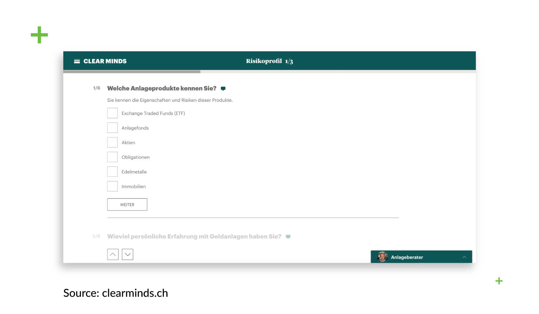
Clear Minds, as one would expect from a company with this name, uses a very clear and minimalistic design featuring a green panel that looks neutral and soothing.
Display of content and device adaptation.
Fintech UX design has one distinctive feature that must always be taken into account. Financial apps have to be able to display large amounts of data like reports, statistics, investment reports etc. in large tables. Which is why, while developing both the web and mobile versions of an app, a fintech development company has to remember that these sheets should be adequately displayed on a screen so that customers can navigate and make sense of them. They should be scalable and readable, logically built and not too overloaded with data.
The other important feature is adaptability. All the information users expect to get should comfortably fit into any screen to ensure a great user experience for any display size or context. By the way, you can research which devices are the most popular in the country where the app will be used. This allows your team to define the right screen size in advance and create an app design especially for these types of devices – and, consequently, save money. StatCounter is a good source of data like this.
Financial apps are actually all about numbers, so be sure to set your app’s numeric fields to decimal. This will allow users to enter a certain amount of numbers after the decimal point – i.e. not only to put in integers, but also fractional digits, as they can critically affect calculations of future payments by investment platforms. In countries with a high currency value, the numbers after the decimal point can add up to a fortune.
Finding the team.
If you find the right team and the right UI/UX developer, all this shouldn’t be a problem. Communicate your goals, think of what problems your service and your app are solving, and how can they do it in the simplest way possible. Think of how everyone should be able to use your product – from Wall Street bankers to the ballerinas of the Bolshoi Theater, from West Coast college dropouts to Texas farmers. But also think about who will be able to develop a service like this. The UI/UX designer market is full of great specialists, but make sure the people you hire have an understanding of finance. Obviously, you will save a lot of time and effort if you don’t have to explain every little detail to your team. But most importantly, you will get much better results if your developers understand financial terms, the correlations between processes, and the whole concept of the service you’re providing.
As you can see, design is indeed not about just the look, but also about the way things work. In terms of UX design for fintech, an app should not only be easy on the eyes, but also make difficult things a lot easier for the users while remaining clear and transparent. To provide your users with the best fintech UX, you must ensure that your app’s text is understandable for people with different backgrounds and financial knowledge. Visual markers like color schemes should correspond with the cultural notions of your target audience, and all the information your service provides should be presented in a way that’s appropriate for different channels.

