Optimizing E-Commerce: The Crucial Role of UX Design in Driving Conversions

E-commerce is growing rapidly, with more online stores, from small businesses to big corporations, popping up. Companies seek ways to attract more customers and boost their sales as competition increases.
To stand out from competitors, having great products and providing an excellent conversion rate and UX design are crucial. This means ensuring everything works smoothly and easily from when customers enter your site to when they complete a purchase.
By the end of this article, you will know:
- Key strategies to improve the navigational structure of your e-commerce site.
- Practical search functionalities that enhance user engagement and product findability.
- Best practices for e-commerce UX to accommodate the growing number of mobile shoppers.
- How high-quality images and clear product descriptions can impact buyer decisions.
- Simplified checkout processes that can significantly reduce cart abandonment rates.
- Techniques for utilizing user feedback to refine the shopping experience continually.
What is E-commerce UX?
UX design and e-commerce are about how users interact with a platform, evaluating its convenience, usefulness, and efficiency during their purchase journey. Every interaction affects their perception of your brand and offerings, from when they land on your site to the final order confirmation and delivery.
Improvements like better site navigation, easy search options, useful filters, clear, interactive elements, high-quality content, and interfaces tailored for different devices improve user experience. These improvements also positively impact key performance indicators (KPIs) such as Conversion Rate, Bounce Rate, Average Session Duration, Cart Abandonment Rate, and Customer Satisfaction (CSAT) Score.
Enhancing UX can boost an online store’s profitability without needing more traffic. Let’s look at the best ways of how UX design improve website conversions and enrich user interaction.
E-commerce UX Best Practices
1. Understanding Users and Their Needs
Understanding how your audience accesses your site, from which devices, countries, and ages, and their goals and issues can help create a more relevant user experience and effectively improve your product.
Simplifying user experience, improving visitors’ lives, and understanding your target audience can help create more effective marketing campaigns.
2. Clear and Intuitive Navigation
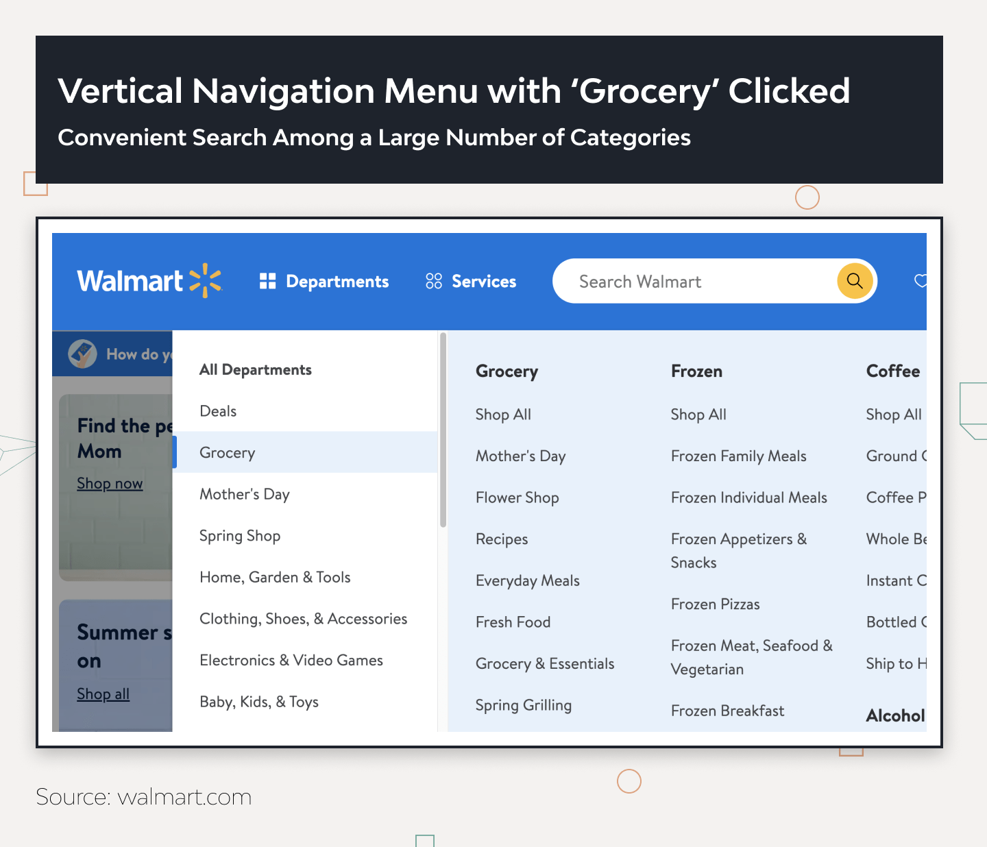
Well-organized navigation is a critical component of a successful e-commerce platform. It directly affects the user’s experience with the site. Navigation menus are one of the main elements a site visitor uses during their first interaction with the interface.
With logical product categorization and clear menu navigation, users can quickly find the desired products that interest them. This saves time and effort and enhances UX metrics.
Effective navigation design anticipates structuring product categories that make sense to the target audience. For example, grouping similar products under specific categories or subcategories can help users narrow their search and find what they need without feeling overwhelmed.
Additionally, clear and logical names for each category can further improve users’ understanding of the available products and simplify navigation.
3. Simple Search Functionality
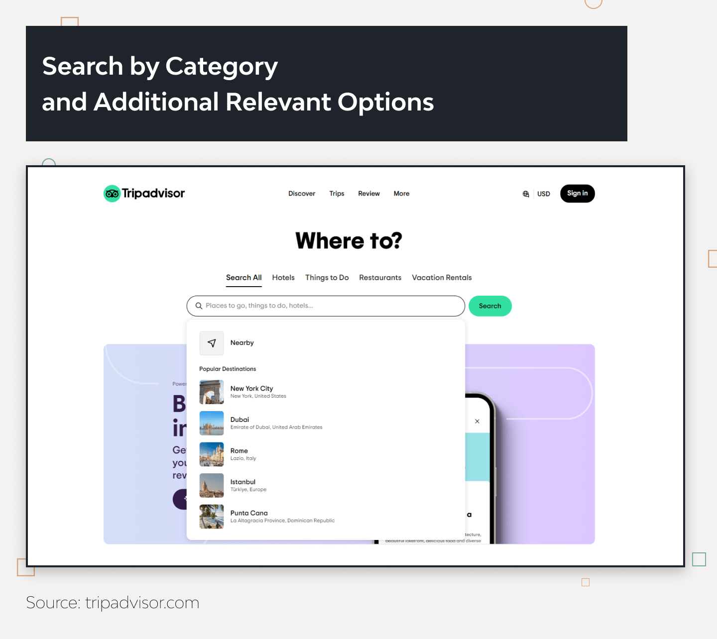
A well-designed e-commerce site helps users quickly find the products they’re looking for through effective search functionality. Features like keyword searches, autocomplete suggestions, drop-down category menus, and filters can make navigation straightforward and significantly reduce the time it takes for a user to make a purchase. A combination of these factors will be driving conversions through UX.
Such clear and user-friendly search options enhance the overall user experience and encourage repeat visits, positively impacting UX metrics. This is especially important for commercial platforms hosting several hundred or more products. Additionally, search functions should be capable of displaying relevant results with photos or links to similar product categories.
4. Optimize the Filter Panel
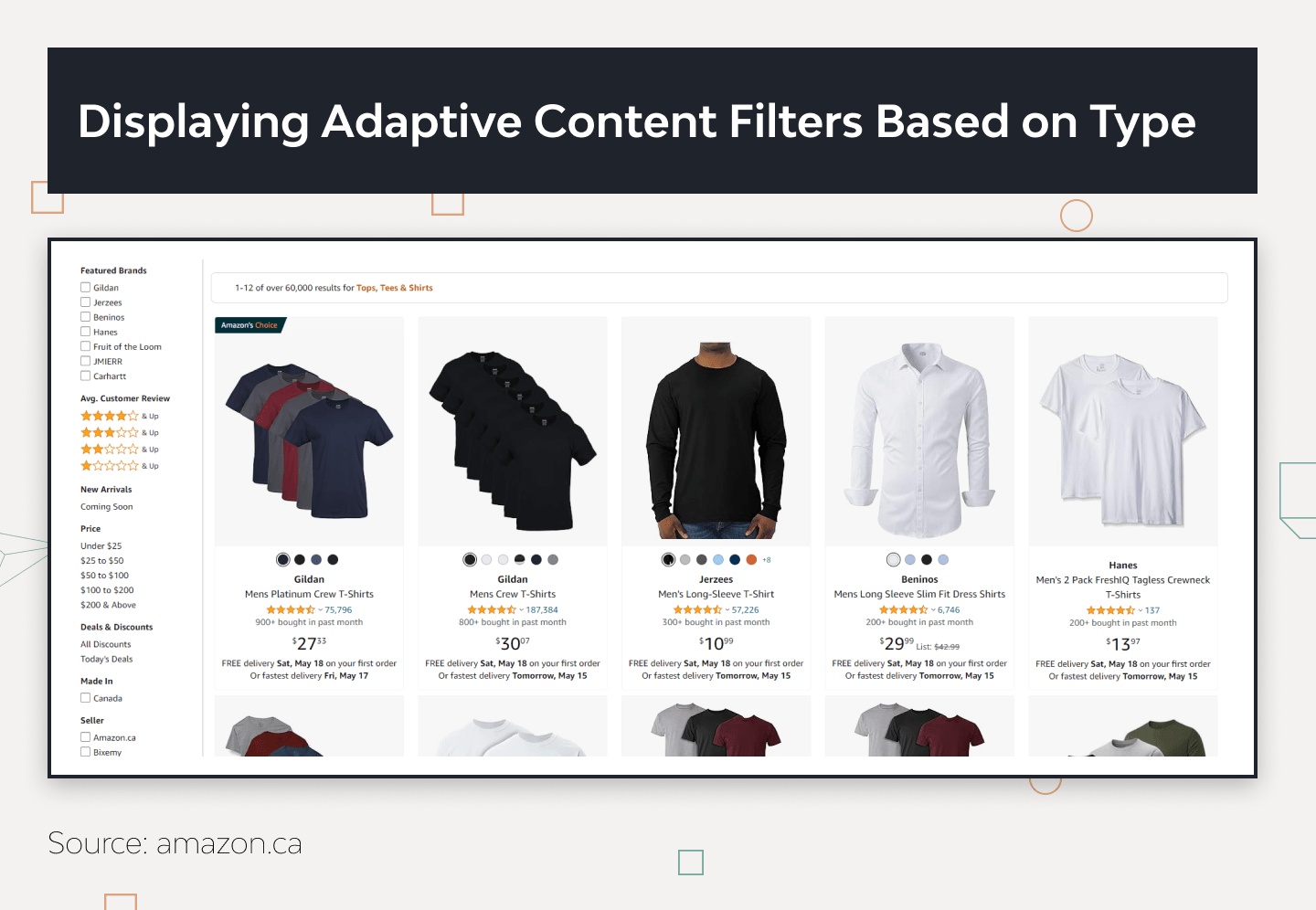
Filtering is key in UX design in e-commerce navigation. It helps users find what they need quickly and must work well on any device. Always choose filter options carefully to streamline the search for products. Include the most useful filters, like a price range slider that allows setting minimum and maximum values, right on the main panel for easy access.
If you have a long list of brands, add a search box within the filter area to simplify finding specific ones. Showing how many products match each filter option is also smart — it lets users see potential results before they apply the filter.
It’s helpful to display which filters are active, with an option to clear them all. This keeps users informed about their current selections.
Make sure the filters are relevant and don’t distract from shopping. The goal is quick, efficient filtering that enhances the shopping experience.
5. Mobile Responsiveness
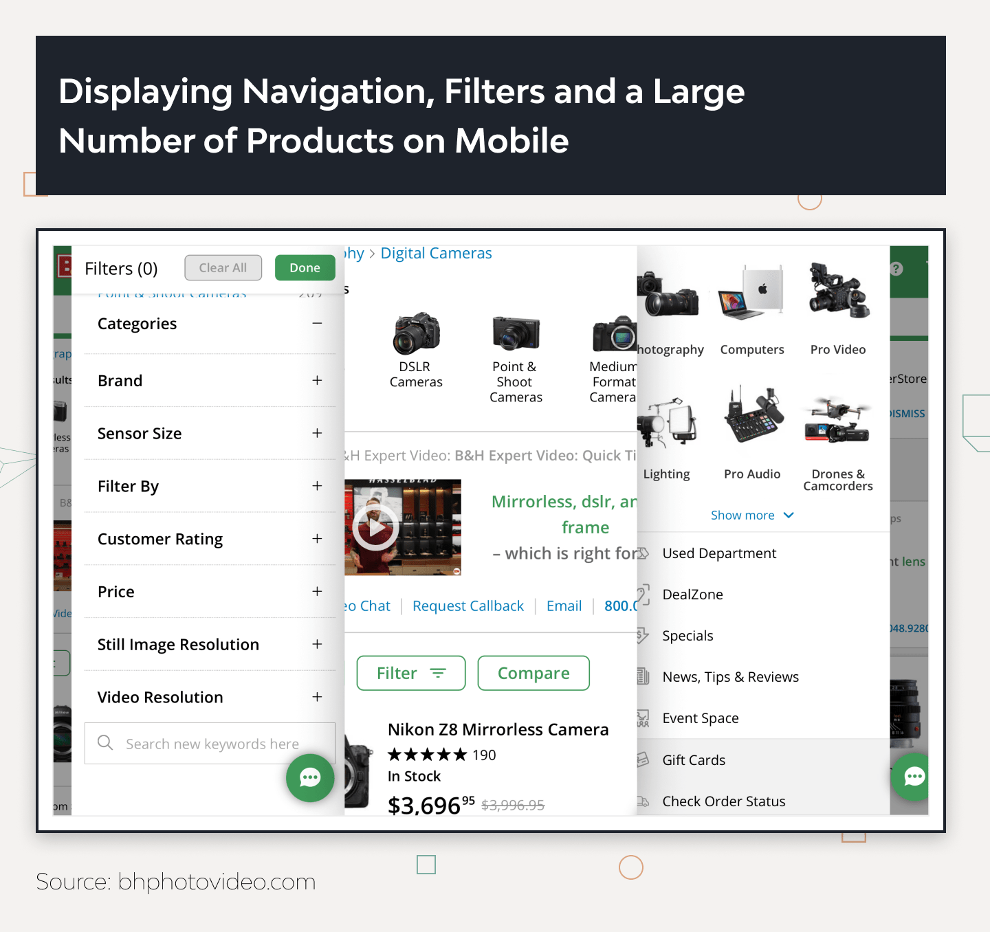
As more people shop on mobile devices, improving mobile user experience (UX) is crucial. When designing, make sure your product works seamlessly across mobiles, tablets, and desktops. Users might start shopping on one device and finish on another, so the experience from browsing to buying should feel consistent.
Mobile e-commerce UX design is tricky due to device limitations like smaller screens, no hover states, varying button sizes, and mostly vertical layouts. Plus, the navigation often hides behind a hamburger icon. You have to consider these factors along with the ever-expanding variety of mobile devices and how people use them under different conditions, all while keeping the user experience unified.
6. High-quality Product Images and Descriptions
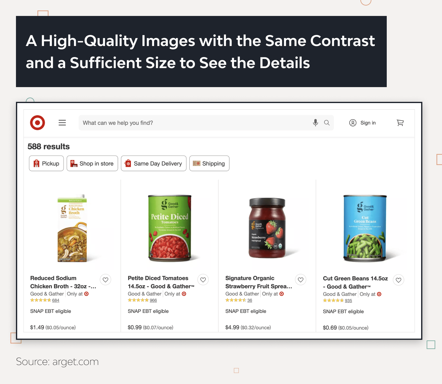
It is essential to use high-quality images and videos that characterize the product and its parameters from various angles. Quality graphics give the user an impression of the platform’s reliability and product quality and allow a more detailed acquaintance with the visual component of the product (color, texture, style, and others).
Remember that photos and videos should not distract the user’s attention from the functionality and main interaction elements (input fields, buttons, dropdowns). Avoid animations with parallax effects, 3D, and other animations that may reload the page (especially on mobile devices) and again distract from the main path to making a purchase.
7. Streamlined Checkout Process
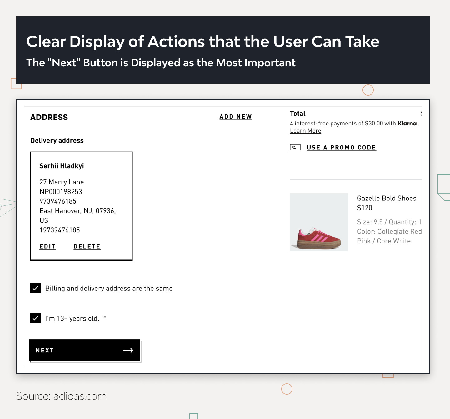
The foundation for better UX for e-commerce is primarily creating optimal user paths rather than just pages. Try to make the purchasing process easy and fast without unnecessary steps or distractions for your site’s visitors.
This saves your user’s time and makes the entire purchasing process simpler and more pleasant. The impression that a purchase can be made quickly and easily is worth the effort, as the customer will likely use your e-commerce platform again next time.
First, identify which elements and functionality need to be improved in the purchasing flow. Many tools will help you quickly find problem areas in the product and design and quantitatively measure which changes are better.
To determine the current state of UX and what needs improvement, you can conduct a UX Audit, as previously written about in UX Audit Service: How to Perform and Get Visible Results [Guide]. Using analytics and data, you can determine and measure interaction with interface elements and prioritize future changes in the interface.
8. Fast Loading Speeds
Users expect a quick response to their actions during interaction with the site. One of the important criteria is the website’s speed (loading speed of content, interactive elements for the first interaction with the user, and the page as a whole).
If visitors wait too long for the page or content to load, they will simply lose patience and leave your site or app. They won’t continue or even start their journey to making a purchase.
Page loading speed is essential for the user and optimizing SEO for search engines. It affects the position in search results and attracts organic traffic to your site if the page speed load is high.
There are various tools to analyze and improve page loading. Let’s consider the most popular ones.
Page Speed Insights (Google)
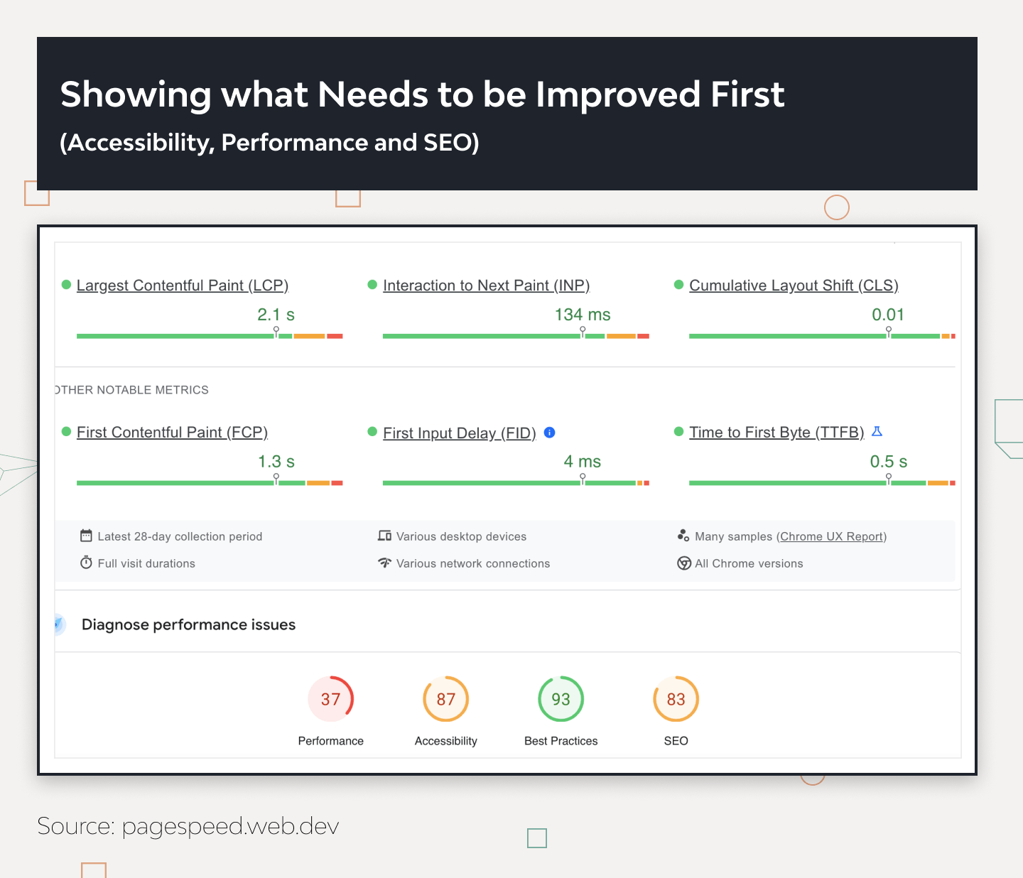
This tool provides a convenient way to measure your website’s performance, including its load times and operational parameters. Page Speed Insights identifies what slows down your website and offers tips to enhance its speed.
It also delivers useful information, such as reports on user demographics, visit times, and usage statistics across different devices and browsers. You’ll also find recommendations for optimizing your page’s code and design.
Just enter your website’s URL, and you’ll receive a score out of 100 within seconds. This score indicates your site’s optimization level and loading speed, highlighting areas needing improvement, such as Accessibility, Performance, and SEO.
Scores range from 0 to 49 for slow websites, 50 to 89 for medium speed, and 90 to 100 for fast-loading pages. A key feature of Page Speed Insights is its color-coded speed report — red, yellow, and green. This makes it easy to understand the performance at a glance. These reports are available for both desktop and mobile versions of your site.
GTmetrix
GTmetrix is a free and convenient tool for determining website speed. Thanks to its multifunctionality, it is currently the best option on the Internet. The interface of this tool is very simple and easy to navigate.
GTmetrix provides a detailed report on your website’s performance using Google Page Speed and YSlow. Access to this data is essential to knowing what to optimize.
This website speed testing tool provides accurate and visual reports on performance metrics, including data on Speed Visualization, Top Issues Page Details, and Structure Browser Timings in a Waterfall Chart format.
DareBoost
It’s a tool similar in functionality to its competitors. DareBoost allows you to check the speed in different locations. However, the emphasis is placed on mobile rather than desktop.
A distinctive feature of this speed analysis tool is that it lets you see your website through users’ eyes. It shows how the page you are checking loads in real-time.
Trust and Help Users
The trust of visitors to your site plays a key role. As soon as a user enters your site or app, the first impression influences whether there will be any further interaction on the site or not. If a person does not trust, they will likely use another site.
As a company or brand, you need to care about the design, as you use it to communicate with the client. Moreover, society is increasingly paying attention to the reputation of the brand. Considering all this, reliable brands are more likely to stand out and win customer loyalty.
How can you use UX to build user trust in your e-commerce platform and achieve business goals?
1. What You Bring to the Table
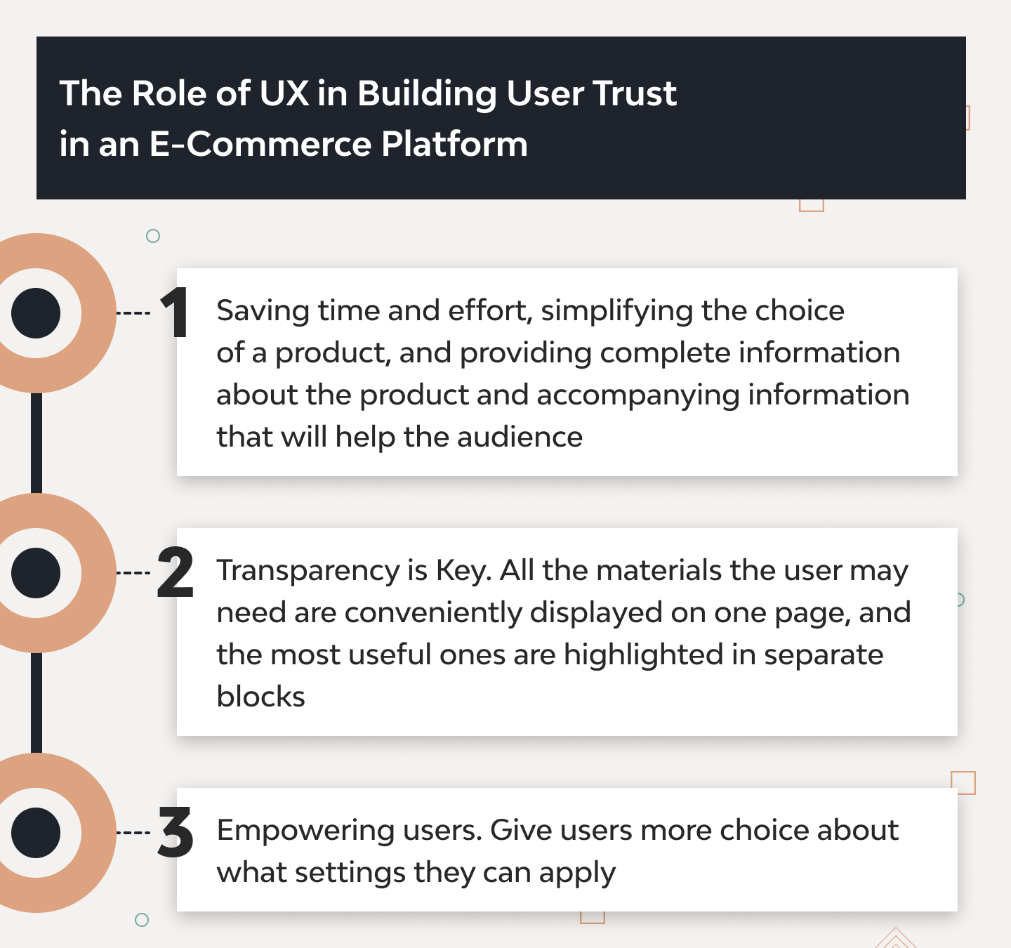
Establishing trust with users is based on people’s impression of whether you bring value and help achieve set goals. Saving time and effort, simplifying the choice of a product, and providing complete information about the product and accompanying information that will help the audience. You can help with the choice of size or display reviews from other visitors so that people will trust your product.
2. Transparency is Key
Offer the user all the necessary information and be honest. Being informed at every step of the ordering process gives a clear understanding of what is happening with the order and how soon it will be processed, shipped, and delivered to the address. This is especially important when something goes wrong, and a force majeure occurs at one of the links. The impression that the company is doing everything possible to solve the problem maintains the users’ loyalty and commitment.
All the materials the user may need are conveniently displayed on one page, and the most useful ones are highlighted in separate blocks. Also, displaying truthful reviews about the product and information that can help the buyer decide is a sign of transparency on the e-commerce platform.
A detailed and precise description of the privacy policy and terms and conditions, no surprises at checkout (additional hidden fees or necessary clarifications regarding the order), a return policy, and others generally create an impression for the user about the transparency of the business and the attitude towards the buyer.
3. Expand the Possibilities of Your Users
By giving users more choices regarding which settings they can apply, you let them feel confident in making their own decisions. Default settings mislead users. It’s better to let them choose the settings themselves rather than look for ways to turn them off.
All settings should be understandable, and changes after application should be clear and specific. In most cases, users are unaware of the irreversible consequences of actions. A lengthy description of the product delivery policy or other instructions is often not read by users, so it is necessary to explain which actions have consequences and whether there can be irreversible changes or if it is possible to return to the previous state.
Explain in detail which data you want to collect and what you intend to do with the collected information (improve the product, save users time, create a more relevant user experience).
Conduct Testing and Collect User Feedback
To understand clearly which part of the product needs to be optimized on your site, you need to gather information for decision-making. One of the most effective ways is to conduct user interviews to collect information and obtain insights that confirm or decline your hypothesis regarding design improvement.
Regular collection of users’ feedback allows you to make changes to the product that solve current problems and bring maximum benefit. When making changes to the design of an e-commerce site, test your solutions and compare data from analytics and test results. A solid base for systematic and consistent product improvement is a clear understanding of what works better.
All the results you get from analytics tools, testing, and user interview sessions should either quantitatively show how KPIs change or be qualitative — respond to the reasons for user behavior and problems that arise during the platform’s use.
Django Stars Approach
Conducting a UX audit is resource-intensive and requires a clear grasp of its objectives and the insights it can yield. Although the Django Stars team has a rich background in designing web app interfaces, including complex ones, usability audits are less frequent in our portfolio.
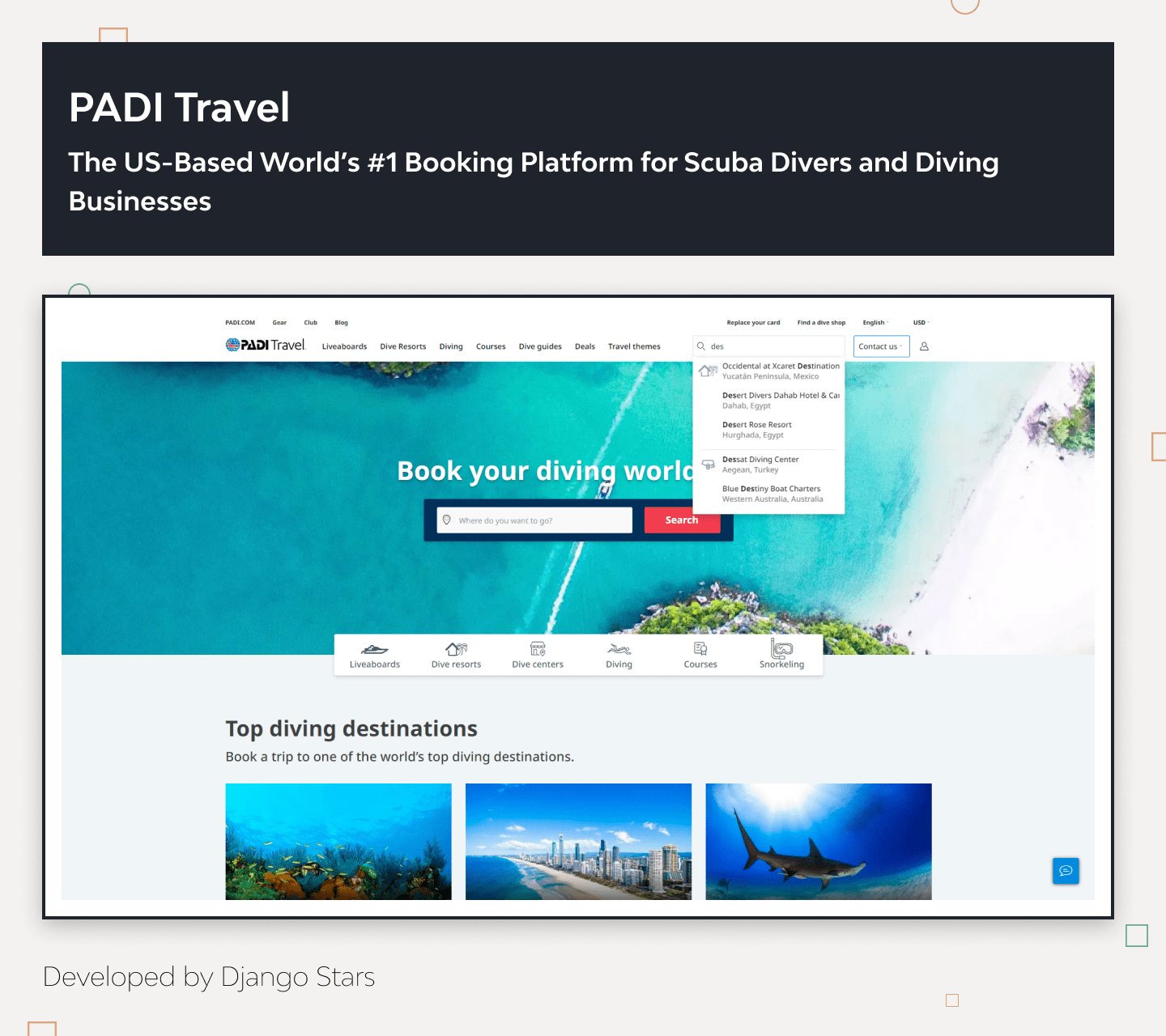
A notable example from our practice is the UX audit for PADI Travel, a travel booking platform where users can select from numerous packages with various options. Over time, the business reevaluated its UI/UX approach, prompting the need for a usability audit.
We incorporate a UX review to identify UX errors in our process, especially when it’s not a start-from-scratch project (where a Discovery phase is standard). To conduct a thorough UX audit, like the one for PADI Travel, we develop and test a set of hypotheses, even those based on extensive experience.
This audit included goal setting, analytics, performance evaluations, user interviews, and other tools, allowing for a detailed UX assessment and precise identification of issues included in the audit report.
Conclusion
Improving website UX conversion rate in e-commerce is crucial because it streamlines the product selection and ordering process for users and boosts business efficiency and profits.
Using various tools and User-Centered Design (UCD) methodology gives your site a competitive edge. To effectively enhance UX, it’s important to follow established UX and UI practices, develop solutions based on both quantitative and qualitative data, and collaborate with other specialists. This comprehensive approach to UX improvement ensures tangible results if you adhere to an organized process and best practices.
Remember, e-commerce users’ behavior and purchasing conditions are always evolving. Although competitors are also enhancing their offerings, continuously working on your UX design can significantly help you stand out and lead the market.

