Shadcn UI vs. Material Design UI (MUI): Detailed Comparison Guide


With nearly countless UI kits available today, the leadership competition happens as Shadcn UI vs Material UI (MUI). The latter established itself as a go-to UI kit in 2014, as it follows all the Google guidelines, provides consistency in the interface design, and has nearly anything a web interface may need. The latter is an emerging star that has gained popularity in recent years and promises to stay on top for long.
But how to choose between Shadcn UI and material UI for the product or the project to make the most of it?
Clearly, the choice depends on your needs in the project and other variables in it. DjangoStars’ case studies vary in purpose and scale: from a new approach to a diving travel experience to creating a digital experience for mortgages in quite a conservative market. Our UI/UX team has extensive experience with a variety of systems and knows how to build an effective design system for a particular case.
Now, let’s overview the features Shadcn/ui and MUI (Material Design) have and compare them to see which choice will be better depending on the nature of the project.
Key Takeaways
- In the comparison between the two, Material Design UI is a more established system, hence it has documentation for virtually any case and is backed by a large online community sharing experiences and tips related to the system. At the same time, shadcn/ui is a new open-source collection that is quickly gaining popularity.
- Shadcn/ui is a modular system that allows working with the source code of each component individually.
- The main benefits that come with Shadcn/ui are its ease of use, accessibility, and scalability, while MUI is known for its consistency, uniformity, extensive editing options, and vast community online.
- The choice of design system depends on the project’s requirements and cannot be taken without thoroughly researching its context.
Shadcn vs MUI Comparison Table
| shadcn/ui | MUI (Material Design) | |
|---|---|---|
| Design System | No design system | Google’s Material Design |
| Approach | Build your own component library from scratch | Component library |
| Styling Approach | Tailwind CSS | Emotion/styled -components |
| Customization and Theming | Full customization control. Copy and paste code into your project and customize. | Theme customization. |
| Platform Support | Mostly web-focused. Only React.js based frameworks. | MUI is a React.js based implementation of Material Design. Other reference implementations exist for the: Web, iOS, Android. |
| Community and Documentation | Expanding and lively community | Large and active community; detailed documentation |
| Pricing | Open-source | Core is free MIT licensed. Advanced components are paid. |
| Learning Curve and Implementation | Coding, Tailwind CSS. Curve is steeper in the beginning but then flattens out. Because components are unstyled you will need to customize them yourself according to UI design. | Coding, MUI design system, Emotion/styled-components. Learning curve is steep because of the large surface area of the library. Harder to implement some customizations that are not compatible with approach that is used in components. |
| Maturity | Young and fast growing library. | Established component library. |
| Maintainability | Since the component code becomes part of the product's source code, you have full control but it will require attention and consideration as your product grows. Component style code is not coupled with the implementation. | Good documentation with solutions to most common problems. A lot of battle experience and scars accumulated during the life of the framework. Some technical decisions are losing popularity in the current context and might be outdated in the future. Breaking changes with major version releases of the library. |
| Distribution | Distributed via CLI tool that lets you pick the components you need then copy and paste the source code into your project and customize to your needs. | Distributed as an npm package that you have to install into your project. And keep track of all the dependencies and conflicts. |
| Suitable Projects | Projects with requirements for smallest bundle size and fast load times. Internal and smaller-scale web products. Current components and blocks list is suitable for your project. Products where the default look and feel is not suitable. | Middle and large-scale products. Current components and templates are suitable for your project. Dashboards and internal tools where differentiation on design is not as critical. |
Shadcn/ui
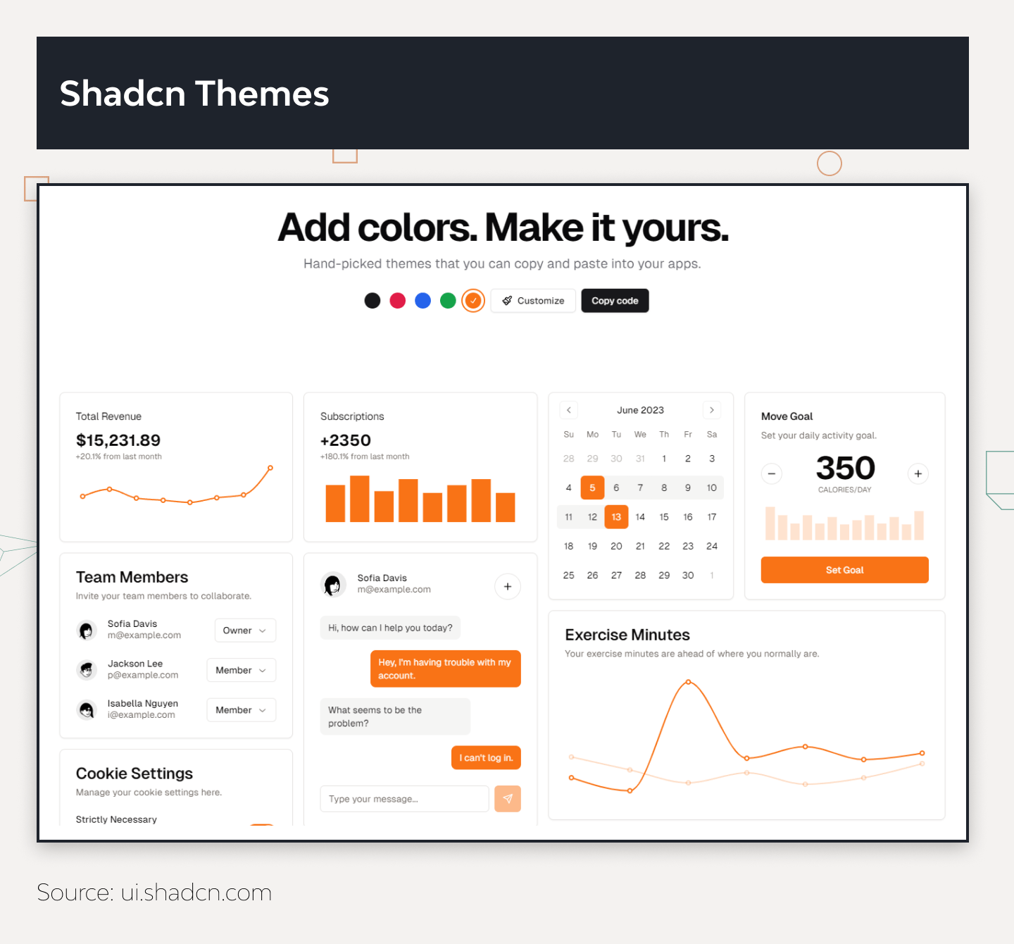
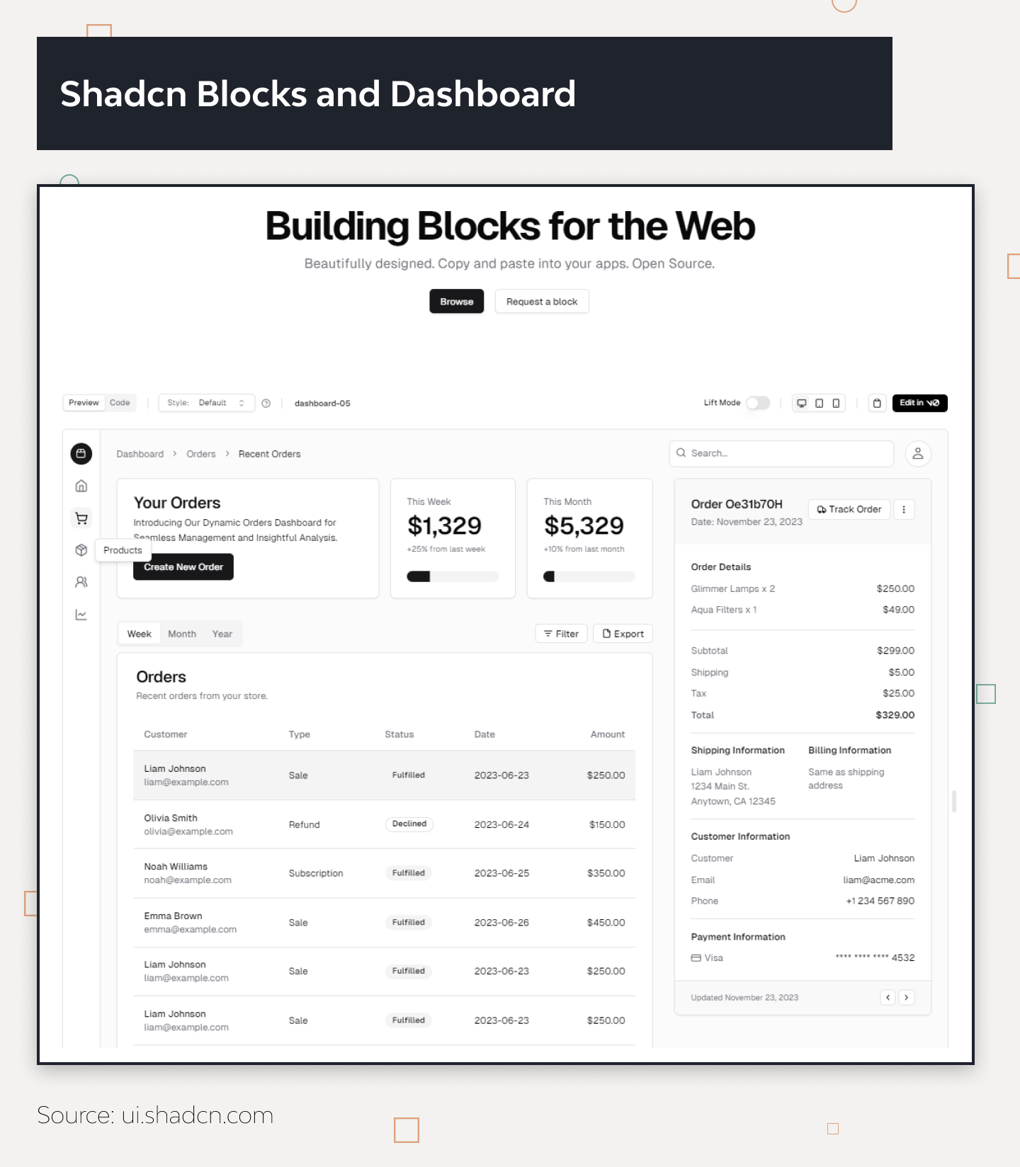
Although it is listed in all charts and used by developers as one of the now countless UI libraries, shadcn/ui’s documentation defines it as a collection of reusable components one can copy and paste into their application. Thus, the key comparison point about Shadcn/ui vs MUI (Material UI) or any other traditional component library is the format of components it provides.
It was only released in 2023, and it is already one of the undeniable design trends and a top selection for experienced developers due to its features and benefits that come along.
Shadcn/ui Key Features
Customization of Components
The platform allows for component-based development and modular UI design, as it provides the full component source code rather than an import from a library. It is also possible to obtain a theme as a bundle, and it is possible to customize it as a code or use Shadcn/ui’s theme editor instead.
Modularity
The platform allows the developer team to simply copy and paste the needed Shadcn components as code instead of piling them in an npm package first. Its component-based structure gives developers ownership and detailed control over the component library in the product. Thus, it provides tools to mold and style the components to the preferences and needs of the product.
Performance Optimization
Shadcn/ui’s modular approach helps with performance optimization, as the team can choose only the components it needs and work with them as code, additionally the Tailwind CSS approach with utility classes also allows to have good reusability of classes and only have the classes that are actually used in the final bundle. This elevates consistency and provides smoother user experiences and faster load times at the same time.
Benefits of Shadcn/ui
Teams who have worked with Shadcn/ui highlight its ease of use, accessibility, and scalability. Basic knowledge of React, JSX, Tailwind CSS, and JavaScript, plus a rendering framework like Next.js application is enough to grasp and work to create your very own component library.
Its components are fully accessible and adhere to Web Content Accessibility Guidelines. Shadcn/ui allows working screen readers and keyboard navigation, providing everything for creating aesthetically pleasing and accessible software. Finally, developers have direct access to each component’s source code, so the only limitation in customization is the developer’s skill rather than the features it has.
Shadcn/ui Shortcomings
Although working on every individual component’s code gives more customization options, copying or installing each element may turn out bothersome at times. On a project with tight deadlines, it can be a complication or a source of stress, especially while working with the entire component package. Also, working with design elements as a code means a larger codebase, which will mean more resources for maintenance in the future. Additionally not everyone is a fan of Tailwind CSS approach of utility first classes that are used directly in the JSX layout.
Takeaway by DjangoStars
For the products that do not project drastic transformation in the long run and the projects with tight deadlines, it is optimal to go for Shadcn/ui compared to MUI (Material UI). Incorporating individual elements one by one simply makes more sense than dedicating a significant time to working with a big UI kit as a whole, especially if the product does not need all its contents.
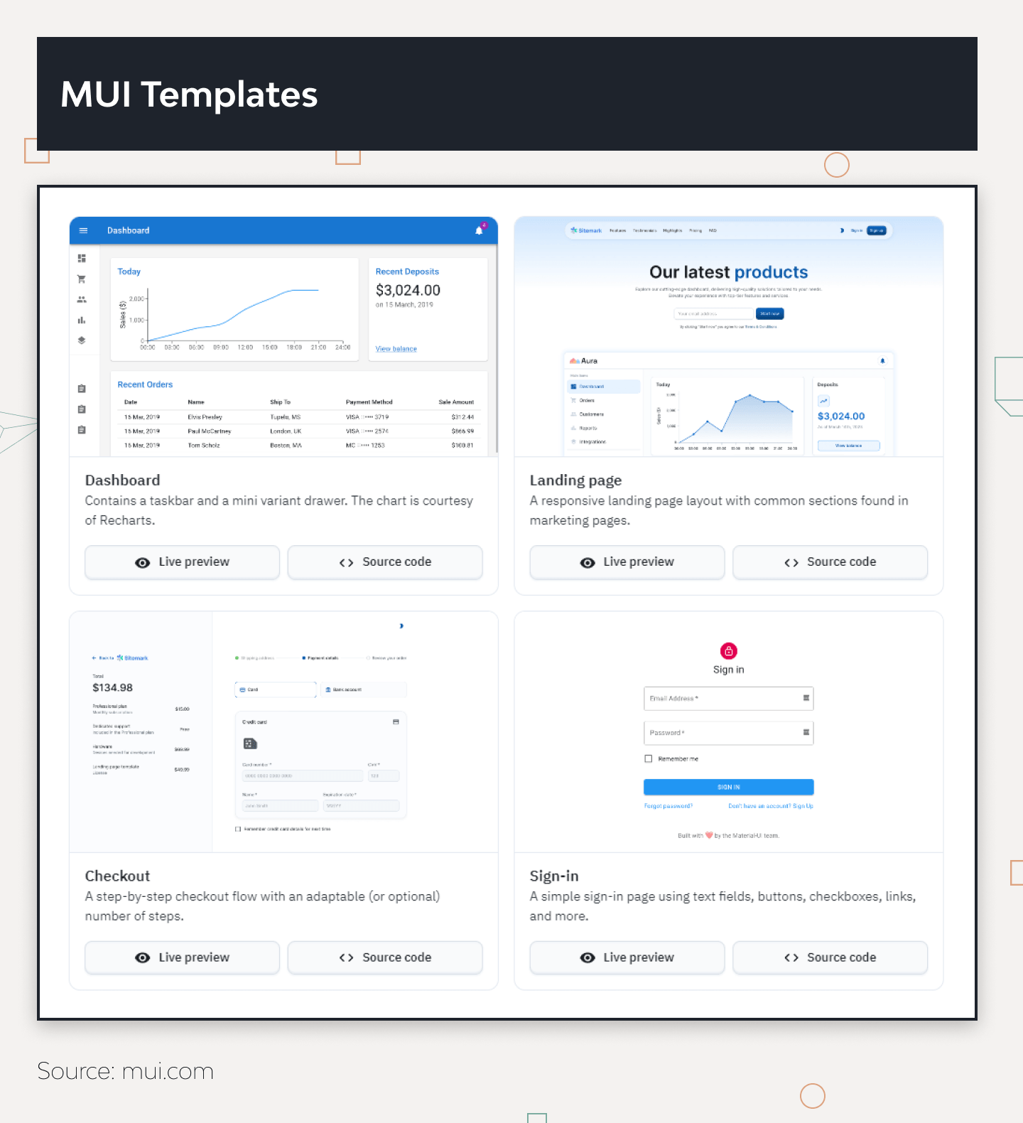
MUI (Material Design)
While one can install shadcn/ui components individually, Material Design comes in packages. Now referred to as simply as Material Design, it is a design system by Google, inspired by its card-based layout. MUI has a visual guide for user interactions and motion, which developers can customize to the project and implement on different devices and platforms.
MUI is also generally referenced as a UI component library, but since it was developed by Google itself, there is an entire philosophy behind it. The Material Design approach is built on these core principles:
| #1 Material is the metaphor. | The whole system is built on the metaphor of physical materials, providing the users with familiar visual elements from real life and thus hinting at how to interact with the product. It offers elements like shadows, depth, and motion to create a sense of tactility and realism in digital interfaces. |
|---|---|
| #2 Bold, graphic, and intentional. | Google leads by example and encourages teams to use bold colors, typography, and imagery. It helps to create engaging and memorable experiences and encourages designers to use strong visual hierarchy and deliberate design choices, which also provides a smoother user experience. |
| #3 Motion provides meaning. | Motion is used intentionally. The system encourages the use of motion to convey meaning, gUIde as an additional means to clarify relationships between elements in the visual hierarchy and to create seamless transitions. |
| #4 Respond and adapt. | MUI promotes responsive and adaptive design principles to ensure that interfaces are usable and visually appealing across a wide range of screen sizes and devices. |
| #5 User actions in the focus. | MUI focuses on the user's actions and interactions to plan or perfect its features. The main priority for the system is a smooth user experience, which is achieved through clear and intuitive navigation, feedback mechanisms, and interactive elements. |
Key Features of MUI
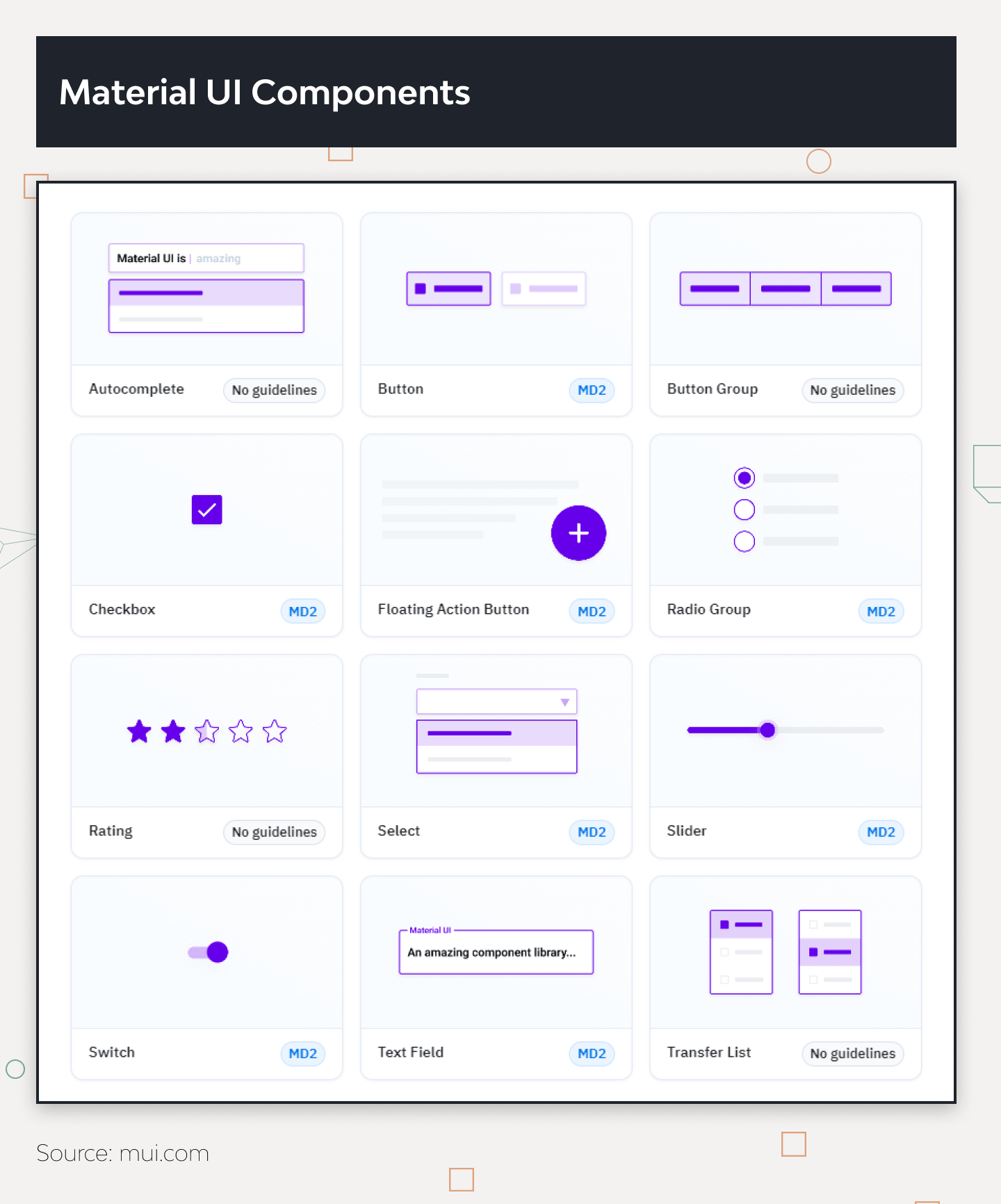
UI Components
The system offers pre-designed UI components virtually for any purpose. Buttons, cards, navigation drawers, lists, sliders, and tabs, are designed to follow the principles of Material Design, ensuring consistency and usability across different applications.
Theming
Developers can easily customize the appearance of the product with the theming system. It gives control such as color, typography, shape, and elevation. With the range of offered components and features to customize them, it gives the chance to create something unique yet perfectly usable every time.
Accessibility
Material Design components are designed with accessibility in mind. Features like proper focus management, keyboard navigation, semantic HTML, and support for screen readers promote developing inclusive products that cater to the needs of broader audiences.
Motion
In Material Design philosophy, motion provides meaning, context, and fun to user interactions. It presents motion to communicate status changes, guide users’ attention, and create smooth and intuitive interactions. For this reason, the system has extensive guidelines and tools for incorporating motion into applications.
Typography
Material Design advocates clear and legible typography, so it has guidelines for choosing and using typefaces effectively, and recommendations for font sizes, weights, styles, and hierarchy.
Documentation
Material Design website offers documentation, guidelines, tutorials, code samples, design tools, and resources such as icon sets and color palettes. Plus, there are community-driven resources and forums where developers can seek help, share tips, and collaborate with others.
Benefits of Material Design UI
Most of the benefits that developers recognize in working with MUI come from the principles the system is built on. It provides a unified set of user experience design principles and components, which helps to create consistent and recognizable user interfaces across different applications and platforms. Plus, the guidelines help designers profess their craft and learn more about users, as its recommendations are empirical and usability-focused.
The system gives all the tools to achieve efficiency on your project, as all the elements are pre-created and unified. On top of that, those working with MUI get huge community support in case of confusion. As it’s developed and maintained by Google, it naturally has a large and active community of designers and developers. So, if you have an issue or a question, you will find your answer in no time.
Material Design Shortcomings
As MUI’s unified system makes it easier to keep the interface consistent, it limits its customization on the flip side. If the project requires highly custom or unique components, it may cost developers significant time. It is also dependent on Google’s ecosystem and design aesthetic.
Even though Google often knows best, it is not always a perfect match with the branding or design preferences of all applications or organizations. Lastly, MUI components and styles in a project may introduce additional code and resources. This overhead potentially increases the size and complexity of the product both in terms of development and maintenance. Styling the components via Emotion/styled-components is not always the best approach and may be considered outdated in the current context.
Takeaway by DjangoStars
In terms of Shadcn/ui and Material Design, the latter is more suited for long-term projects, the products projected to undergo growth and transformation, and multi-platform products. For all the cases mentioned, it takes a longer time to accommodate the guidelines at the initial steps, but the system’s consistency will ensure less maintenance headache as the product grows.
Shadcn/ui vs. Material UI Design. A Side-by-Side Comparison
These two systems are built with different approaches and needs in mind, and throughout their establishment, they took their distinctive directions.
For more insight, let’s discuss the development-related points about Shadcn/ui compared to Material UI.
Design Principles
Shadcn/ui templates are designed with a business-oriented approach. Its focus is on a clean and professional user interface suitable for internal tools and serious application scenarios, while MUI promotes consistency and uniformity in UI. The latter manifests classic principles of good design with the innovation of technology and science.
Component Library
Shadcn/ui focuses on providing essential components for applications with a clean and functional interface. In turn, MUI’s component library is extensive and covers everything from simple buttons and text fields to complex navigation drawers, all tuned to Material Design guidelines.
Customization and Theming
In the Shadcn/ui vs Material UI comparison, the former gives developers the freedom to customize components according to their project’s needs. Shadcn/ui allows for selective installation of elements, which gives developers more freedom on the project. At the same time, even with the elaborate and science-based guidelines Google’s MUI sticks to, it still allows for a high degree of customization with its toolset. Essentially, developers can modify the look and feel of components to match their brand identity with both libraries: either through code or with the tools.
Platform Support
Shadcn/ui’s focus is currently placed on web applications, and the components are optimized for desktop environments. MUI supports a wide range of platforms including Android, iOS, Flutter, and the web—basically, any platform popular among users. Thus, it helps developers to maintain a consistent design language across multiple platforms and devices.
Community and Documentation
Even with a big splash Shadcn/ui made last year, it is still actively building its community and documentation. Nonetheless, its documentation is sufficient to get started, and its growing community is a good source for developers seeking support.
Naturally, in the Shadcn/ui vs Material UI comparison, the latter boasts a large and active community, along with comprehensive documentation provided by Google. However, proportionally, both have active and lively communities: one due to its track record and name, and the other due to the innovation it brought to the idea of a UI library.
Shadcn/ui vs Material UI: How to Choose The Right One
There is no universally clear winner in the Shadcn/ui vs Material UI battle, as they approach building the design system differently. The relevance of one framework or another depends on the project’s resources and requirements. Such conditions as the project’s objectives, time frame, the complexity of the product, and the context of its use heavily influence the whole planning and UI development process in particular.
If you are working on a project with no complex data processing requirements, it is perfectly suitable to go for open-source UI components by Shadcn/ui. It is simpler to configure and more lightweight. However, if your project requires high-performance data components or intricate charts, has potential for continuous growth, and can afford such front-end framework fees, it is more sensible to stick to MUI.
Still, the full picture of all of these can only be visible after the discovery phase, a decisive part of user interface development. It can remove all the uncertainties and tell you clearly whether to use Shadcn/ui or Material Design for your next project.
The Bottom Line
While Material Design has its name and is developed by one of the biggest trendsetters in tech, Shadcn/ui rapidly grows its popularity and expands its community. Due to the difference in features that they offer, they can only compete where they can compare—namely, how relevant one or the other will be in terms of product complexity, requirements, budget, etc.
If you don’t know whether to choose Shadcn/ui or Material UI, be sure to reach out to our UI/UX design services which will dig into all the project’s particularities and come up with the best suitable option for your case.
Is Shadcn/UI quick to implement?
- In terms of individual component implementation, Shadcn/UI is faster to implement, as building everything with MUI requires more groundwork with the guidelines.
What projects does Shadcn/UI suit best?
- It is a great option for smaller or internal web-based projects. Its components are quick to implement selectively and the system does not require installing the entire package of components the products do not need.
Are Shadcn/UI products scalable?
- Products created with this design system are scalable. However, since in this case, the design system becomes a part of the source code of the product, it will require more maintenance in the future.
Does Shadcn/UI have any limitations?
- Its limitations mostly revolve around its focus on specific application scenarios. It still has a relatively smaller component library compared to more established frameworks.
Can I combine Material Design and Bootstrap?
- Both frameworks offer comprehensive styling options, so it's crucial to harmonize the layout and utility classes provided by Bootstrap and ensure that the user interface stays cohesive. Material Design with Bootstrap to leverage the strengths of both frameworks to create unique and effective designs.
Hire experienced developers to build your next project with DjangoStars