UI/UX Terminology: What Every Designer Should Know


Listen to “UI and UX Terminology What Every Designer Should Know” on Spreaker.
This article is dedicated to designers and the people who have to communicate with them. Of course, if you go into any design studio, 99% of what you see will be drawings. But probably 100% of what you hear in the studio will be words. And when it comes to developing UI and UX, words are often specific UI/UX terms.
Imagine yourself in a situation where:
- You need a glossary on the blog so you can refer to it, reading an article about the elements of user interface.
- It makes sense to shed light on the most commonly used UX terminology at design conferences and meetups.
- A new business meeting was going swimmingly – that is, until the client started asking questions about your design process. Then you poured out the complete UX lexicon of specialized user experience UX buzzwords the client knew nothing about.
- While having a conversation about designing stuff with a friend or colleague, it’s helpful if you know basic UI/UX terminology.
The UI/UX Glossary For Designers is a valuable bag of tricks that will teach you to speak the same language as designers. This short article provides you with better understanding of key UI/UX terminology. And in 15+ years of software development, the Django Stars team has seen many times that knowing how to speak the same language with designers helps a lot when creating projects in any industry, whether it is fintech, travel, or e-commerce.
Ready? Let’s go!
General Terms for UI and UX Designers
· User Experience (UX)
A broad term that includes several disciplines that study the effect of design on the ease of use and level of satisfaction with a product, site or system. The term UX was invented by Dr. Donald Norman, a cognitive scientist.
· User-Centered Design (UCD)
An approach to designing a product or service (user interface design), in which the end user is placed in the center of the process. User-Centered Design (UCD) and Human-Centered Design (HCD) are similar sounding UX terms, but the second one is more suitable for the “social problems solving” context.
· User Experience Design (UXD)
Designing software products and systems to be useful to a set of end users. It is a broad concept applied during the design process. UX design covers the technical use of a product or service and its essential physical interface.
· Customer Experience
Among other UI/UX terms, we recommend that you remember such an important one as customer experience. The feelings of a customer generated by his or her interactions with a supplier’s employees, systems, channels or products.
· Interaction Design (IXD)
The study of how a user interacts with a page, application or product. IXD facilitates the actions we want to take with any given system.
· User Interface (UI), or Graphical User Interface (GUI)
What the user sees. This can be a set of commands or menus through which a user communicates with a program. It is also the space where interactions between humans and machines occurs.
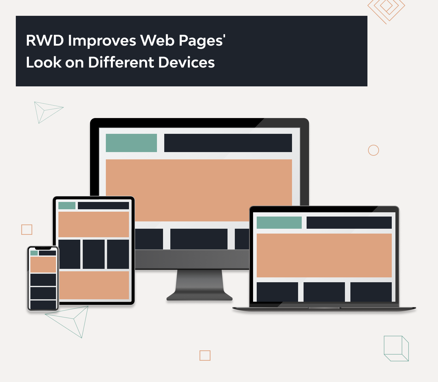
· Responsive Web Design (RWD)
RWD provides an optimal viewing experience across platforms and devices. The content and layout of a website should efficiently adapt to the sizes and technical abilities of the device it is opened on.
· Data-Driven
This means using all the available data: analytics, A/B tests, customer service logs and social media sentiment to develop a better understanding of UX. There are common misconceptions that user experience is purely an art, but there is a lot more involved. Understanding how to collect and process data is one of the key tasks you have to face as a UX designer.
· Accessibility
The measure of a web page’s usability by persons with one or more disabilities.
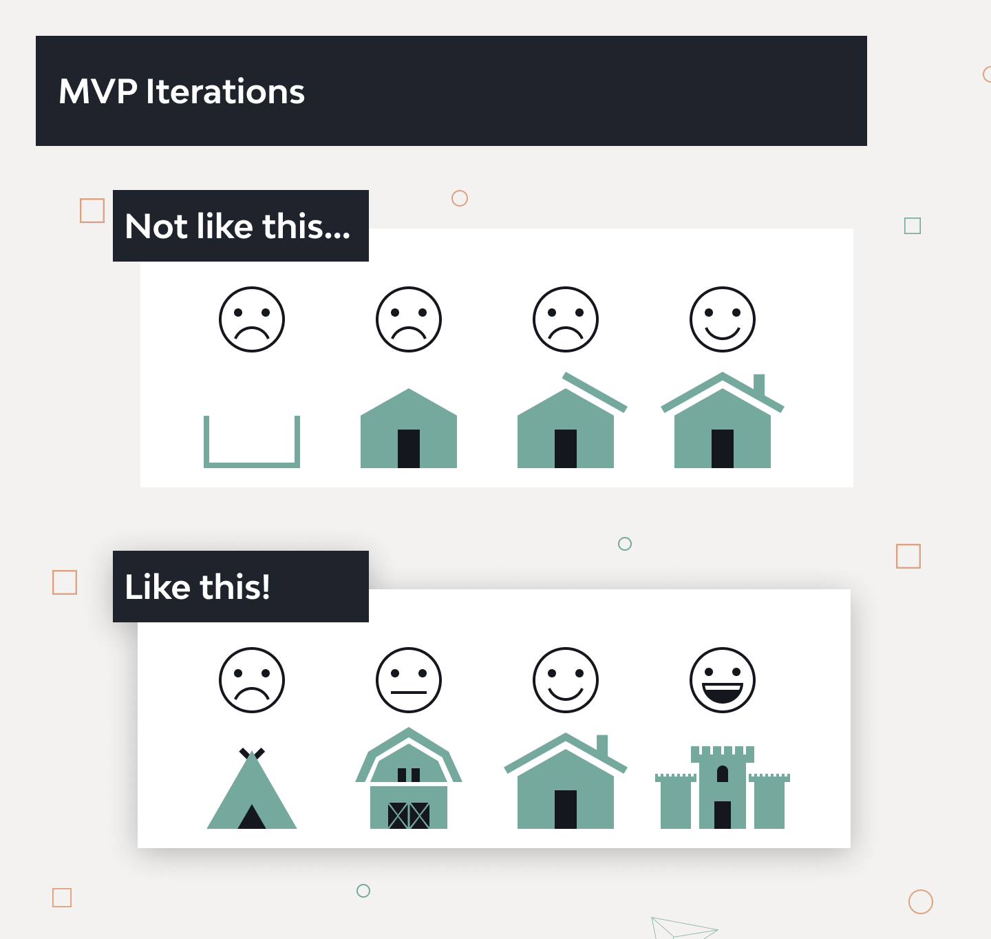
· Minimum Viable Product (MVP)
MVP is a product with enough features to meet the needs of early customers. This strategy provides feedback for future product development.
· Fitts’ Law
A mathematical model that predicts how long it will take to point at a target based on the target’s size and proximity. The further away and smaller it is, the longer it will take for users to interact with it.
· End Users
Refers to those people who use a website or those who are participants or subjects of research studies.
· Focus Group
A focus group is a pointed discussion with a group of participants led by a moderator. Questions are designed to gather feedback about users, products, concepts, prototypes, tasks, and strategies.
· Nielsen’s 10 Usability Heuristics (Rules)
10 general principles that objectively characterize the user experience. These are practical algorithms that make it possible to obtain adequate solutions to problems in most cases.
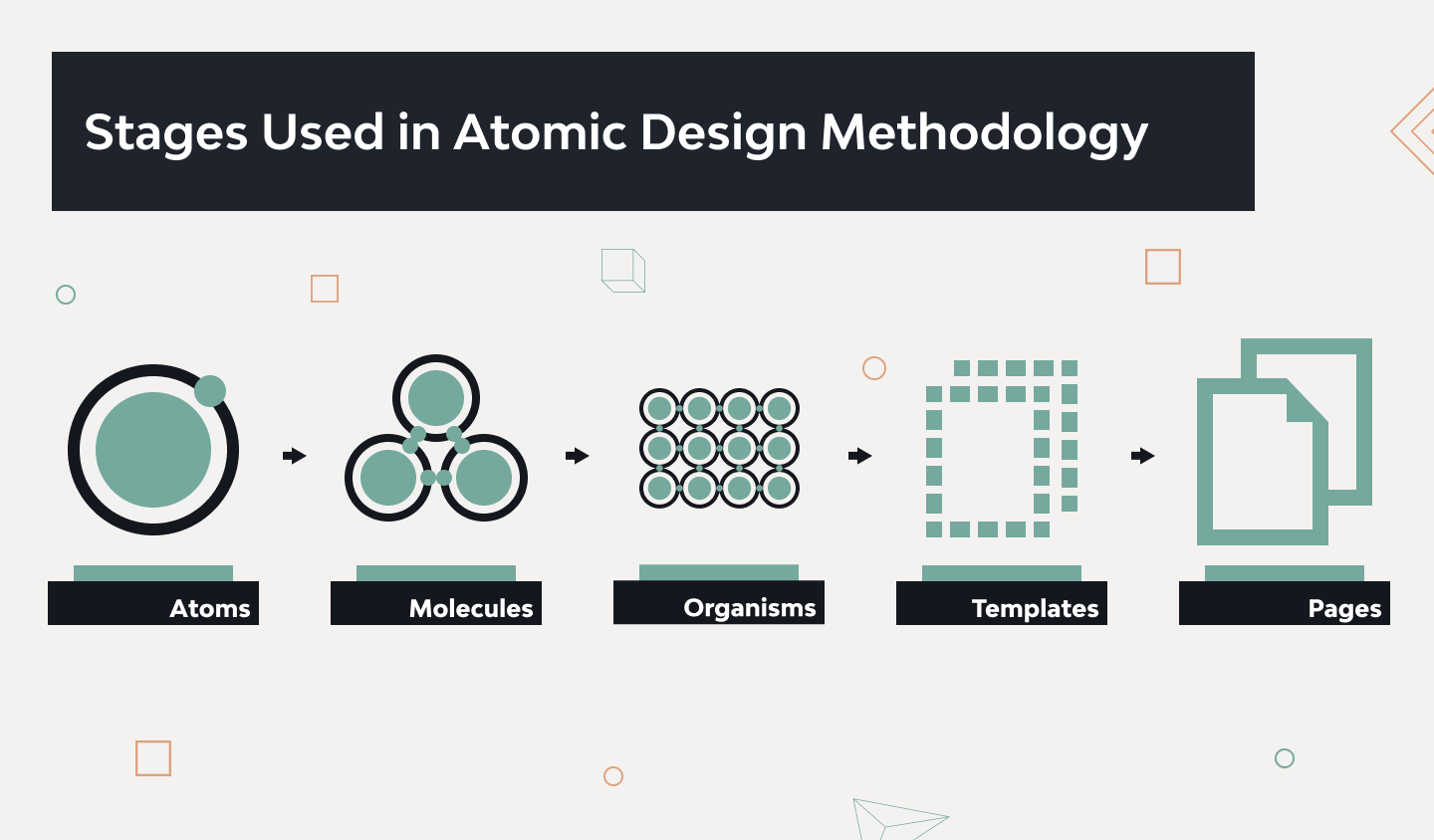
· Atomic Design Methodology
A mental model that allows interface design systems creation more deliberately and hierarchically. For this purpose, Atomic Design Methodology uses five distinct stages:
- Atoms (include basic HTML elements like buttons, inputs, and labels),
- Molecules (relatively simple unit that consists of UI elements functioning together),
- Organisms (more complex UI components that can be composed using groups of atoms, molecules, and other organisms),
- Templates (page-level objects that serve to place design components into a layout),
- Pages (UI objects that demonstrate the placement of real representative content).
Design Laws and Rules
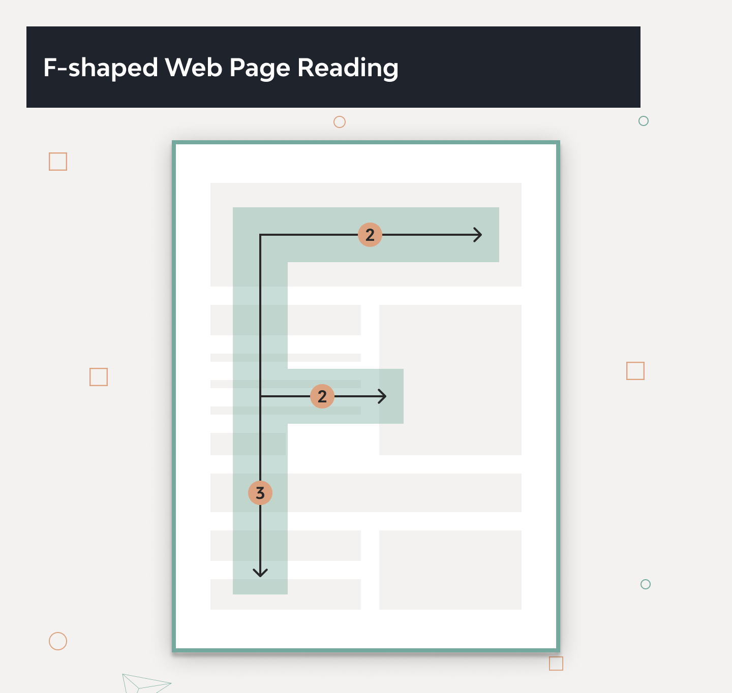
· F-Shaped Pattern
Users often read Web pages in an F-shaped pattern: two horizontal stripes, followed by a vertical stripe. In a few seconds, their eyes will move at amazing speed across your website’s words in a one-of-a-kind pattern.
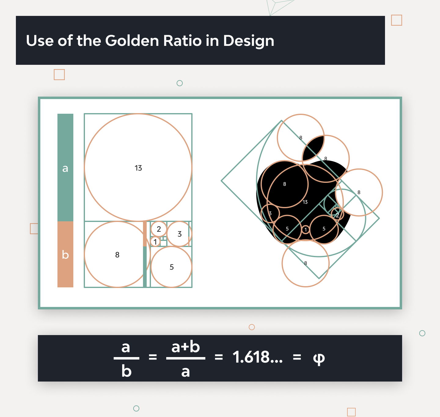
· Golden Ratio
A mathematical ratio with origins in ancient Greece, also known as the Greek letter Phi. It is found in nature, and has made its way into graphic and print design as people deem it to be the most visually appealing layout to the human eye. The Golden Ratio approximately equals 1.618. We find it when we divide a line into two parts so that the full length divided by the long part is equal to the long part divided by the short part.
· 3-click Rule
The theory that users will abandon a website if they are unable to complete their task within 3 mouse clicks.
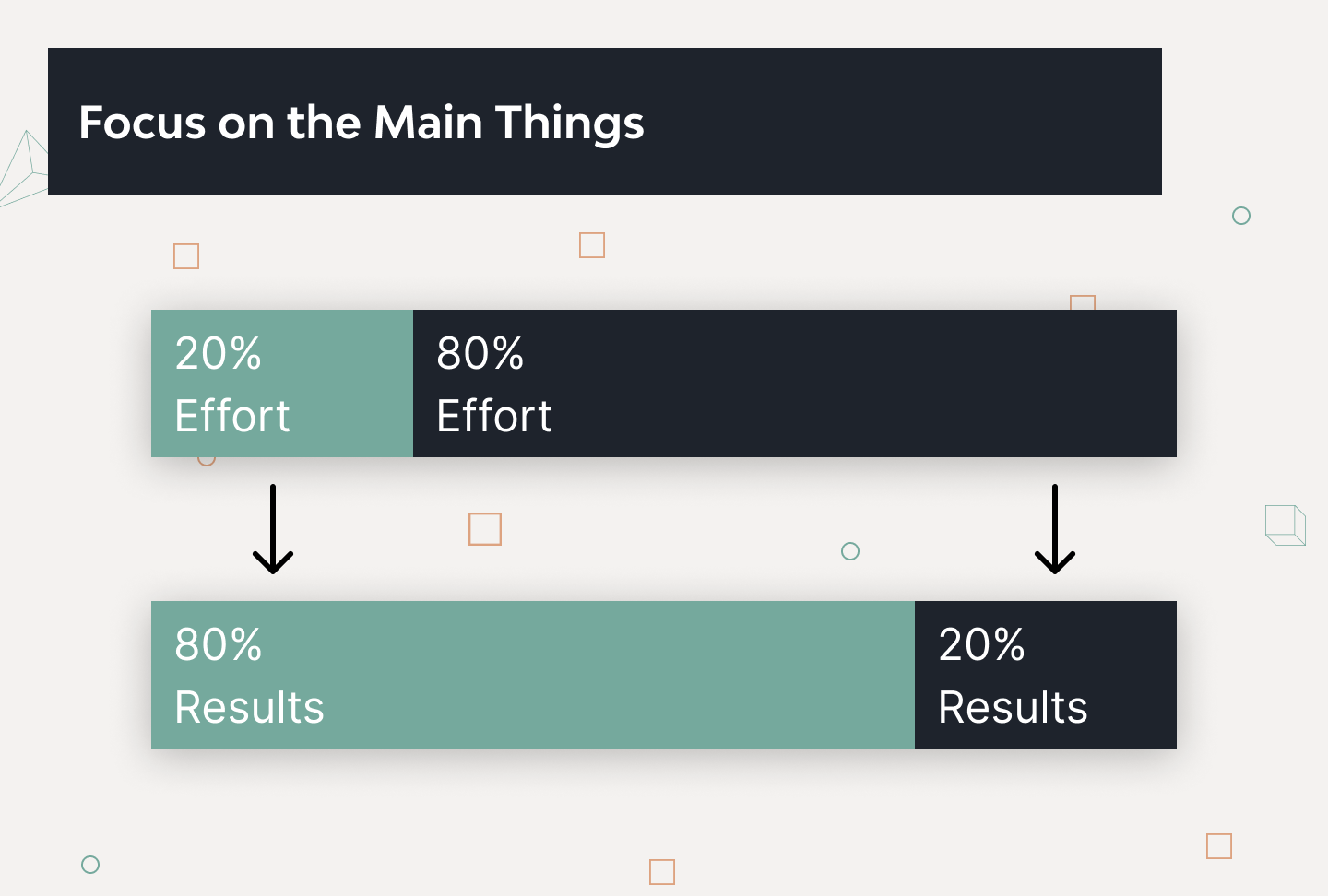
· 80/20 Rule
20% of the functionality and features in any environment will be responsible for 80% of the actions taken within that environment. This is Pareto principle as applied to any website, web app or software environment.
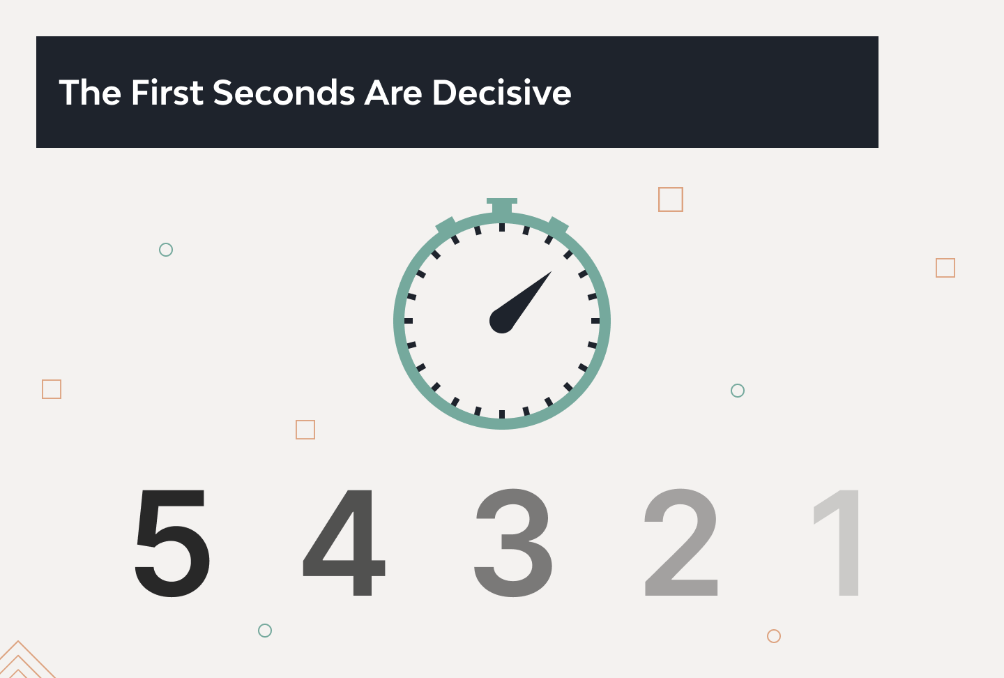
· 5-Second Test
A technique that involves showing users a single content page for a quick 5 seconds to gather their initial impressions. Users make important judgments in the first moments when they visit a page. It gives the team insight into essential information about the page.
· Gestalt Principles
People do not visually perceive items in isolation, but as part of a larger whole. These principles account for human tendencies towards similarity, proximity, continuity, and closure.
· 60-30-10 Rule
A timeless decorating rule that can help you put a color scheme together easily. To put it short, the 60% + 30% + 10% proportion is meant to give balance to the colors used in any space.
Design Activities and Deliverables
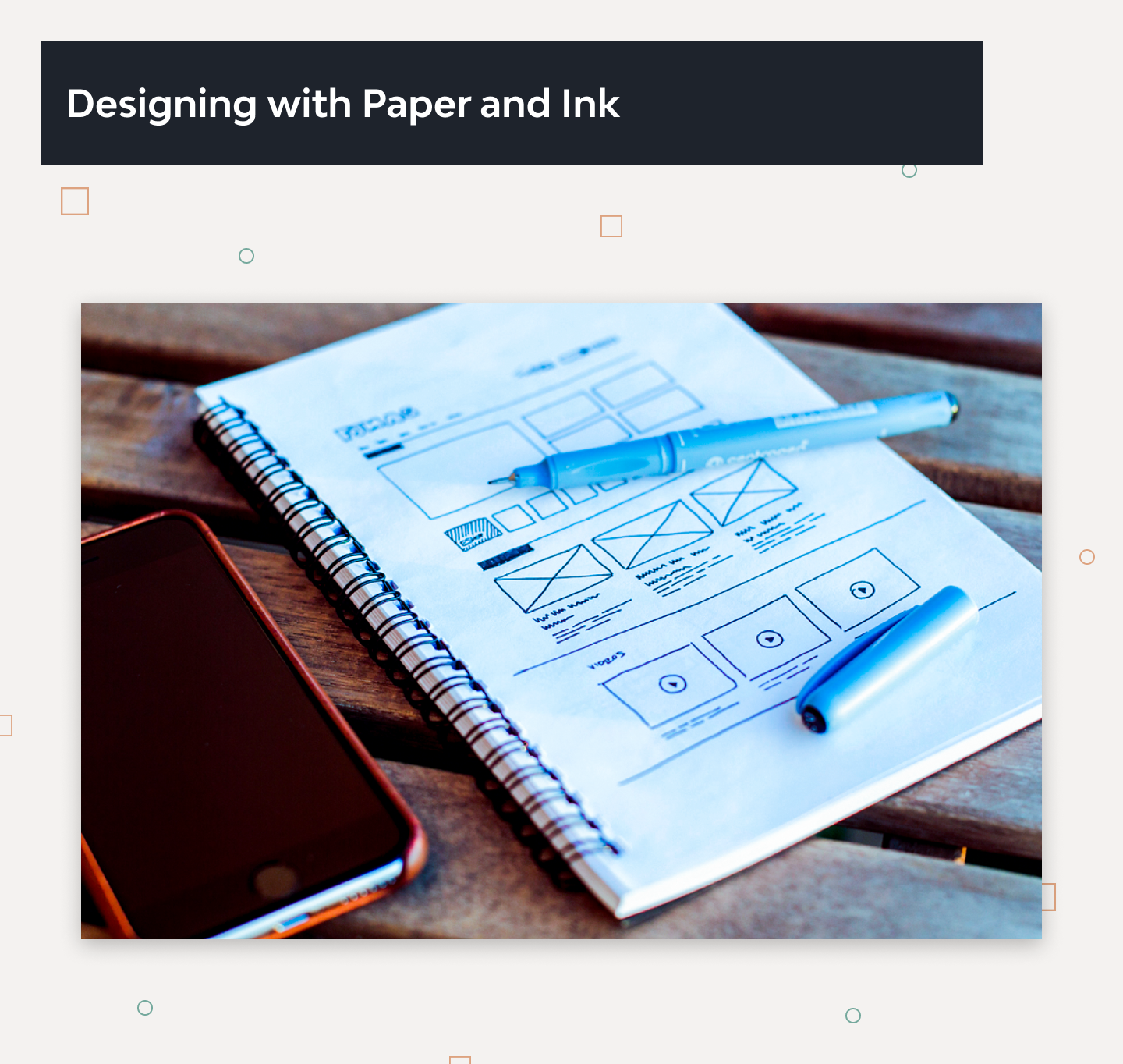
· Sketching
A drawing which designers use to propose, explore, refine and communicate ideas. As a UX designer, you too can use sketching as your first line of attack to crack a design problem.
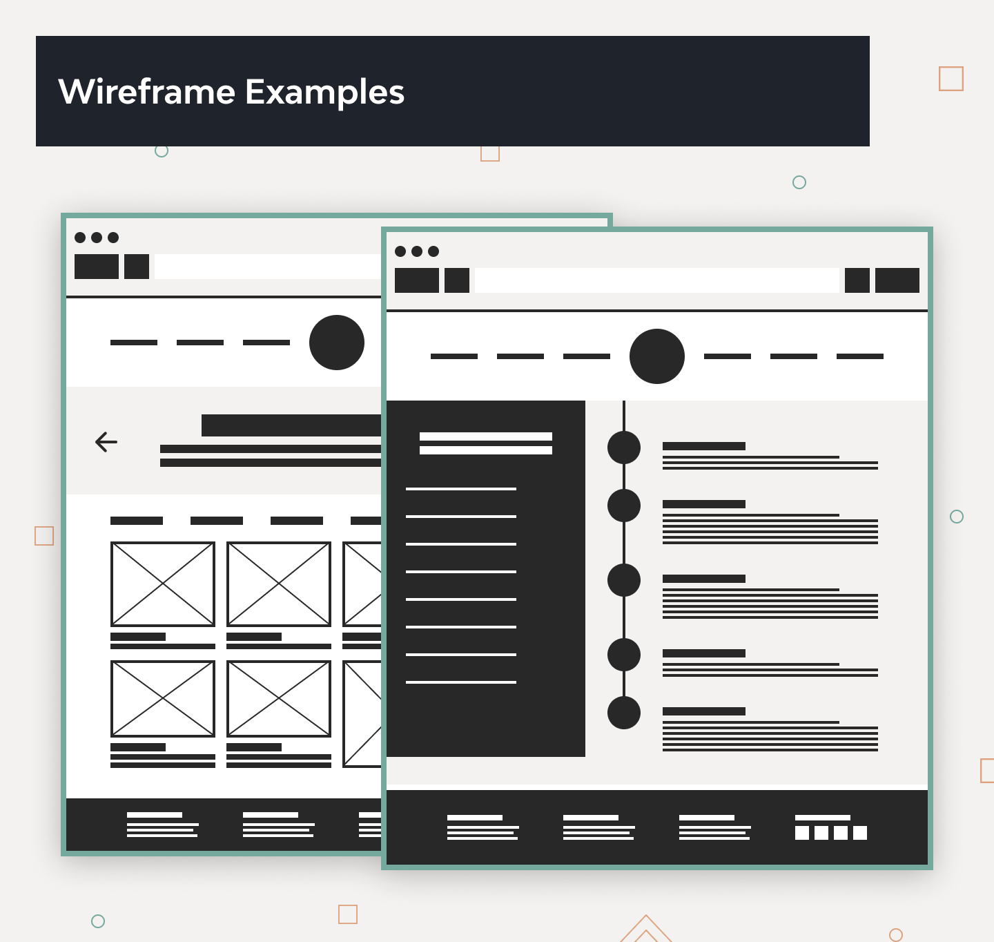
· Wireframe
A simplified sketch of the important information on a page. Also known as page architecture, page schematic, or a blueprint. Basically, it’s a skeleton of the design and should contain all the important UI elements of the final product.
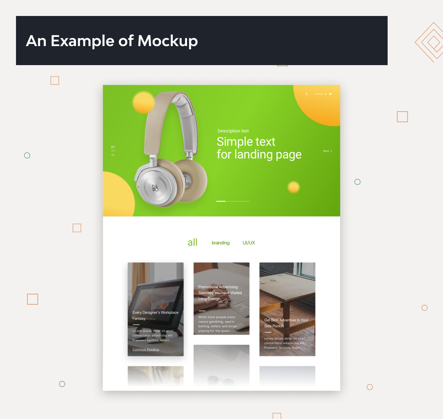
· Mockup
A medium or highly detailed static representation of the design. A good mockup demonstrates the information structure, content and basic functionality in static form. Moreover, mockups make it easy to perceive the idea of the final product, and the process of mockup creation is less time-consuming compared to prototypes.
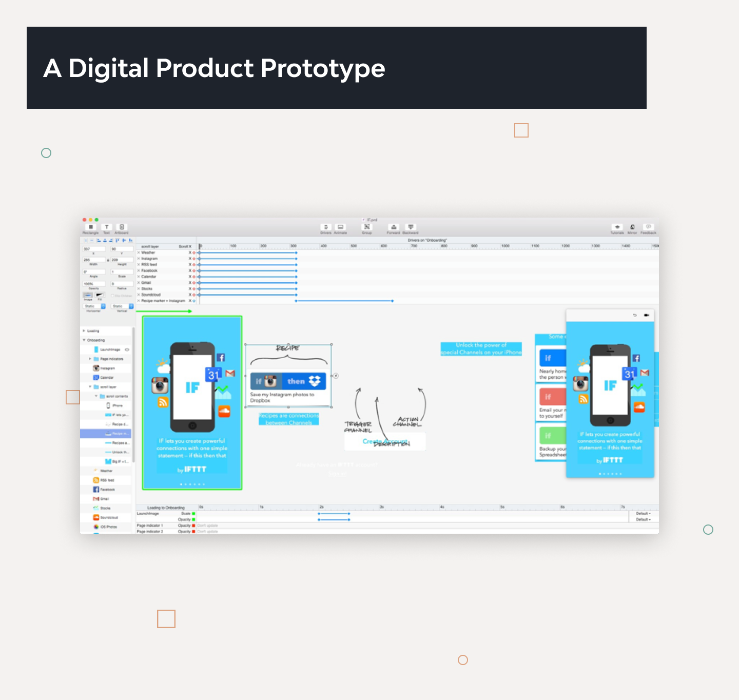
· Prototype
Often confused with a wireframe, a prototype is a medium or a highly detailed representation of the final product. It simulates user interaction with the interface and allows the user to rate the content and interface and test the primary options for communication with the app. Though, prototype may not look exactly like the final product, but it definitely should not be sketched in shades of gray. In addition, interactions must be modeled in a way that closely mimic the final product.
· Persona
The creation of a representative user based on available data and user interviews. Though the personal details of the persona may be fictional, the information used to create the user type is not.
· Customer Journey Map (CJM)
A tool companies use to see what their customers truly want. A customer journey map tells the story from initial contact through to engagement and the long-term relationship. It may focus on a particular part of the story, or give an overview of the entire user experience. It talks about the user’s feelings, motivations and questions for each of these touch points.
· Information Architecture (IA)
The organizing of information, including site hierarchies, web content, labeling schemes and navigation. IA makes it easy for people to find, understand and manage information.
· Mindmap
A diagram used to visually organize information. A mindmap is hierarchical and shows the relationships among the parts of the whole. It is often created around a single concept to which associated images, words and parts of words are added. Major ideas are connected directly to the central concept, and other ideas branch out from those.
· Card Sorting Method
The goal of card sorting is to understand how a typical user views a given set of items. Designers write items on individual paper cards, and then ask users to group together similar cards. Card sorting helps to create websites that are easy to navigate.
· Brand Book
An official corporate document that explains the brand’s identity and presents brand standards. Besides the design aspect, brand books may include a company overview and communication guidelines as well.
· UI Kit
A structured set of all interface elements that make up the UI of your site at any moment of interaction.
Practical UX Design Terms
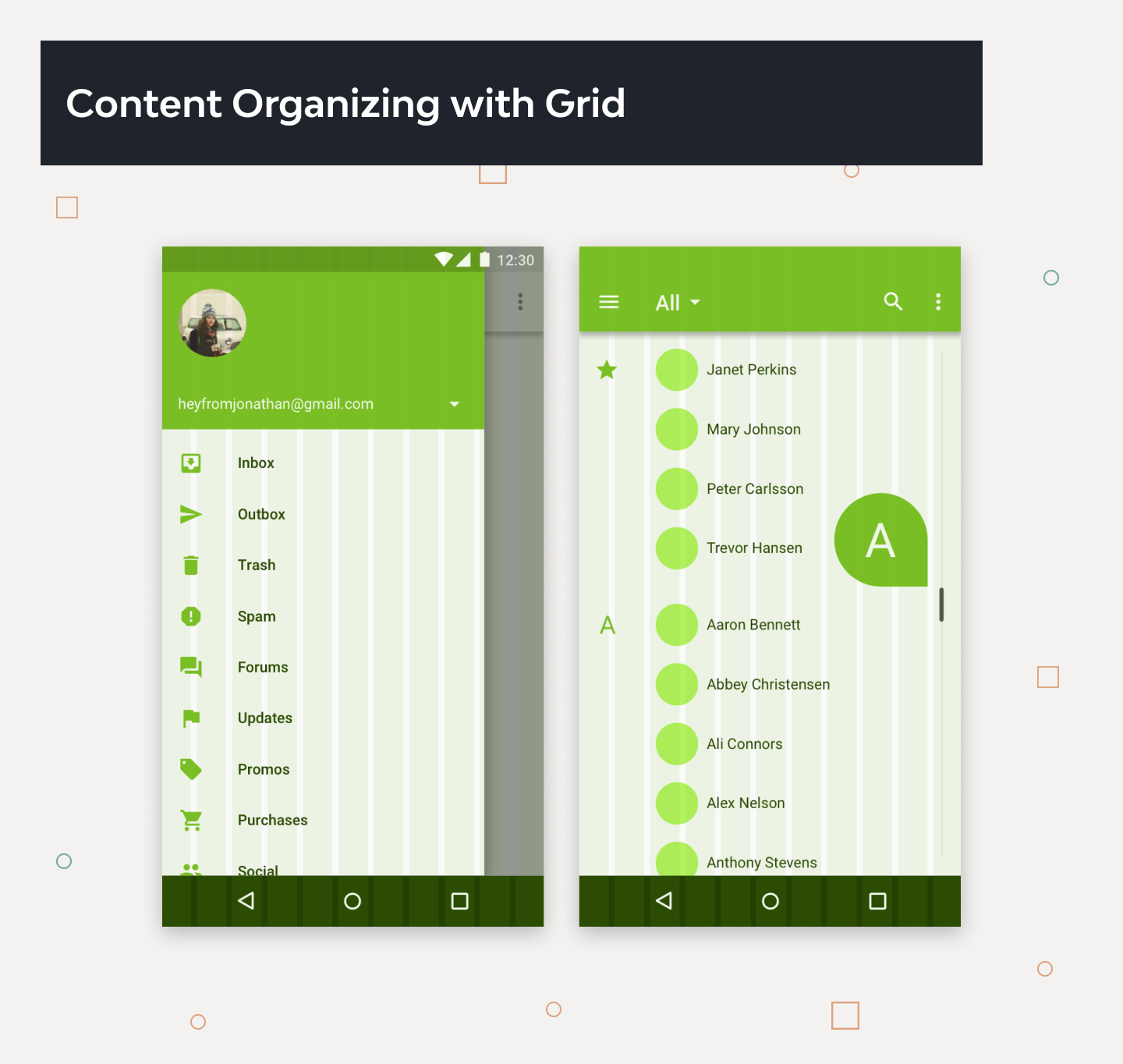
· Grid
A system of horizontal and vertical lines providing a structural basis for page layout and design. It communicates order, economy and consistency. The grid provides a common structure and flexibility for organizing content.
· A/B Testing
Determining which of two alternatives is preferred by the target audience.
· Micro-copy
The ubiquitous text that turns up in tiny chunks on a webpage or in an application when you need it. It can be the label on a field, a quick set of instructions on what button to push, etc. It’s the tiny text on which much of the product’s UX hinges. Micro-copy provides those just-in-time clear instructions.
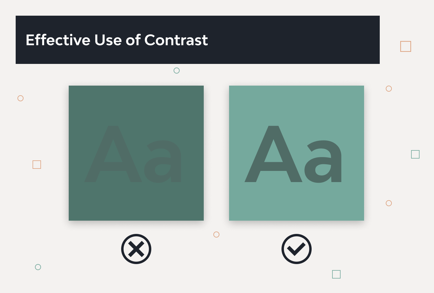
· Color Contrast
The difference between two colors. Black and white create the highest contrast possible. Colors can contrast in hue, value and saturation. You usually want a high contrast between text and its background color. But too high contrast between design elements might give an unsettled and messy impression. Effective use of contrast is the essential ingredient that makes the content accessible to every viewer.
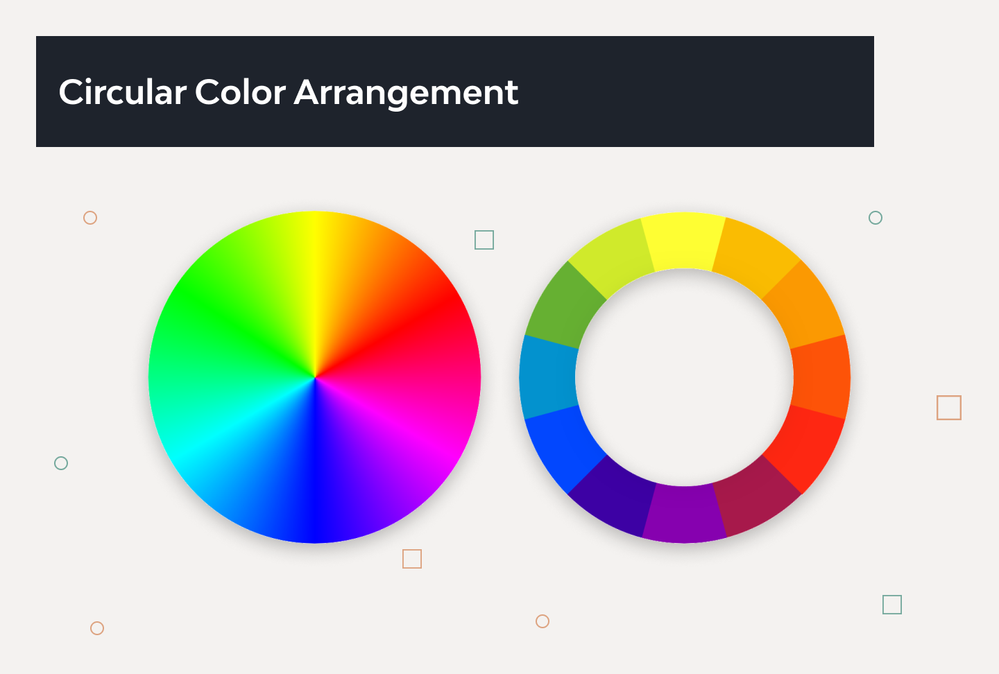
· Color Wheel
This circle shows the relationships between primary colors, secondary colors and tertiary colors. Artists and designers use red, yellow, and blue primaries arranged at three equally spaced points around their color wheel.
· Mobile First Approach
An interface design approach that focuses on creating a design first for mobile devices and then for devices with a larger display.
· Eye Tracking
Specialized hardware and software that tracks users’ point of vision on an interface. Namely, it tracks where users focus their visual attention while viewing an interface.
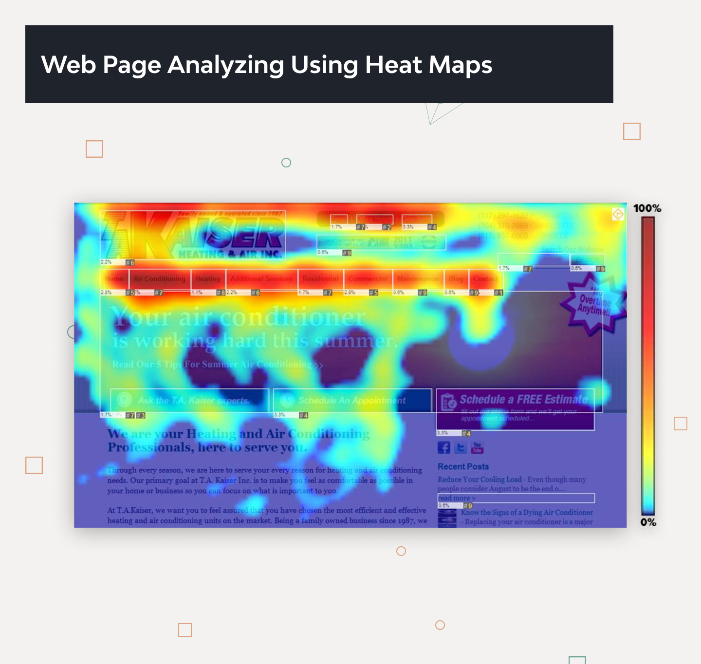
· Heat Maps
Color-based representations of areas of interest/focus points; generally associated with eye-tracking software.
· Web Analytics
The measurement, collection, and analysis of the internet to understand and optimize web usage.
· Dots Per Inch (DPI)
A way to measure the density of a print or video image. The number of differently colored dots that can fit into a one-inch space provides information about the resolution of an image. If an image is not of adequately high quality, it may not be able to be resized or printed without a loss of resolution.
· Onboarding
Designing a welcoming experience for new users by easing them into it. The design of the onboarding process for your site is usually limited to a first-time use scenario.
· Scalable Vector Graphics (SVG)
An imaging application and language written in XML. The SVG interface offers a solution to the problem of sharing many sophisticated Web-based images and animations.
· Vertical Rhythm
This concept originated from print typography. Vertical Rhythm keeps the vertical spaces between elements on a page consistent with each other. This is often done with the help of a baseline – a common denominator used to create the consistent spaces.
· User Scenarios
Hypothetical circumstances used to frame and prompt the user to follow or pursue a particular task path.
· Iconic Font
A font that contains symbols instead of letters. They can be styled with CSS in almost the same way as regular text.
· Breadcrumbs
Breadcrumbs are a navigation element that allows users to orient themselves within a Web site or move to one of the intermediate pages. It is usually placed near the top of the page (generally, right under the browser’s address bar). Actually, it allows users to find their way to the homepage.
· Call to Action (CTA)
For designers and content creators, the CTA is the word or phrase that stimulates users to interact with a product in the way it is designed for. CTA elements are the interactive controls such as buttons, tabs, or links that enable users to perform the expected action.
· Landing Page
It is the Web page a given user goes to after clicking a link, also known as the Target or Destination page.
· White or Negative Space
The use of blank (unmarked) space on a page to promote content and navigation. To be precise, when the products or pages have enough white space, it helps them feel uncluttered, elevates them, and makes them feel special. And it makes people want to take a closer look.
· User Engagement
It represents the purposeful choices a user makes with website content. Engagement is how people get value from the site. By the way, just recently we talked about what models of engagement exist in business.
How the Knowledge of UI/UX Terms Benefits You
Did you already add a few new UX words to your design vocabulary?
Those are just a few common usability terms used during a designer’s work process. Now you have a bit more muscle to flex. In addition, the UI/UX Glossary For Designers provides a great opportunity to translate design jargon. If you’re going to use words like “mockup” and “breadcrumbs”, at least take a few minutes to define those terms for your colleagues. Start building that common language.
When you work with a client, prepare to continue describing your design ideas in plain language. Through a slow process of education and mutual trust, your clients will grow to understand your UX terminology. This will make it easier for them to be involved in the design process in the future.
When British Rail wanted to develop a new design for their InterCity trains, they invited a number of leading designers to submit proposals. The winners were Seymour/Powell, who at that time had no previous experience in train design. They simply explained to British Rail that their design would once again make children want to become train drivers, as in early times. Such a description must have triggered childhood memories in the minds of some senior British Rail executives. So a picture is worth a thousand words – but not always.
Would you like to use the services of a reliable software vendor with developers and UX/UI designers who have participated in more than 120 projects? Give a boost to your project by contacting Django Stars.
- Can UI/UX designers call the same terms with different words?
- Yes, UI/UX designers can use different words to refer to the same concept or element. This can be due to the fact that the field of UI/UX design is constantly evolving and new terms are being coined and adopted. Additionally, different designers may have different backgrounds and may have been exposed to different terminology. It is important for designers to clearly communicate and define the terms they use so that everyone is on the same page and there is no confusion.
- How do communication and UI/UX design terms affect the project design process?
- They have a significant impact on the project design process. Clear communication is essential for ensuring that everyone involved in the project is on the same page and understands what is expected. This helps to set up a smooth design process and get a consistent final product that meets user needs. Misunderstandings and confusion can slow down the process and lead to errors. Properly defined and communicated terms also help ensure alignment among the business side and the software vendor's team and a better feedback and review process.
- What UI and UX terms are most often used in project design?
Some common UI (User Interface) and UX (User Experience) terms that are often used in project design include:
- Wireframe
- Mockup
- Prototype
- User Interface (UI), or Graphical User Interface (GUI)
- Call to Action (CTA)
- Responsive Web Design (RWD)
- Brand Book
- A/B Testing
- Grid
These are just some of the terms explained in this article. However, the specific terms used may vary depending on the project and design team.
- What mistakes are made in design communication?
If in communication with designers you don’t tell them that something must be changed, they won’t know what’s bothering you. Take time to carefully look at the first draft your designer hands you. Make a list of the corrections you would like to see, and recall all of them at the followup meeting.
"I like it / I do not like it"
Phrases like “I do not like it” or “This looks weird” are frustrating for a designer to hear. Without describing exactly what you find weird, saying things like this doesn’t help the designer solve the problem.
Feedback needs to be as specific as possible. Explain how you would like the product to look and feel. Point to specific elements, styles, fonts, color palettes or layouts. Provide the designer with a few samples of designs you like.
"Can you move that button up and to the left? And make it smaller?"
Second-guessing and dictating to designers how they should do their job diminishes their trust. Designers can’t read your mind, so don’t expect them to have paranormal abilities. Your job as the client is to define the problem, but not to manage web designer. The designer’s job is to find the solution. Avoid giving too many detailed instructions. Instead, tell the designer what issue you or your audience might have, and trust the designer to fix it.
Remain open to the designer’s ideas, even if they don’t align with your vision. Allow the designer to use his or her brain.
Approach your relationship with your graphic designer with discretion and tact. For example, when talking about changing a font, don’t point to your designer’s work and say, “This typeface is kitschy.” Rather, say, “I would like to try a different font here.” Then specify the next step you’d like to take.
- How to prevent communication gaps with designers?
The following tips can help:
- Ask Simple Questions to Understand the Problem. Give feedback early and often. Asking designers about issues saves them time and results in a better project, as elements don’t have to be altered at the last minute.
- Ask More Questions. It’s easy to blame an unsatisfying final product on the designer. Instead, give the designers all the tools they need to succeed. Your job as the client is to help the designer understand exactly your idea and goals of the product. It’s up to the client to ask more questions to facilitate effective communication.
- Answer Your Designer’s Questions Without Delay. Try to provide all the necessary information requested by the designer on time. Explain the message you want to convey. Give an overview of your business or product. Remember that your procrastination slows down the design process.
- How to manage a graphic designer with good feedback?
Try asking the designer what they would suggest. Here are some examples of how to ask a designer for their professional opinion:
- “What can we do to deal with that?”
- “What do you think will be the most effective solution for our company?”
- “In your professional opinion, which one do you suppose will resonate more with our audience, and why?”
- “Are you able to render that a bit more to make it clearer?”
- “We would like more emphasis on the logo. It seems to be getting lost at the moment.”
- “I’m worried that people won’t see the button. What would you recommend to make it more prominent?”
- “Can you explain the distinction between RGB and CMYK again?”
- “This is a smart start. Yet I’m worried that this appearance resembles some of my competitors’ visuals. Is it possible to differentiate ourselves better?”
- “The font you used is a nice choice. It’s very clear and will charm our younger audience.”
It’s not uncommon for designers to feel as if they are being micromanaged, especially if the client provides too many details about the design. When a designer works with too many demands, the ultimate product looks like it was created by checking off boxes on a checklist. Be flexible, grasp what’s necessary for your product and what isn’t, then let your designer use their skills to create your vision.
Hire experienced developers to build your next project with Django Stars


Всего комментариев: 0