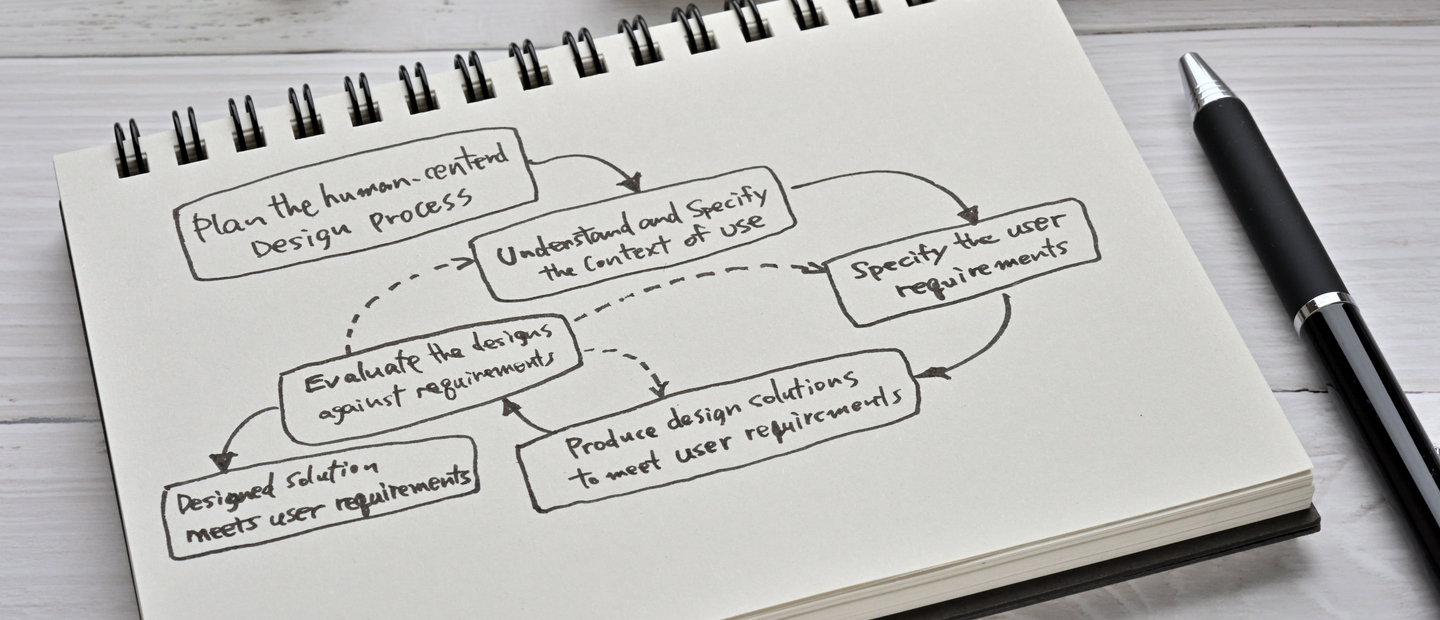
10 Things to Remember When Designing your App’s UX

A certain number of UX guidelines apply to both mobile and desktop apps, such as the general requirements for convenience, functionality and content highlighting. But don’t be fooled by these similarities. The number of moments you can miss relying on this part is more than likely to make your app fail. Make no mistake: the first thing that differentiates a good app from a bad one is the user experience. After all, the happier the users, the more popular the app.
A modern human being spends five hours a day on average using mobile gadgets. Among other things, this means that users are exposed to a colossal stream of information, and you have just a few seconds to catch their attention.
Listen to “10 Things to Remember When Designing your App’s UX” on Spreaker.
That’s why the requirements are so high for modern UX. To help you meet them, here’s a checklist of tips that will help you design the best UX possible.
1. User Research
It’s not uncommon for teams providing a web development service to skip this step in the initial stage of the project development as a cost-cutting solution, assuming that its results are obvious. But it’s a huge mistake known as the false-consensus effect, which originates in the biased experience of the developers and designers. If you want to create a product that your users will appreciate, you need to know who they are and what they (not you!) expect from your future app.
User research can be conducted in a variety of ways. Here is a short list of steps that can help you achieve a proper result:
- Analyze competitive apps and apps with similar feature sets. Define typical user groups and their typical behaviors.
- Build User Personas. This is a stage when UX designers create personal profiles of real users in the greatest possible detail. It’s important to realize that you should start not from the app’s features and the strict patterns they define, but from real-world user behavior, which may not be obvious. By adding secondary details to your user personas’ profiles (such as their budgets, technical skills, professions) you can build much more accurate portraits.
- Contextual Inquiry. Consult with 5 or 6 specific members of different user groups to survey their experience with similar apps, as well as their demands and expectations for your future product. During this inquiry, pay attention to the conditions around the most and least satisfying experience with the app. It will help emphasize the product’s strengths and minimize its weaknesses in future development.
- Concept-testing. When you have a prototype (or parts of it), test it on users from different groups. It will help you make necessary changes to the UX or product architecture before development begins. You don’t need a finished or realistic product for this part — you only need to test its key features and scenarios. You can do this online or in person, using boards and stickers.
The more detailed your user research is, the more successful your UX will be. In reality, deep user research involving all of these steps isn’t always possible. But completing several or even one step from this list is better than nothing.
2. Using iOS and Android Guides
When developing an app (and especially its navigation) you need to factor in the platform you develop it for. But more importantly, you should consider the fact that platforms’ requirements change with every new version. Here are the latest iOS and Android UX guides to help you stay up to date.
Remember that the differences between the platforms your app is used on doesn’t divide your users into essentially different groups. When trying to keep up with the platform’s requirements, don’t ignore human-centered solutions in favor of following the guidelines. When you skip the “iOS user” and “Android user” cliches and think about the comfort of the person with a smartphone that uses your app, you realize there are more uniting than dividing factors – such as navigation that can be easily tapped with a thumb, finger-size tap targets, a universal checkbox, pin and arrow behavior, and other details we will discuss later on.
3. Eliminate Clutter
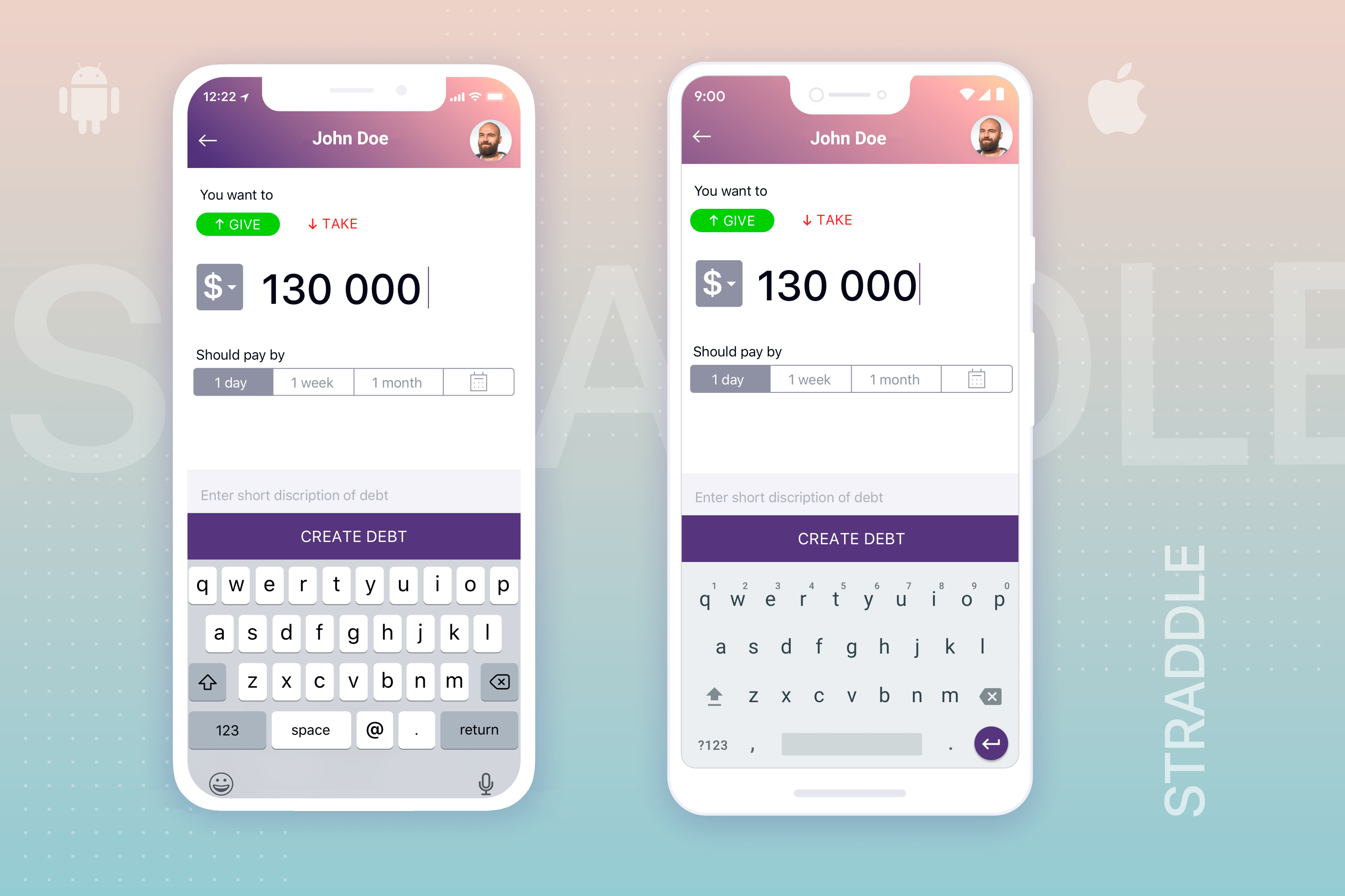
The more time a user wastes to separate useful information from chaos on the screen, the less satisfied he is. The “computing capacity” of a human brain needed to solve a problem (in this case, the problem of how to understand an app) is called the cognitive load. Minimize it!
Clutter is annoying on any app or website. But a mobile app’s limited space means that every needless button, link, or bit of text is one too many. The only thing the user should see on the screen of your app is the thing he needs at that exact moment. Here is a helpful UX design checklist to make sure that will always happen:
- Use dropdown blocks that allow the user to see more options and information after tapping.
- Default reuse of previously inputted data allows users to reduce the number of required inputs.
- Prioritize structure and the visual weight of the elements. Arrange information according to fixed levels of importance, and give it a corresponding visual weight, from high to low. Depending on your UI, this can be done through font size and weight, block colors, etc.
- Stick to the principles of visual and functional coordination. The layout of recurrent functional elements should be unified for the whole app.
- Leave tips in spots where the user might feel confused. But don’t overload the screen with them.
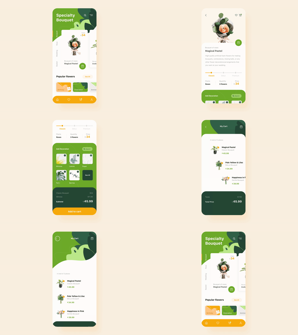
Source: Dribbble / by Taras Migulko
4. Provide Feedback
For a user, nothing makes operating an application harder than not knowing what they need to do or what will happen after they take an action. For user experience to be successful, an app should communicate with the user person in clear, straightforward language and give him status information exactly when he needs it.
Unfortunately, you can’t design a hover effect on a mobile device. All you have is a tap that the element does or doesn’t react to. Your job is to use proper positioning, style, and short instructive texts to show what will happen after the user taps one element or another.
Other important parts of app feedback are dialog boxes and error messages. In the case of the latter, self-descriptiveness is crucial: the error itself is a stress for a user, so don’t make him even more confused. Make it clear to him what happened and how to handle this situation.
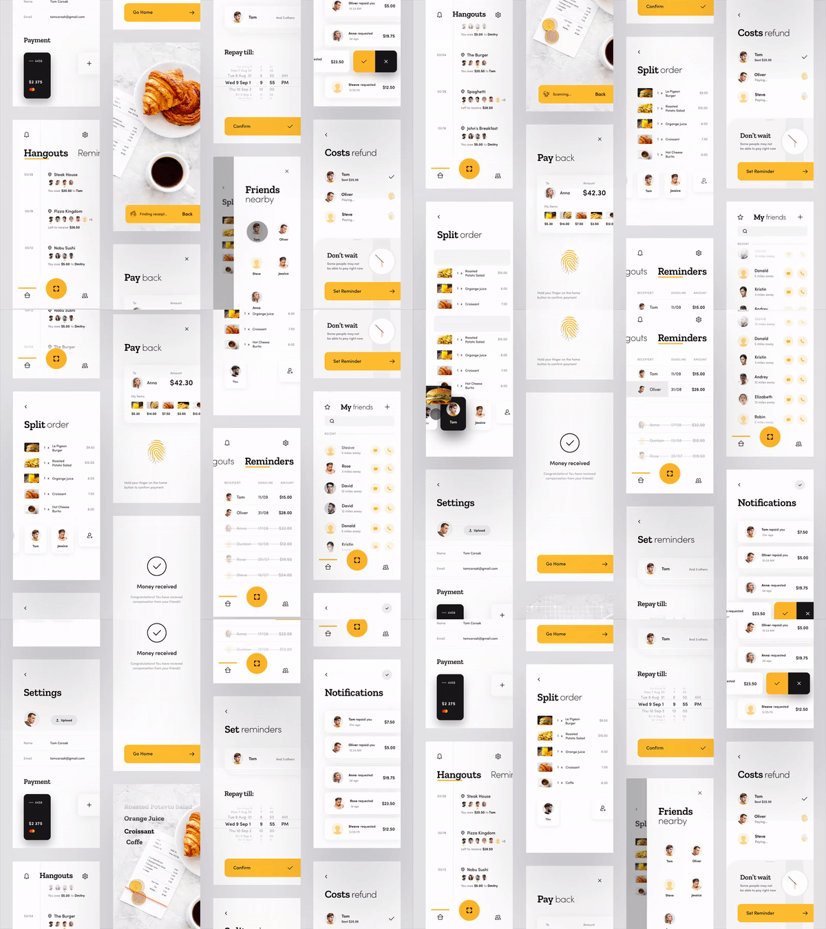
Source: Dribbble / by Den Klenkov for Fireart Studio
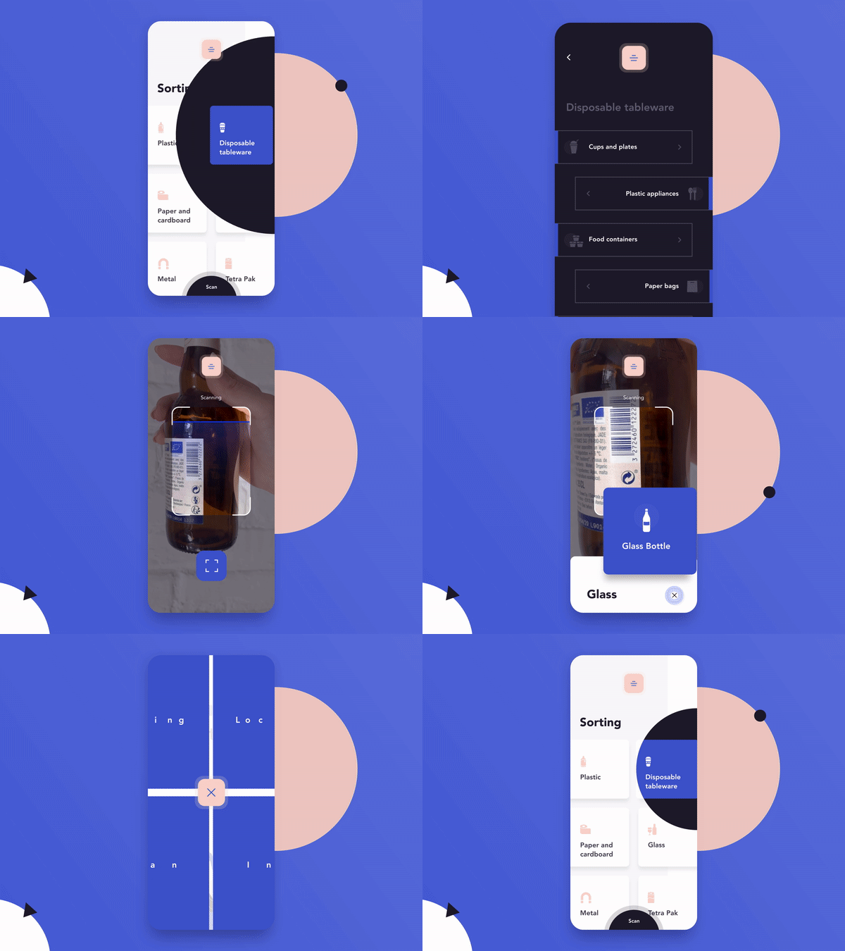
5. Take Advantage of the Device’s Capabilities
If we consider a mobile gadget as a minimized version of a desktop one, certain obstructions limit your opportunities to create a unique and outstanding application. But try to move beyond the “mobile-first” approach and use the perks of a mobile device that a desktop lacks. Include these features in your UX project checklist:
- Push messages. When relevant personalized information from an app appears as a notification, it’s harder to miss. On the other hand, don’t overdo it, because 32% of users quit working with an app that sends more than 5 push notifications a week.
- Voice activation. The screen and its elements are no longer the only forms of interaction between a person and his smartphone. Add a voice interface to make your app even more usable.
- Geolocation. This helps personalize results displayed on the screen and eliminates the need to input the user’s address manually. In turn, geolocation testing ensures accurate detection of the user’s location, further enhancing the user experience by providing relevant information tailored to their geographic location.
- Accelerometer. This is a popular tool for mobile games. The smartphone reacts to its position in space, which defines the behavior of elements in the app. This expands its use beyond the game field — for example, for 3Dobject viewing.
- Camera. This helps release users from unnecessary manual data input (when they can be scanned) and opens up new opportunities to implement AR tools, which are gaining in popularity.
- Biometric data. Face and fingerprint recognition technologies have already replaced clumsy start screens that ask for passwords.
Depending on your app’s purpose and focus, you can use various combinations of these smartphone features to help users see your product as something irreplaceable and unique.
At the same time, don’t ignore the general principles of design for touch. The size of the clickable elements and the space between them should be comfortable for tapping and stay the same on all of the different smartphone screens (including the smallest ones). Aside from that, the screens of different devices have different sizes for the thumb zone (the area where you can drag your thumb comfortably). Consider this when positioning the elements on the screen. Here you can find the design-for-touch guidelines, supported by statistics.
There is one general principle underlying all these rules: use the device features, and let your app become something more than a website for a phone.
Read more: Cost to build a messaging app.
Source: Dribbble
6. Navigation Tips
Easy-to-use navigation is probably the biggest UX challenge. The functionality packed in your app must be easy to find and use. The fewer taps the user needs to perform to achieve the goal, the better your UX/UI design. Sure, to achieve this you need to understand your specific target audience and what navigation pattern is more natural for it. But it’s even better if your navigation is made of universal and standard components, so no one needs explanations at all.
Speaking of informational architecture – and, more specifically, the choice between flat and deep navigation for a mobile device – flat solutions are the obvious priority (at least, all the parts coupled with the main functionality). A user won’t be happy searching for necessary tools in the tree-like structure and constantly having to tap the “back” button.
Since the majority of navigation elements remain hidden in working order, make sure the user can always know where he is in the app. Aside from the obvious labels, a step-by-step structure and path display are useful here. At the same time, navigation shouldn’t distract from the content and clickable functional elements.
Make sure your navigation is visible at all times and stays in the same place on different screens. This will lend a sense of reliability and clarity, and decrease the user’s cognitive load.
Read more: How to build a location-based application including backend
7. Interactive Elements
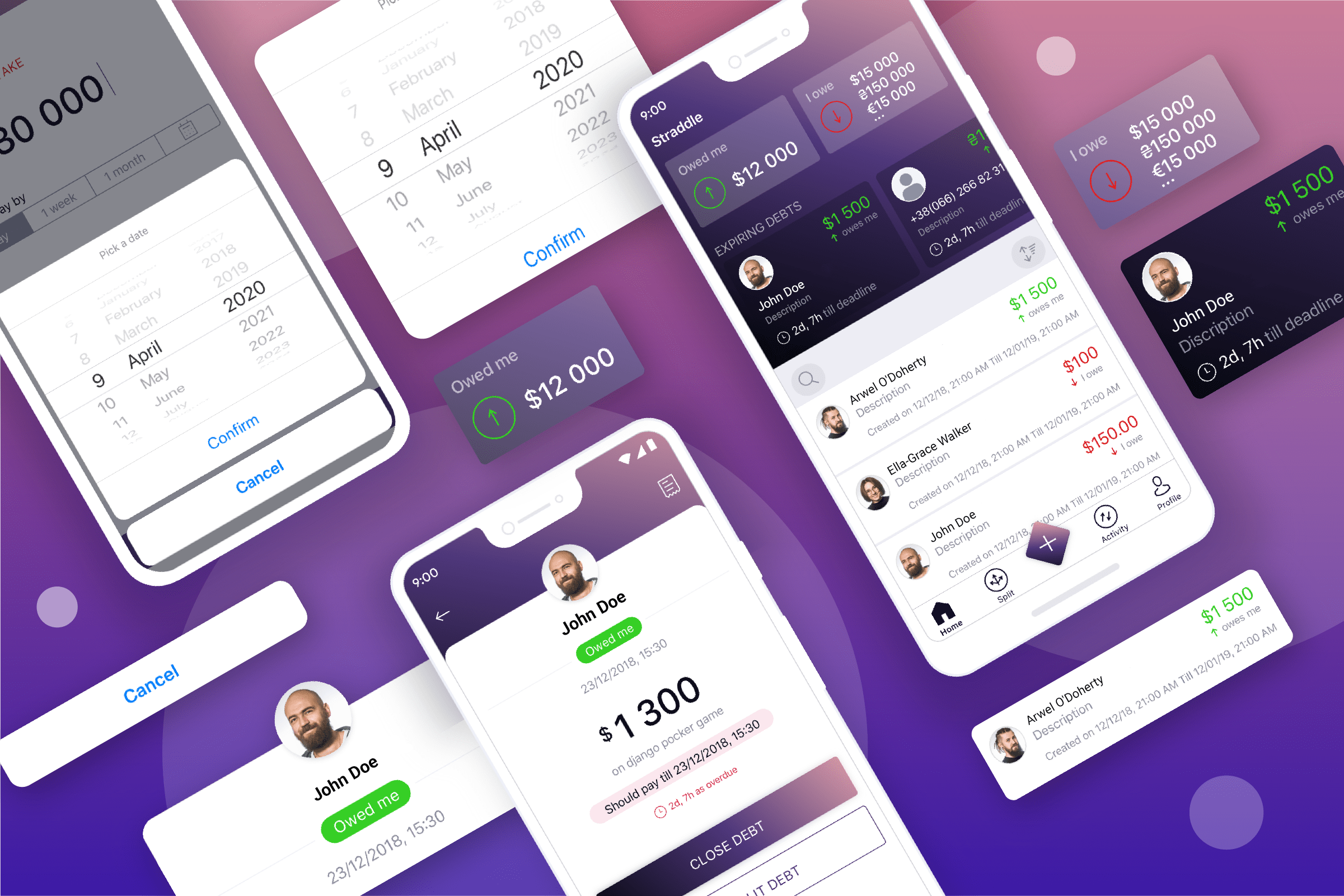
Almost every interaction between a man and a device comes down to the user giving a command (tapping on a button, data input, etc.) and the program reacting to this action. Whatever your app is, interaction is its basic essence. Your goal is to make each one of these two steps easy and clear so users won’t encounter any problems.
All of the interactive elements should stand out from the other content and be predictable, so the user can understand how to perform an action he needs (“give a command”). Clear labels and proper UI can help with that.
Feedback on interactions tells the user that the reaction to his action happened. Avoid empty screens and static buttons, which can make the user think the app isn’t working properly. Highlighting by tapping, load and progress bars, and other informative animated effects are always good solutions.
8. Loading
Let’s focus a little more on the screen loading process, or the wait time while an action is underway. Modern users have become accustomed to applications loading content instantly. If their wait lasts longer than a few seconds, users get impatient and might even quit the app. But sometimes a wait is unavoidable — for example, during the execution of transactions, or when there is low-speed internet. In this case, your goal is to make these miserable seconds less frustrating for the user. Here is a convenient mobile app UX checklist to address this issue:
- Main screen first. Make sure your main screen (the one with the most important information) displays immediately, while information that will become available after the scroll keeps loading. In this case, users might even remain unaware that content is still loading. But try to avoid static load screens that lack functional elements — this UX practice is outdated, as it doesn’t align with the principles of human-centered design.
- When you can’t avoid the load screen, make it obvious that the load is underway. An empty screen or an unchanging previous screen makes you think there’s something wrong with the app. Use loaders and load bars.
- If a loader is animated and looks interesting, it will keep the user’s attention for a few extra seconds of waiting. At the same time, you should still follow the principles of simplicity and minimalism – in some cases, users might see this loader often enough for it to become annoying.
- A skeleton screen is the screen of a loading page during an update of data. As opposed to the usual loader, this creates a sense that the page is already loaded and the data update is imminent. Plus, the image of an already filled page will hold the user’s attention better, since it will include a large number of different elements.
Read More: The Best Practices for Mobile App Design

Source: Dribbble / by Ion Shipilov
9. Search Recommendations
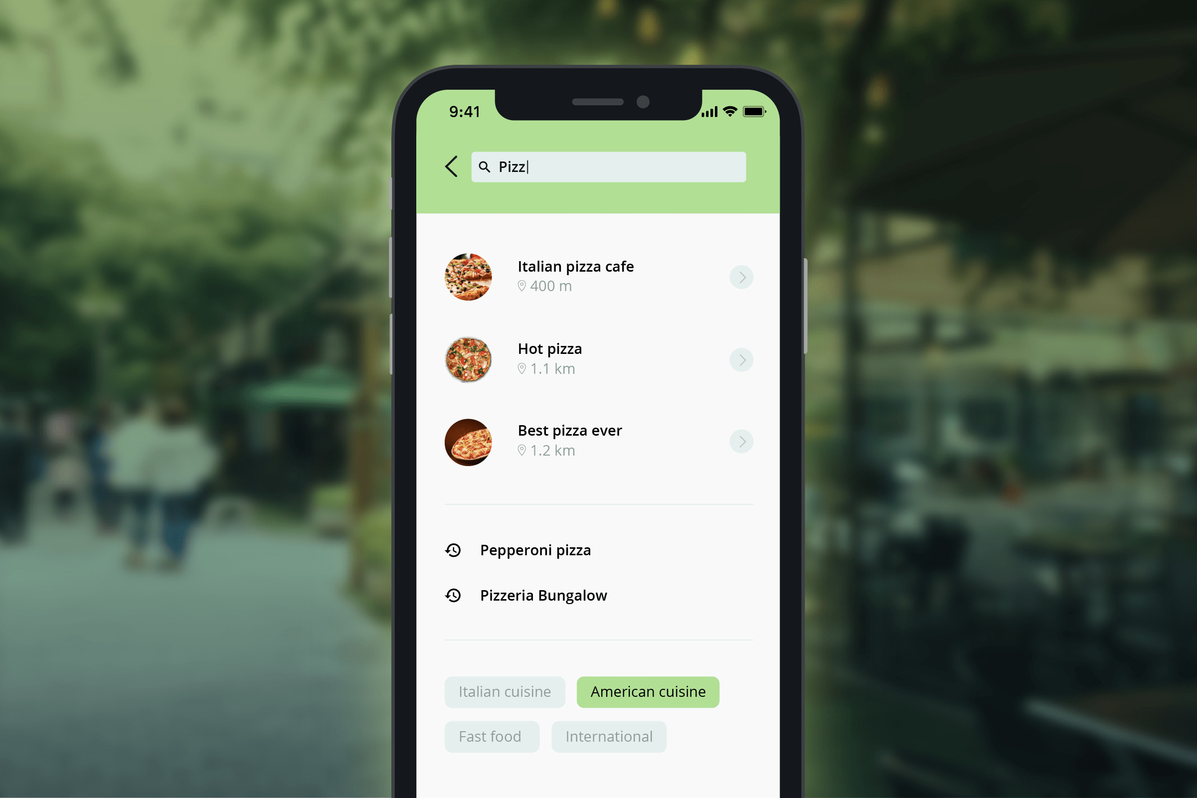
Most apps include a search bar, and sometimes it is even their main functional tool (e.g., in internet shops, music apps, services and delivery searches). Use this UX checklist to make sure the search process in your mobile app is flawless:
- Use a full-sized search bar if you can. Yes, you can save screen space by input extending after icon tapping, but this forces the user to take an extra step every time. Even more, a noticeable and recognizable search bar will always help a user if he gets confused.
- Give default options. There’s almost no need to type a thing if a list of popular requests appears after the user taps his initial input.
- Use auto-suggestions. If the previous step didn’t work in a specific user’s scenario, auto-suggestions can help minimize the input.
- Memorize recent searches. People often search for something they’ve already searched for. Quick input of previous requests can simplify the job in the future.
- Categorize results. Displaying search results by category in the form of tabs can help the user find what he needs faster.
- Suggest alternatives when there are no search results. An empty page of search results shouldn’t be a dead-end and make the user think his problem has no solution. Offer him alternatives in the form of closest results or results with a similar spelling.
10. Test Your Design
Even the best UX won’t escape minor flaws without proper testing. But it’s easy to catch and correct them by following this universal UX testing checklist.
Test your product on different kinds of devices, including tablets on different platforms and smartphones with various screens. There is an extensive list of recommendations regarding user testing. Its main point is to divide the testing process into many stages, start as early as possible (which can save you time and budget on making changes), and conduct tests with different groups of people. One of the most helpful stages here is testing on real users — for example, on users who took part in user research or similar members of the same categories.
Conclusion
Every year, the mobile applications market offers up exciting new tools and technologies. As this happens, UX trends are becoming more and more focused on the availability and simplification of the interactions between the user and an app. To create a high-demand product in these conditions, you need to understand the user needs your app fulfills and what basic functions it should include. To do that, use the above recommendations to help you figure out which UX elements your app needs to succeed and stand out from the pack.


