Top 6 UI/UX Design Cases for LegalTech Projects

In the age of the customer, a product is always designed with the user’s goals, problems, and expectations in mind. The look of the product and its functionality never exist on their own. They’re always based on the target audience’s needs.
But what about industry-specific products that handle large volumes of specialized data? Their users are usually advanced professionals whose pain points and requests can be difficult to analyze at the start of the project. In this case, designers must thoroughly study these specialists’ needs and goals.
However, this is not always as difficult as it might seem. Even complicated products have common UX/UI design rules that can be applied in most cases. When checking out the Django Stars case studies, you may trace this in different industries – whether it’s fintech, travel, healthcare, or e-commerce. With experience, you notice more.
Read Also: UI/UX Design Trends
When working on a legal-tech solution, I discovered six of them, which I’ll share with you in this article. Let’s begin.
Case 1. Complex heterogeneous tables vs modular tree structure. What’s the best way to represent your data?
When designing for legal tech, we paid attention to the presentation of data and how to do it correctly. The project’s information architecture comprised a list of sections in the form of tables. Each table had its own second- and third-order sub-sections that usually contained information strings. Sometimes, these strings opened in the second-order subsections only or weren’t linked to any subsections at all. In addition, the cell with each query description had a different number of words, from 3 to 30.
Things were similarly complicated in the data cells. The string entities contained numbers in one-third of the cells. Sometimes, these numbers could consist of 80 to 100 symbols. As you can imagine, the project structure was over complicated and not systematized. Except for the UI, the structure confused the users with a complicated flow of data, most of which they didn’t need.
I came up with the solution to create a modular tree structure for each section block. The endpoint of the customer journey was the former table “string”, which is now included in the card. Now, the cards either belong to the second- or third-order sub-sections or can be opened from within the entity with their name. As a result, the user can easily find any information they need by navigating inside the systematized “tree” or via a search query.
This solution also allows more necessary information to be placed on the card. A set of data on the page (that was hidden in the link in the table string) is now easily transmitted to the card, so the user can immediately see it without any extra clicks. I also used additional colors inside the card to draw the user’s eye to the most important elements.
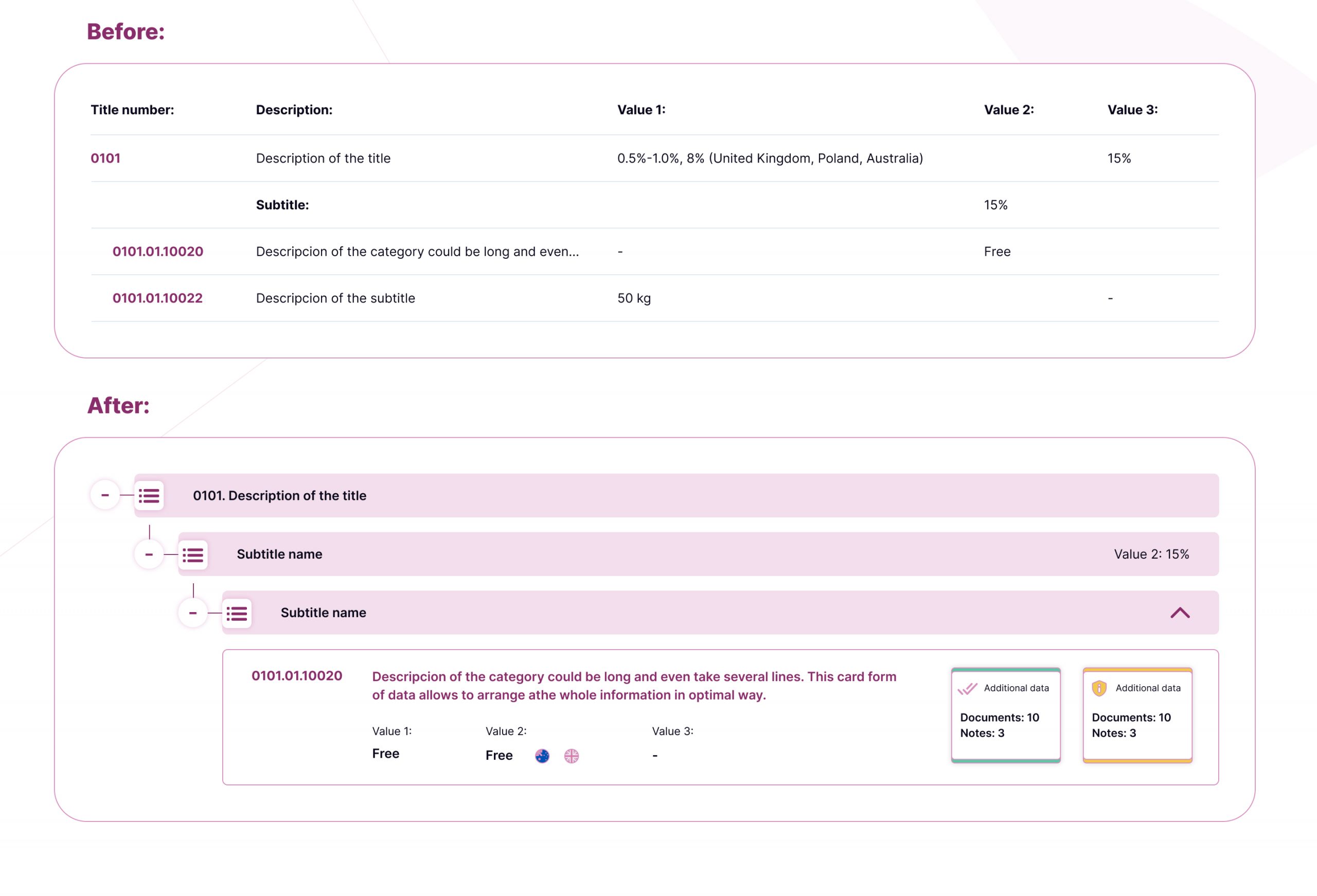
One crucial function of the project to aggregate a large number of diverse documents (laws, acts, international agreements, tax quotas, court decisions, etc.) in one structure. Here’s how you can display such information by data type and section. As you can see, this is very important when you do UI/UX for legal tech.
Case 2. How to display information by type and sections without losing data
Before creating this product, specialists had to collect all the data from different sources, analyze them, and issue the decisions to the clients. The main purpose of the product was to collect in one place all the necessary documents relating to one case and easily track any updates. The main challenge was to create a general interface containing all the required information and would not overload users.
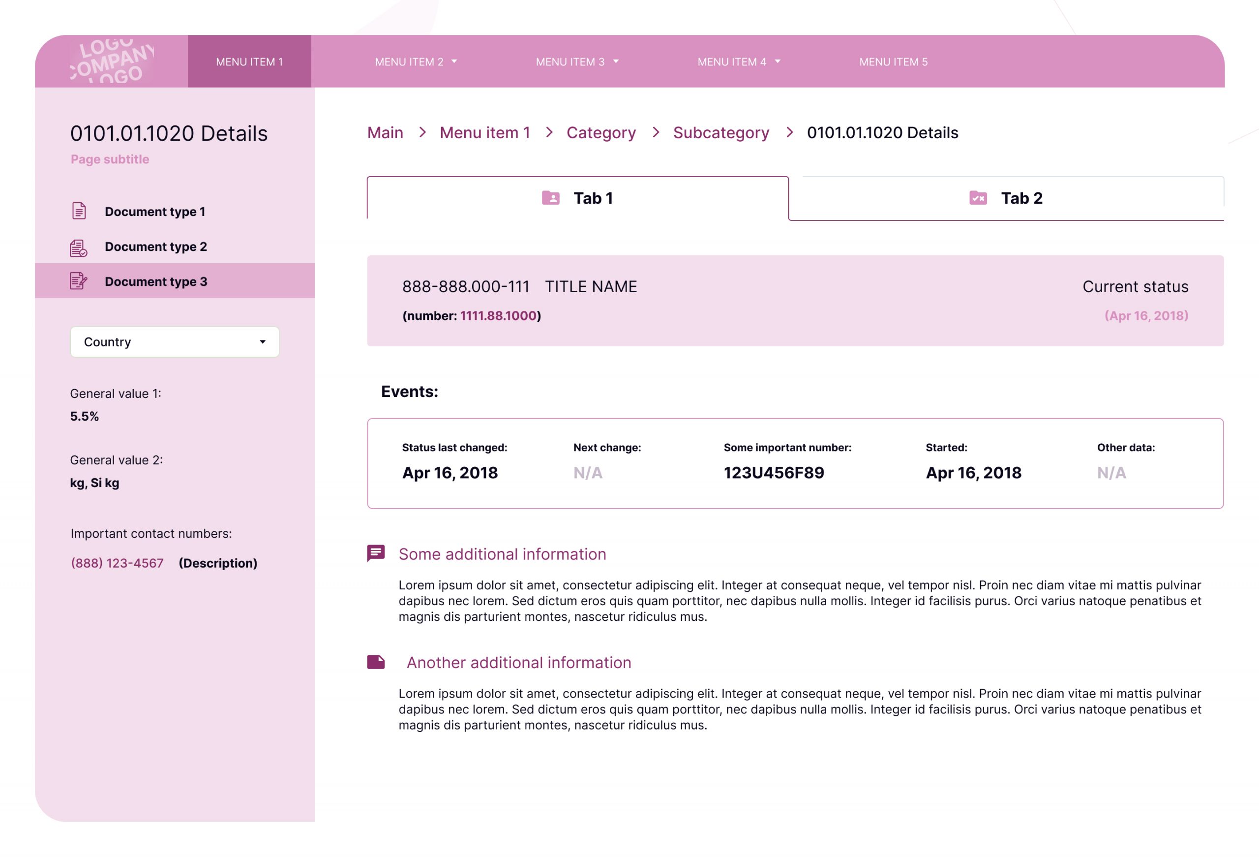
First, I decided to sort all the documents by their types in the navigational menu on the left. This decreased the maximum page width, but this wasn’t critical. The interaction with the side menu was standard: after choosing an item, the user sees all the information about it on the main part of the page.
However, this was only the beginning of the design of legal software. The next task was to group the information by sections inside the document types. I hadn’t found any reliable ready-made solutions for this, so I created several prototypes and passed it to the focus group of specialists who would be using the product. The lawyers had to choose between 3 variants: a tab menu, an accordion menu, and button links. Each of these variants had its pros and cons.
- Tab menu – a user-friendly and common configuration.However, it’s relatively new, so it’s not used in the project elements.
- Accordion menu – this option was perfect for representing data in other sections; however it required the user to scroll.
- Button links, in their turn, would allow us to create the key root page for some general information.
The focus group chose the first variant, so the sections from the left menu contained the upper bars with tabs, which I put under the breadcrumbs. Because it’s the one but very important – section of the service and the general navigation is in the top-step menu, breadcrumbs are a vital part of the structure.
After I created this structure and filled in the section with data tables, I realized that some information had to be displayed beyond all the sections, such as the contact details of the public institutions and the dropdown menu with countries (because the country choice changes the information inside the section).
Here are my main conclusions:
- Don’t be afraid to change the structure of the sections by creating a page grid and leaving space for other data
- Prototype testing by the focus group helps you come up with the right UX solution.
Let’s jump into how I used graphs and diagrams to better represent the data.
Case 3. How to use graphs and diagrams as an alternative to tables
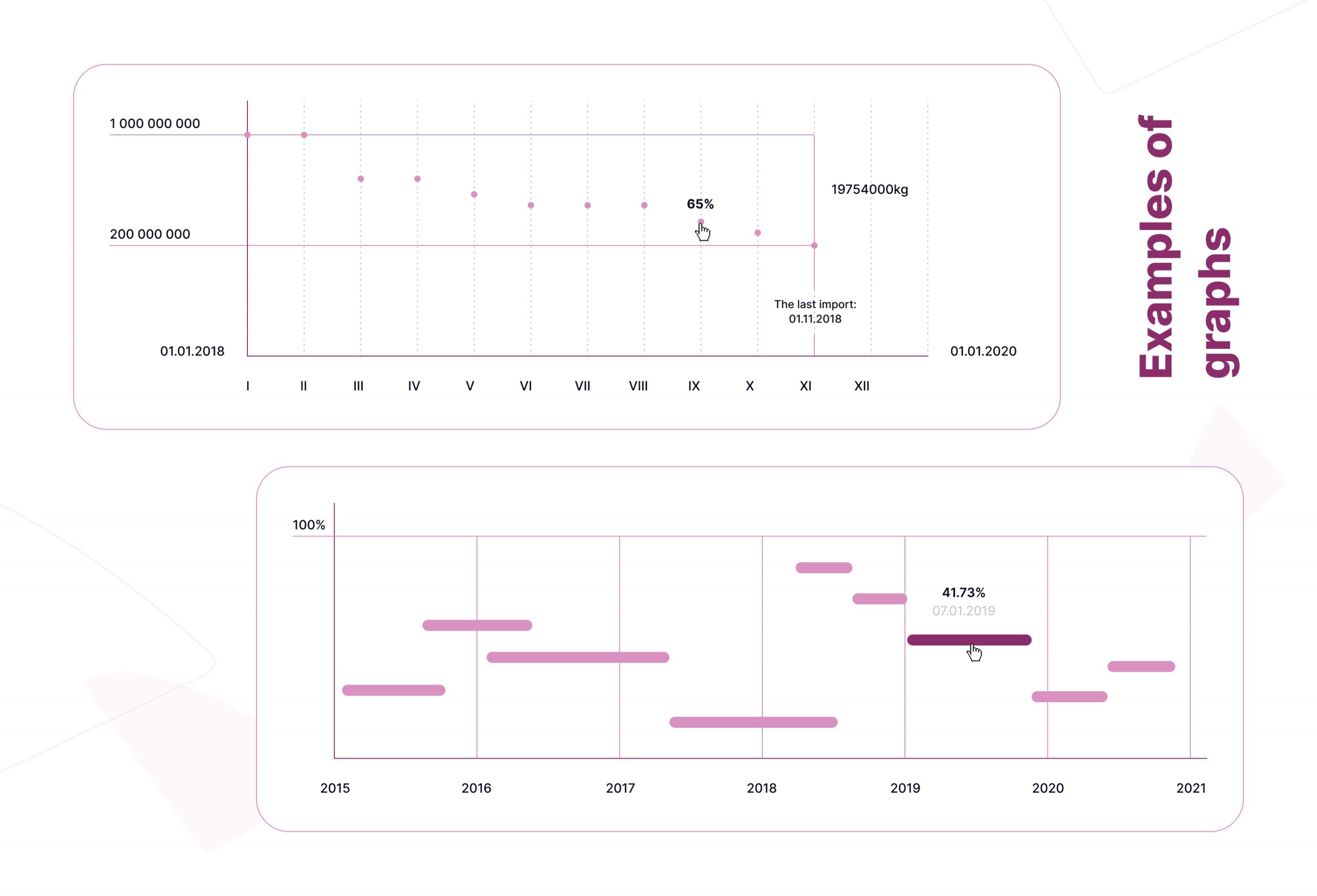
When doing UI/UX for legal software, you will often encounter the need to implement graphs and diagrams. A table is usually the first thing that comes to mind when we think about displaying a data set. However, “Information Architecture” methodologies provide a variety of alternative ways to show this data. In this project, I decided to change the tables into infographics with diagrams, graphs, etc. Here’s why:
- User experience
User experience always comes first. The specialists need to track the chronological history of percentage changes, tax amounts, and other values. It’s much easier and quicker to compare all this data on a graph than on a spreadsheet.
- Better perception of information
The internal interface mostly consists of text or numbers grouped into sections, tables, and paragraphs. The infographics in this case narrow down and highlight the information.
- Responsive design
All users like it when an interface quickly reacts to their actions and displays the information they want in seconds. With the help of graphs, users can interact with data and see detailed information about any item just by hovering over it. Such an approach allows you to display more information than you can in a spreadsheet while keeping the interface clean and beautiful.
Case 4. Libraries and selected lists: What’s common in these sections, and why it’s better to use them separately
The main product value is its display of a variety of laws and legislations. It allows any lawyer to find all the necessary documents for specific cases and client requests and track their amendments in real time.
After discussion with the client and team, we offered two ways to implement this functionality: a library, and selected lists. Both options have one goal in common: to save documents from the cards and quickly access all saved and sorted information. Let’s see how these two features differ from the UX point of view:
- Library
Lawyers can easily add any regulatory document from any section. They can group and classify all the saved data in the tree structure of library folders and create and delete it. In this case, the lawyer has all the cards. They can decide what to save and how to group documents by items, clients, or years, or just leave all the documents in the quick access section without linking them to specific cases.
- Selected
Here, users can add all the documents connected by the packages, either by client or rates. The added record contains the maximum amount of information, including documents of all types that belong to the case, notes, or contact data. In addition, users can import data in the selected lists by CSV importing or QR-code scanning. In such a way, this section already contains ready-made templates that need to be filled in. Why is this convenient? Because it’s easy to track updates in documents or other fields. Also, specialists don’t have to spend time on grouping data by cases.
These two features are similar in their functionality, but different in the details and the opportunities they offer. This gives us a chance to differentiate the subscription packages. For example, the basic package can contain one standard variant, and the premium package the extended one.
Case 5. What if we still need to use the table? The informational architecture of the table
Previously, I described how we can replace monotonous spreadsheets with infographics and tree structures. However, the key point here is not to overdo it.
In many cases, spreadsheets help users quickly interpret complex information. So when you decide to avoid spreadsheets just for the sake of avoiding them, you risk increasing the cognitive load of your users. So how do you know when it’s better to keep the spreadsheets? Here are the main 3 cases:
- If you’re dealing with a large array of single-level data
- If the displayed data is not connected (to create an infographic with charts or pie chart)
- If the user needs to see all the data simultaneously to quickly analyze or compare it.
If you can’t relate to any of the cases above and aren’t sure how to display the data, prototype testing with potential customers is the best way out.
I’d like to also share the tools that helped me interact with the large spreadsheets. In my case, it was the internal table of records of the “selected” section. Of course, there is no one-size-fits-all solution, but I hope you’ll find my tips useful for your project.
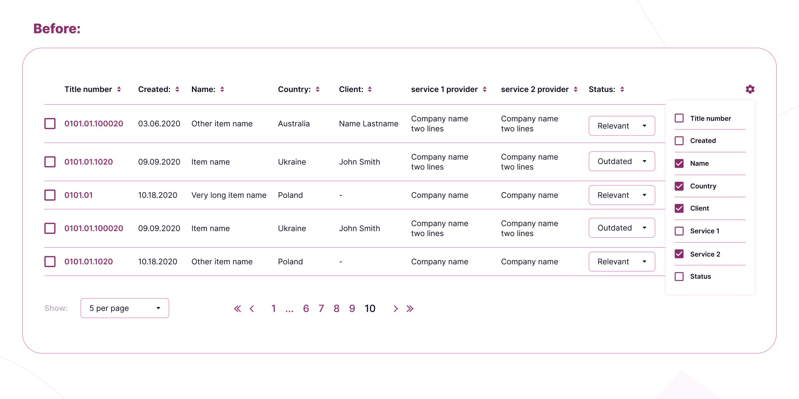
- Use filters
It’s likely that if you work with large tables, it may be difficult to find space for filters in the screen width. But this is no reason not to use them. Your users will appreciate that you saved them time.
- Sort the data
It’s important to put the sorting in the usual place for the user (in the spreadsheet title cells) or mark it with commonly used icons.
- Use bulk actions
This feature is useful when the user interacts with spreadsheet queries. It’s better to use a separate menu and functionality for bulk actions instead of action buttons in each query. It allows you to save screen space and avoid using repetitive elements.
- Pagination
Why is it better than endless scrolling? First of all, users focus more on the content. Also, localizing queries simplifies the data search.
- Columns setting
You’ve done everything possible, but the spreadsheet doesn’t fit into the working area of the screen. It’s a common problem, and the best way to fix it is to let the user decide which information is most important. The alternative variant is to use a horizontal scroll inside the table or divide the information into several spreadsheets.
Also, this is just the right time to refer to an important part of UX engineering: user personas.
You can probably divide your users into several categories (even if your users are single-subject specialists). Most likely, each user searches for specific information in the spreadsheets, and this information differs depending on the user category. That is, if the columns display only information necessary for that specific category, users could enjoy simple and clean spreadsheets without extra scrolling or spreadsheet fragmentation.
Try to conduct prototype testing with users from different categories. In such a way, you’ll be able to create sets of columns and include them in the “package” settings. Depending on their category, users will be able to choose the necessary set of displayed columns during the registration or subscription process and customize or change them later.
Case 6. How to organize additional informational sections
Since the “Selected” section includes the maximum data volume the professionals need, the services also created an additional database with addresses, phones, client contacts, contractors and service providers, as people will use this information during their work. We decided to create a separate section for it rather than just add it to the selected cells.
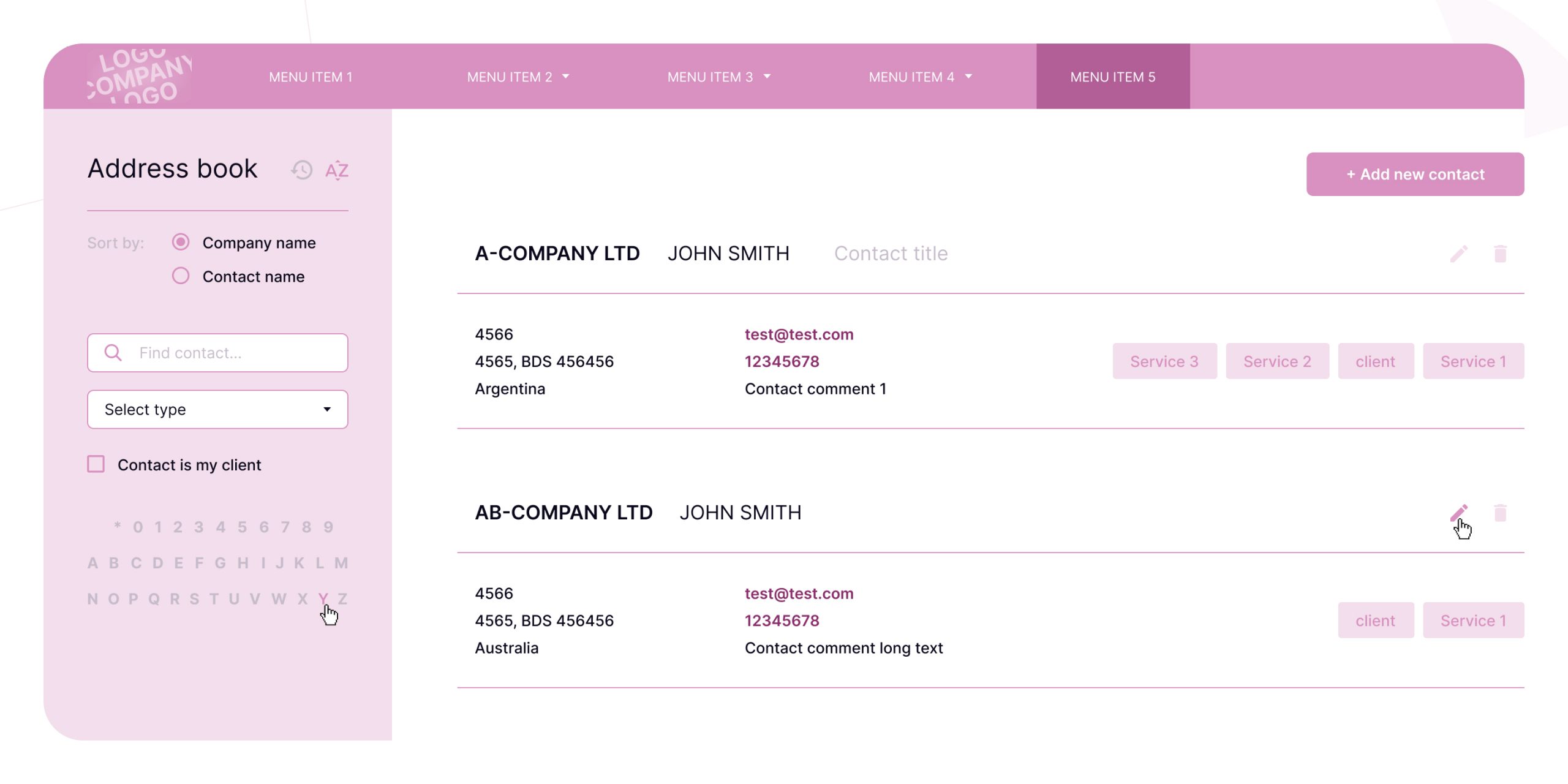
The address book looks like the cards page, with infinite scroll, search, and alphabetic filtering. Most of this data already existed as additional information in the “Selected” section, so it was easier for me to create functionality for adding contacts. In just one click, a user can pull up existing data and doesn’t have to waste time filling in all the fields.
Another project feature is the glossary of UI terms. I decided to create it using the existing structure, which is similar to the address book. As we already have 2 supporting sections with similar logic (address book and alphabetic filtering), the interface should be similar as well. It will definitely save the user’s time on studying the supporting functionality.
Wrapping up
Online work process management not only eliminates paperwork and saves time, but is also good for the environment. The UI/UX design and information architecture of a legal tech product is a complicated and multi-level task with a lot of non-obvious aspects.
The key here is to always communicate with future users to understand their needs and expectations for the product. I really hope that my guide and experience will help you create scalable projects for niche specialists and digitize their work processes. If you want to consult on the design of your project or discuss the terms of cooperation, schedule a call with our specialists.
- How important is it to have a good UX/UI for a legal tech product?
- It's extremely important as it can greatly impact the user's experience and adoption of the product. Legal tech products are typically designed for legal professionals who are often working at a fast pace and have specific needs and expectations. A well-designed UX/UI can help simplify complex legal processes, provide clarity in legal documents, and improve the product's overall usability. On the other hand, a poorly designed UX/UI can lead to frustration, confusion, and, ultimately, users abandoning the product.
- Can you give me a UX design checklist for my own legal tech project?
Start by answering the following questions:
- Have you identified your user personas and their needs, goals, and pain points?
- Have you mapped out user journeys and identified potential roadblocks?
- Is the navigation simple and easy to use?
- Are the texts clear and concise, avoiding legal jargon? Are the calls to action clear and concise?
- Have you optimized your product for mobile devices?
- Is your design clean and consistent, with a clear visual hierarchy?
- Have you conducted user testing and iterated on the product's design based on feedback?
In addition, you can read about the best mobile design practices in 2024.
- I have a complex UI design for my legal software. Can you simplify it?
- Sure. To create legal software products that meet high aesthetic and functional standards, Django Stars provide a range of UX/UI design services covering user experience, user interface, visual identity, and motion design. Schedule a call to discuss your project requirements and business goals with our UI/UX experts.
- Are the UI/UX case examples that you talk about in the article taken from real projects?
- Yes. In this article, I share six cases from my practice working on a legal-tech solution for the Django Stars clients. They aim to illustrate how UX/UI design rules can be applied to complicated products to maximize user satisfaction. To learn more, take a look at our case studies.


