Product Redesign: How to Update Your Product’s Design
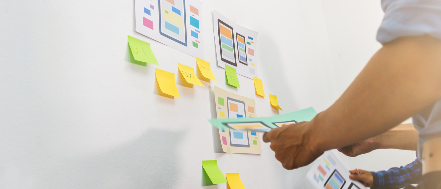
If your product is out there for a long time, it may get old in terms of its functions, capabilities, and relevance for the user. There’s nothing wrong with that—the world nowadays changes extremely fast, and so do users’ needs along with aesthetic trends. For your product to stay relevant and demanded, be it a site, a service, an app, or all the three, you need to keep it up to date, which means that sooner or later a product redesign will be required.
When done right, the redesign will refresh your product in the eyes of users and ensure their loyalty. However, if failed, a redesign can get it in trouble. In this article, we’ll look at when, how, and why to redesign a product. We hope that our valuable advice will help you, and if you have any further questions, you can contact us.
Why and When your Product Needs a Redesign
Redesigning of an app product is a big move for a company, and it can hugely impact a business’s future revenue. But before delving into the intricacies of redesigning an entire product, we first need to define what a redesign is and what it’s not. A redesign is a visual, content, and/or experience upgrade of a product based on qualitative and quantitative data. A redesign does not include rebranding, changes in color or stylistic scheme that does not affect the content and UX, or changes in the locations of individual elements in the user interface that are not based on data analysis.
Listen to “How to Update Your Product’s Design to Meet Users’ Expectations” on Spreaker.
Often, product owners of existing and actively operating services decide they need a redesign. Of the reasons that led them to decide to update the design, the most common are the following:
1. The service is failing to attract enough customers, users, or buyers. It’s a situation in which everything seems to be working but conversions are insufficient or viewers skip the pages that are supposed to attract customers.
2. Feedback from users signifies the need. You can collect it both through research and during the operation of the service. For example, you can get insightful feedback from users who had to contact support due to the same bugs on the site, or because they couldn’t find the function they needed without help from the support department.
3. Your goals and functions have changed. Naturally, the service won’t meet your goal with an old design if the goal itself is different. The service expands its capabilities, launches a new product or service, adds an additional tariff plan, and so on. In this case, a competent redesign will help you avoid a drawdown in conversion and a decrease in popularity.
4. Your competitors have redesigned their products. Arguably, this reason is valid in specific cases, but nevertheless, it is not uncommon for companies to jump on this bandwagon. Companies don’t want to lose customers that may now see them as “outdated” compared to what’s happening in the market.
In fact, obsolescence is something that today’s products are facing faster and faster in the ever-changing world. New technologies appear, trends change, and the algorithms for user interactions with the product transform. In fact, the design race is endless, one in which the one who doesn’t just ride the wave but can consistently anticipate it, wins.
All this input logically signifies that the goals and expectations for a redesign inevitably lie far beyond the UI, which means that the redesign should be based on relevant data about the current user experience, its flow, and the points at which users tend to stumble most. Hence, let’s split the process of a competent redesign into stages and see what steps it goes through.
By the way, when redesigning, you may need a new design system. In one of our recent articles, we talked about how to develop a design system, so check it out if you need it.
Product Analysis and UX Audit before the Redesign
A product redesign done right always starts with research. It’s necessary to analyze the current UX in great detail, determine its weaknesses, and how it can be improved. The first step here will be the analysis of the current user experience by the design team, conducted and assessed from the perspective of the goals and values of the product. Here’s the recommended course of action for the product analysis and UX auditing step:
1. Determine the business goal that the product has to meet and measure the conversions compared to this goal. The target action can be a subscription, registration, purchase, and so on.
2. Evaluate the extent to which the site content corresponds to the site’s functionality and the intended target actions. Check to see that there’s no conflict between the two.
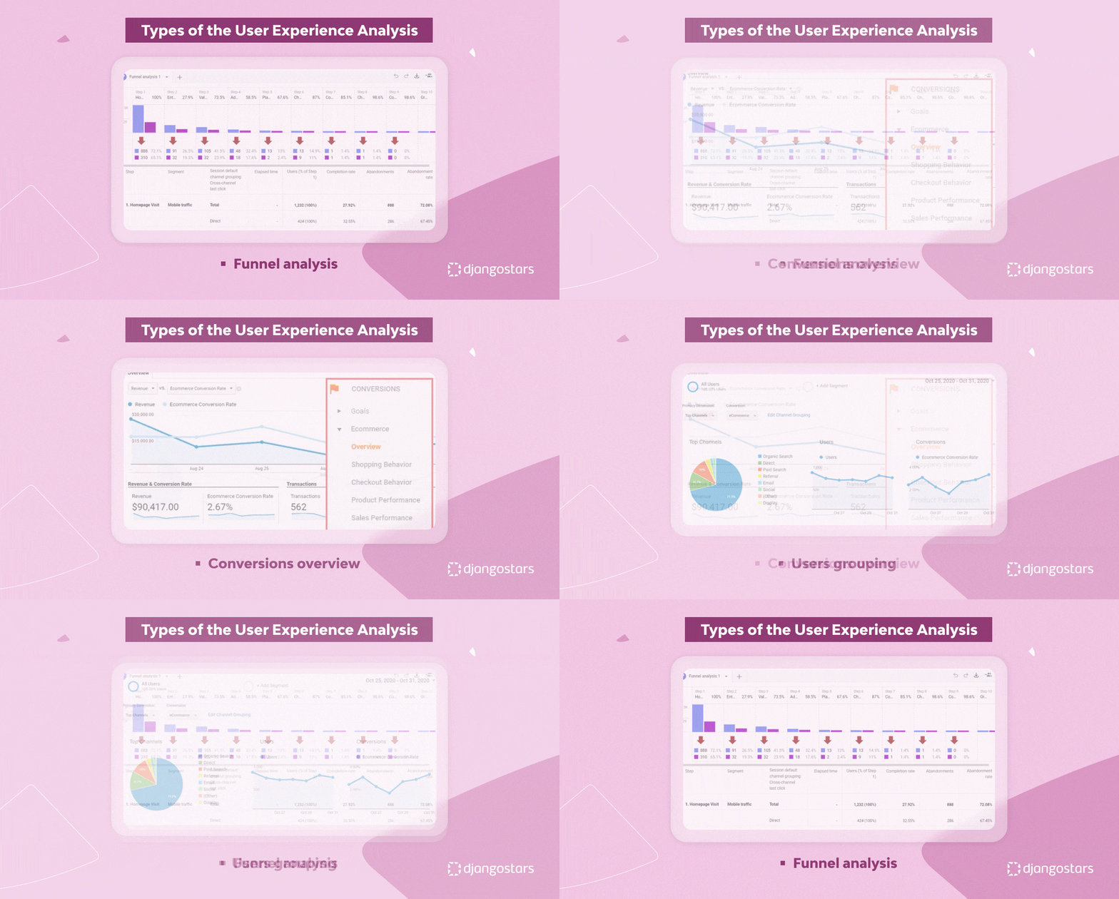
3. Analyze your traffic. Track popular entry and exit points, and get statistics on users’ browsers, geography, and screen sizes.
4. Create flow diagrams of user behavior. Work out which pages users visit most often and what actions they take.
5. Estimate the loading speed of pages, especially functional ones.
6. Calculate conversions (the ratio of users who performed the targeted action to the total number of website visitors). Your team will need this data later, mainly for comparison with the results produced by the new design.
7. Determine how the current functionality of the site corresponds to the current capabilities the product is ready to offer.
8. Conduct an heuristic analysis of the interface using usability heuristics.
At this stage, the team and the product owner will be gradually forming a list of final goals you’ll have to reach with the redesign. It’s not yet a list of specific tasks, but it presents a general vision of all the possible weaknesses and their future improvements.
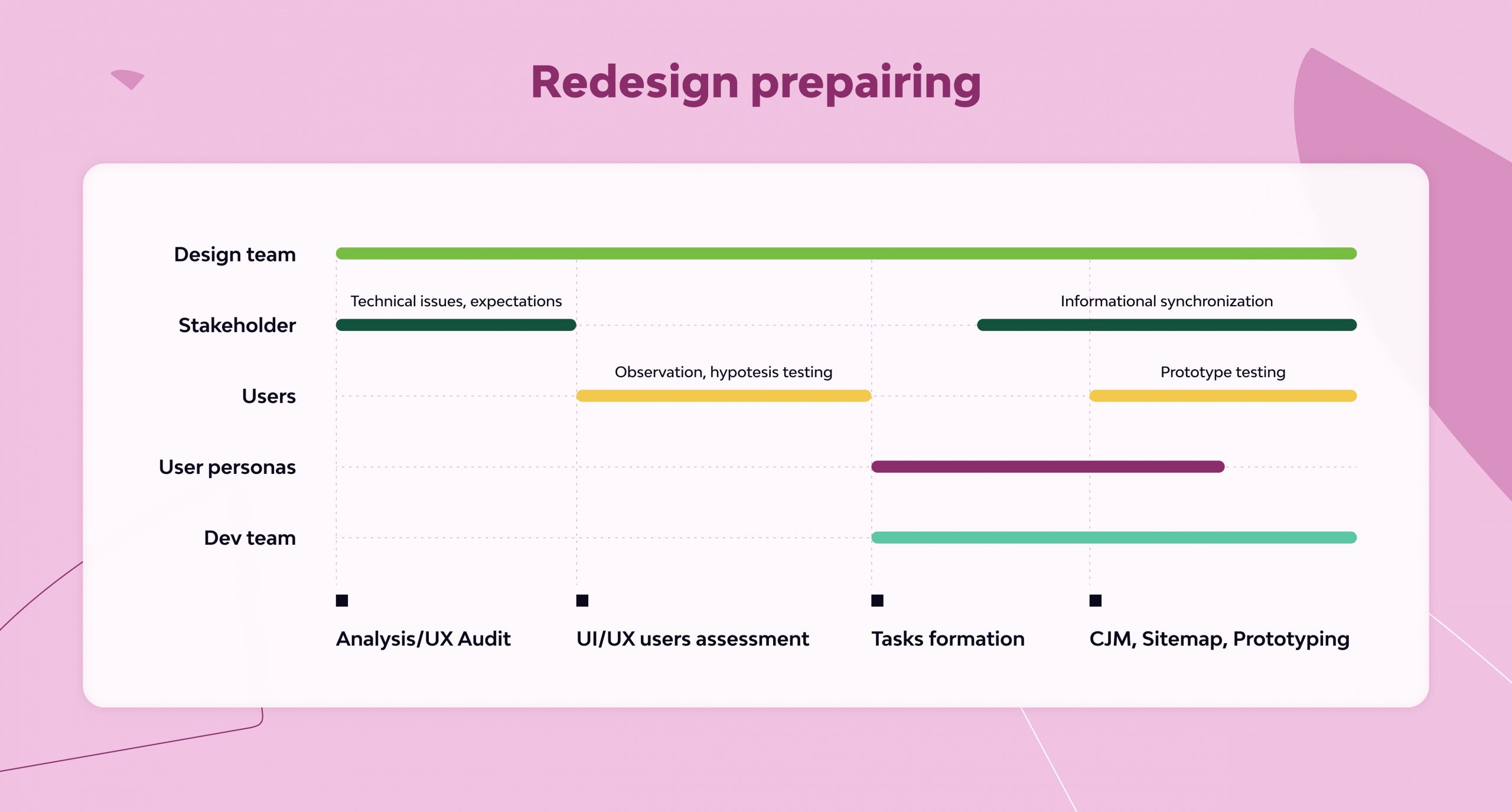
For your team to clarify this vision, a stakeholder interview usually takes place at this stage. The interview will also cover technical and organizational issues. For instance, these are the terms of timing and tools that the team will have at their disposal. But it’s much more important to understand stakeholders’ expectations from the results of the redesign together with the product owners. For the product redesign process convenience, the expectations should be divided into three blocks: appearance and positioning, product functionality, and target audience of the product. What aspect of the product has changed and needs updating? What would you like to change, but it is not yet obvious how? What suits you the way it is? Overall, the more detailed the picture you obtain as a result of this interview, the clearer and faster the further redesign process will go.
Assessment of User Interaction with the Product
The previous stage of product analysis can get the “preparatory” code name. At this point, we have already figured out where and what pain points there are. So, now, it’s time to test hypotheses through the context of user experience and interaction with real people. The mechanics of data collection per se can go in any shape and form. These can be field observations (for example, in production, if the product has to do with corporate software), questionnaires, moderated testing, collection of focus groups, etc. The main goal is to get as exhausting feedback as possible that highlights all the bottlenecks of the product from the point of view of its users.
It is the most important step in the redesign planning phase. Unfortunately, product owners often aim at getting by with simple solutions, which is why they narrow interviews to discussions with the design team about their own vision, and dry analytics numbers at most. Yet, this approach is a big risk of missing the most important thing, which is, in fact, what the product redesign is for. The user research frequently signifies that the weak spots of the product are somehow different from those listed by the stakeholders, one way or another. In particular, research shows that it takes less than a second for a new user to form an opinion about the product’s visuals, and therefore want to work with it or not. But the value of the product for users is dictated by the positive experience of interaction to a much greater extent. On the other hand? product owners are often inclined to spend a greater share of attention and resources on finding color and stylistic solutions, leaving possible UX problems off the table. And even in the case when stakeholders are attentive to interaction design issues, only User research will help to check the validity of certain business hypotheses about user needs with enough precision. After user research is carried out, only then the design team can draw up a full picture of the future redesign, the functionality that it will affect, as well as the way it will affect it. In their turn, business owners will not spend fortunes on the development of things that users are not interested in.
Tasks’ Scope Formation
The moment has come to transform all the information obtained in the previous steps into a single list of tasks. This is how an experienced design team usually approaches it.
1. Based on the information collected from users, we compose the user persona of the product. These are generic images, the embodiment of the most popular groups of users represented as characters that have portraits, names, and their own stories of the case (life experience) of using the product. This approach helps to strengthen empathy, as empathy is a key component of a successful redesign both in general and especially at the stage of task formation.
2. On behalf of user personas, we create epics. On this stage you can use the template accepted for the user story: As a <role>, I want <goal / desire> [so that <benefit>]. However, it is important to remember that, unlike user stories, epics are put as globally and schematically as possible. There is no need to go into details at this stage, it is much more important here to empathically formulate the general desires of the user personas regarding each functional aspect of the future design.
3. Before proceeding directly to the task formation, it is important to do a few more things. One of them is the decomposition of the existing design. Many designers are tempted to skip this step and create a new UX from scratch, but this usually leads to errors. The old design didn’t come out of the blue, and the elements definitely made sense both for the product and for its users in the past. Analysis of these elements ensures you will make fewer mistakes at later stages. How exactly to decompose it? Thanks to heuristic analysis, collection of statistics, and information from users, we already understand both the pain points of our design clearly, so at least we have the direction towards solutions to these problems. So, we turn these data into our basic set of tasks, distributed over epics.
4. To complement the terms of reference and make sure we don’t miss any opportunities, it makes sense to conduct a Competitive Analysis? — a review of direct and indirect competitors. How do similar features work in their products? Ultimately, the user will end up choosing between competitors’ products and yours. In this process, it is important to remember two main points:
a. Instead of focusing on specific user flows, look at general flows of solutions and functions. Thoughtless copying will obviously not lead us to the result we are striving for, but at the same time, thoughtful analysis of analogs will help us ensure we don’t end up reinventing the wheel.
b. Partly for the same reason, this stage cannot be carried out before the main data collection before the product and its decomposition stages. Before analyzing other people’s products, you should clearly understand what exactly we want from our own. Then, we do not run the risk of getting lost in doubts about decisions or repeating other people’s mistakes.
5. So, we have a general list of redesign tasks related to different epics. Next, we need to prioritize them. Priorities are determined by two dimensions — the estimated complexity of implementation and the expected value to users. Thus, minor changes with a high value have the highest priority, and complex tasks with a questionable value are the least important. The rest of the combinations go to the medium priority category of tasks.
Since a redesign is something you can only do with an existing product that is already functioning for its users, such a distribution will help to introduce new features and functions as smoothly and painlessly as possible. Moreover, this way the most important functional changes will start working as early as possible.
Customer Journey Map, Sitemap, and Prototyping
And now, finally, it’s time to move directly to user experience design. There are enough tools for this.
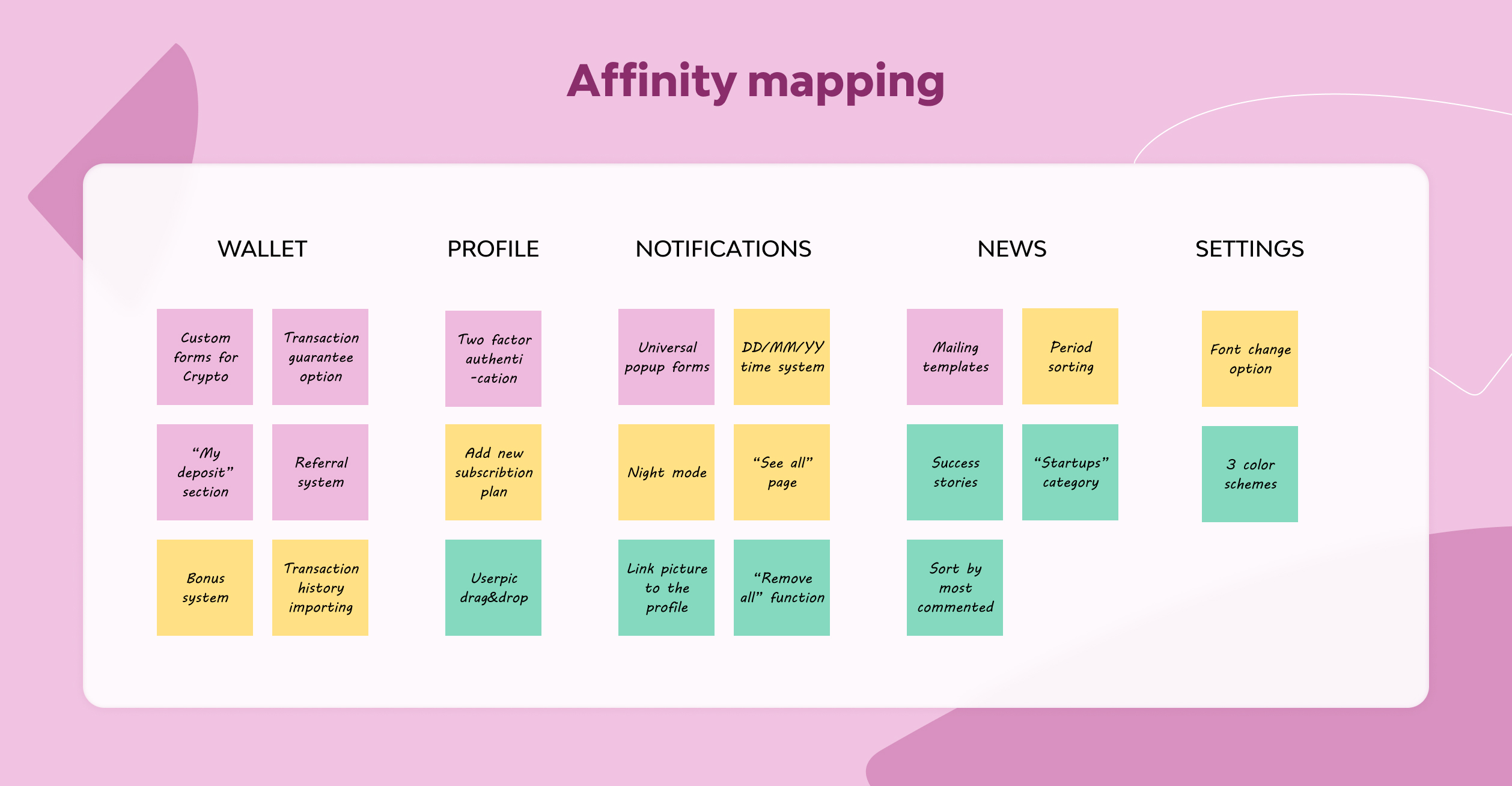
1. Affinity Mapping is first. As a starting point for work, we use the result of the previous stage — the priority map. Tasks that are taken in progress are rewritten as stickers corresponding to the priorities of colors and are grouped by epics. Thus, we can clearly see the number of changes required by different sections and/or aspects of the functionality.
2. The site map will help us recreate the user flow. Thus, we can see potential spots for improving the positive user flow and determine the negative user flow. If the Site map requires improvement, for example, add new links or redesign the page routing, then this must be done carefully, taking into account SEO recommendations and the marketers’ opinion.
3. Based on the data obtained as a result of research and user feedback, we compile a Customer Journey Map (CJM). This tool will help us identify all the bottlenecks in the positive flow and improve it. Through hypotheses, we validate our design solutions using a prototype, testing them on potential users. CJM will also help us to always be on the same page with the entire team and stakeholders, as well as to be in the same information space during the entire redesign process. CJM can be built using online tools such as Miro or using a board with stickers.
4. We’re moving to prototype. It makes sense to start with paper prototypes so that the search for fundamental solutions for future design is faster. In the end, one or several (but not more than three) sketches are selected to turn into wireframes.
5. Wireframes. It is worth designing them on the grid from scratch so that later when creating adaptive versions, there are no additional problems with the location of large elements. It is also worth considering a clear division of content into blocks here.
6. Prototyping. The first clickable prototype is made from wireframes. It can already be tested by both stakeholders and user groups. This will help to decide on the best solution or to adjust the functionality before it is implemented into the product.
By the end of this phase of redesign, we have a CJM, a sitemap, a full set of wireframes, and a final prototype. It is important that the developers take part in the process from this very stage of the redesign. Firstly, it saves them time, as they do not have to spend much more hours trying to figure everything out on ready-made designs. Secondly, their comments at the stage of prototyping will clarify the understanding of the complexity of developing a particular feature, which will also allow us to revise the final version of the prototype in the optimal direction.
In addition, there is one more general recommendation about it: when creating wireframes, you should make the most of the actual site content whenever possible. Templates and placeholders are allowed in case there is no final content yet, but even then it is better to take care of this issue in advance. This is necessary in order for the wireframes and prototype to reflect the appearance of the future product as much as possible. Content is more important than it sounds. It can have a big impact on how blocks look.
UI Design and Typography
Now it’s time to dive into the UI. A useful preparatory step to take here is to assemble the structure of the future UI-kit, bringing in all the main functional elements (inputs, dropdowns, forms, headers, etc). The choice of style and color scheme is highly dependent on the scope of the product, brand identity, established recognition, and the personal preferences of stakeholders. It is rather difficult to single out a list of general recommendations here. Nonetheless, there are directions you might want to take at this stage.
1. The main thing is to take care of the consistency of the elements in the interface. Its theme, fonts, the appearance of fields and forms must be visually consistent. Such consistency smoothens up both the front-end development process and, most importantly, the end-user experience of the service. Consistency of elements makes the design intuitive.
2. Cleanliness and informative value. How to display all the intended content without overwhelming the user with information, while not distracting them from the product’s intended actions? Rational and natural use of graphics along with text blocks, iconography, structuring texts using several different styles and colors will make it easier for the user to enjoy your product and get the benefit they seek.
3. Show more, tell less. As a follow-up to the previous point—the faster the user understands what is required of them to achieve their goal, the more content they will remain. Text blocks should be easy to read, and messages should be concise and unambiguous. Functional and interactive elements should be clearly visible, but at the same time not draw all the attention of the user.
4. Combinations of fonts for a better presentation of information. The classic well-established solution here will be 2 different fonts—one more decorative for headings, and the other should be as convenient as possible for body text. Specific combinations here may be different, but it is important not to overdo the typography since an excess of fonts of different shapes and types will be difficult to percept and your user will only get confused.
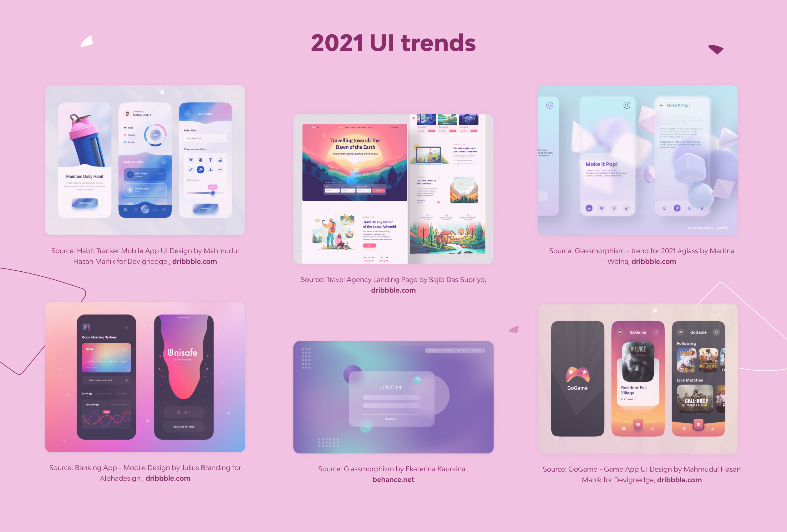
A redesign is always accompanied by the desire to give the product an appearance as modern as possible, and this is natural. Guides on trends that are gradually changing every year (or even faster) will help you find your visual style. In particular, in 2021, 3D graphics and motion design, glassmorphism, smooth shadows and elements, bright multi-colored graphics, element shapes resembling physical and large magazine fonts for headings stay popular. If you want to find out more about contemporary trends, be sure to check out an article by my colleague about UI/UX design trends.
Instead of a Bottom Line
A redesign is a process, not a single action. If we disassemble it into separate tasks and actions, we see that the design itself takes about 30% of the total time. The lion’s share of time and effort is usually spent on preparing and finding the best solutions.
Naturally, it is impossible to dismiss the importance of this stage nonetheless. The time and budgets spent on preparatory steps are tens (or hundreds) times less than the costs of poor decisions when the research was not carried out appropriately. You should not rely on the personal vision of anyone particularly — either the product owner or the design team. The main purpose of any service is to make life easier for its users. Analyzing the interaction of people with the old version of the design, testing hypotheses, and later testing the new prototype are key points in the redesign process. Of course, someone can promise you the best possible redesign and immediately go straight to drawing the layouts. But this, at best, will be one of the thousands of standard solutions based on general considerations, which will have nothing to do with the individual connection with your product and your users. In the worst case, it will be an obvious redesign failure.
Providing prototype redesign services, our design team knows how to approach redesign tasks the way they should be. You will go through all the stages described, adjusted to your wishes, terms, and product specifics, which will ultimately bring the most successful result for you and your users.
- When should you not redesign a product?
Based on the above, you should avoid redesigning an app product when the product is performing well, your budget is limited, or there is a lack of user feedback. Also, if your business model is still in flux or not well-established, it may not be the right time to redesign your product.
However, the most accurate answer to whether a product redesign is worth doing can be given by Product Analysis and UX audit before the redesign. Remember that the time and budgets spent on preparatory steps are tens (or hundreds) times less than the costs of poor decisions when the research was not carried out appropriately.
Redesigning a product should be a strategic decision based on user feedback, business goals, and budget constraints. It's important to carefully consider whether a redesign is necessary and feasible before embarking on the process. If you need advice or assistance with a redesign, you are welcome to contact our team.
- How do you know if a product needs a redesign?
Here are common reasons that lead product owners of existing and actively operating services to decide to update the design:
- The service is failing to attract enough customers, users, or buyers.
- Feedback from users signifies that need.
- The product's goals and functions have changed.
- Competitors have redesigned their products.
But to confirm a need for a redesign, it's better to conduct a product analysis and UX audit before the redesign.
- How much does it cost to redesign an app product?
The cost of redesigning a software product can vary greatly depending on various factors such as the product complexity, the scope of the redesign, the design team expertise, the engagement model used, and the time required for the redesign.
In general, the cost may vary from a few thousand dollars to tens or hundreds of thousands of dollars. To get a more accurate estimate of how much it costs to redesign your app, it's best to consult with specialists. The Django Stars designers can provide you with a detailed proposal based on your specific needs and requirements. They can also guide you on the budget allocation to achieve your desired outcomes.
- How to measure the success of a new product design?
- You can correlate the results with the reasons that led to the need for a redesign. That is, whether the redesigned product attracts enough users or customers, meets your current goals, and withstands competition. In addition, you can take into account feedback and pay attention to quantitative and qualitative metrics that align with the objectives of the redesign process. By monitoring these metrics over time, you can identify areas for improvement and optimize the design to achieve better outcomes.

