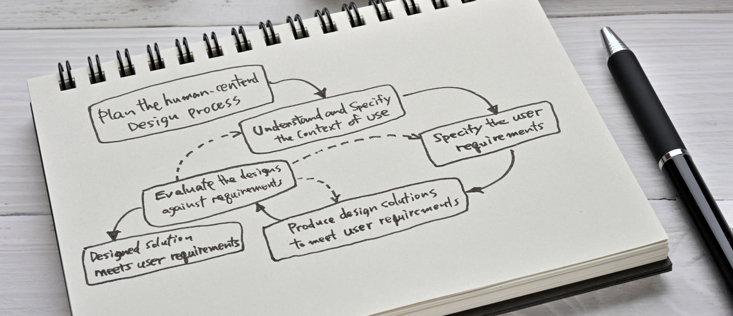
How to Build an Effective Design System: The Ultimate Guide

Design systems are instrumental in improving the consistency and efficiency of software development. A design system is a collection of reusable components, patterns, and guidelines that can be used to create a consistent user experience across multiple products.
In this article, we will discuss the benefits of using a design system, the steps involved in developing a design system, and some of the challenges that you may encounter.
Does Your Company Need a Design System?
If you want to make your brand attractive to the target audience and get a competitive advantage, then the answer is ‘yes.’
A design system visualizes your brand, including styles, fonts, shapes, and product appearance guidelines. It makes the brand recognizable at first sight and without any words.
Here are the most valid reasons why any ambitious company need to create a design system:
- It creates a stable visual perception of the company’s brands, goods, websites, and social media accounts. It guarantees a better user experience and brand visibility.
- It saves money. A unified visual style lowers the price of designing new features, websites, ads, printed materials, and products. In our experience, a proper design system saves up to 50% of all design-related expenses.
- It saves time. Because experts follow the guidelines when designing new visuals, they don’t have to create them from scratch.
- It makes onboarding employers simpler. New staff members don’t have to research all previous design solutions to catch the brand style — it’s enough to read a single document where all required design features, ideas, and specifications are written.
Creating a convenient and attractive design system is challenging, even for a large international company. It’s a strategic task that must be perfect. If you need to develop a complex design system for your business, Django Stars can help.
How does Design System differ from Style Guide?
Before diving into the main steps of design system development, let’s review the difference between the design system and the style guide.
First and foremost, a design system is not a style guide.
A design system is a collection of rules, standards, and limitations in design and code. Think of it as a centralized source of design knowledge that you can easily change and update.
Style guides describe the visual style of the product (its color, font, logo, etc.). In contrast to a style guide, a design system covers much more than just the visual presentation. It addresses the style, tone, and brand voice with descriptions, documents, use cases, and collaboration tools.
How To Build a Design System: Key Steps
Your design system components may be different, depending on their purpose. In general, design system development can be broken down into the following steps: a visual audit, creating the design language, creating a pattern library, and constant support.
Let’s review each step of building a design system in more detail.
1. Perform visual audit
Before jumping right into building a design system, take a step back to look at the general picture. Try not to think about what your design system should contain, but analyze its main goals and tasks and proceed from what your team already has. It will probably include interface elements, styles, CSS attributes, documentation, etc.
If you need to build a system for an existing product, start by collecting and grouping all the design system elements into categories (according to their type, function, and purpose). This will give you a full picture of what you should change, remove, or add.
By doing this, you will examine where you are, what resources you have, and what you need to do to improve your work process.
Read More: Product Design Process Steps
2. Define a target audience and its preferences
Creating a design system is almost a scientific process. Brand visuals must meet its goals and resonate with the target audience. Even if the brand knows its customers, it needs additional research on what style will be the best to reach the audience.
The correct understanding is crucial. It means a cheap supermarket must look like a cheap supermarket. Even if someone knows nothing about it, they must conclude it right. If a cheap store looks like a premium boutique, it will attract the wrong audience, so its performance will not be as good as expected.
Businesses don’t need the best visuals; they need precisely what their customers prefer to see.
3. Gather visual design language elements
The design language system describes the product’s overall visual design. It consists of elements such as color, typography, borders, and graphics.
Color
Describe the color palette you use for your product (e.g., its primary and secondary colors, their hues and shades). Here you should not only describe the color’s meaning, but dwell into use cases for this or that color (for example, in illustrations, graphics, and other interface elements).
Also pay attention to color contrast, as it influences the user experience and helps to differentiate product elements. (You can check out the color contrast with help of this contrast checker.)
The color palette is also a crucial part of your brand identity. The shades you use in your product help make the defining elements of your interface recognizable. Users will understand which colors refer to the clickable elements and which ones highlight important information.
The more the product grows, the more features and elements will be added to the primary design. That’s why a well-defined system of colors, graphics, and text will help a product maintain its identity and simplify the UX/UI design service process.
Typography
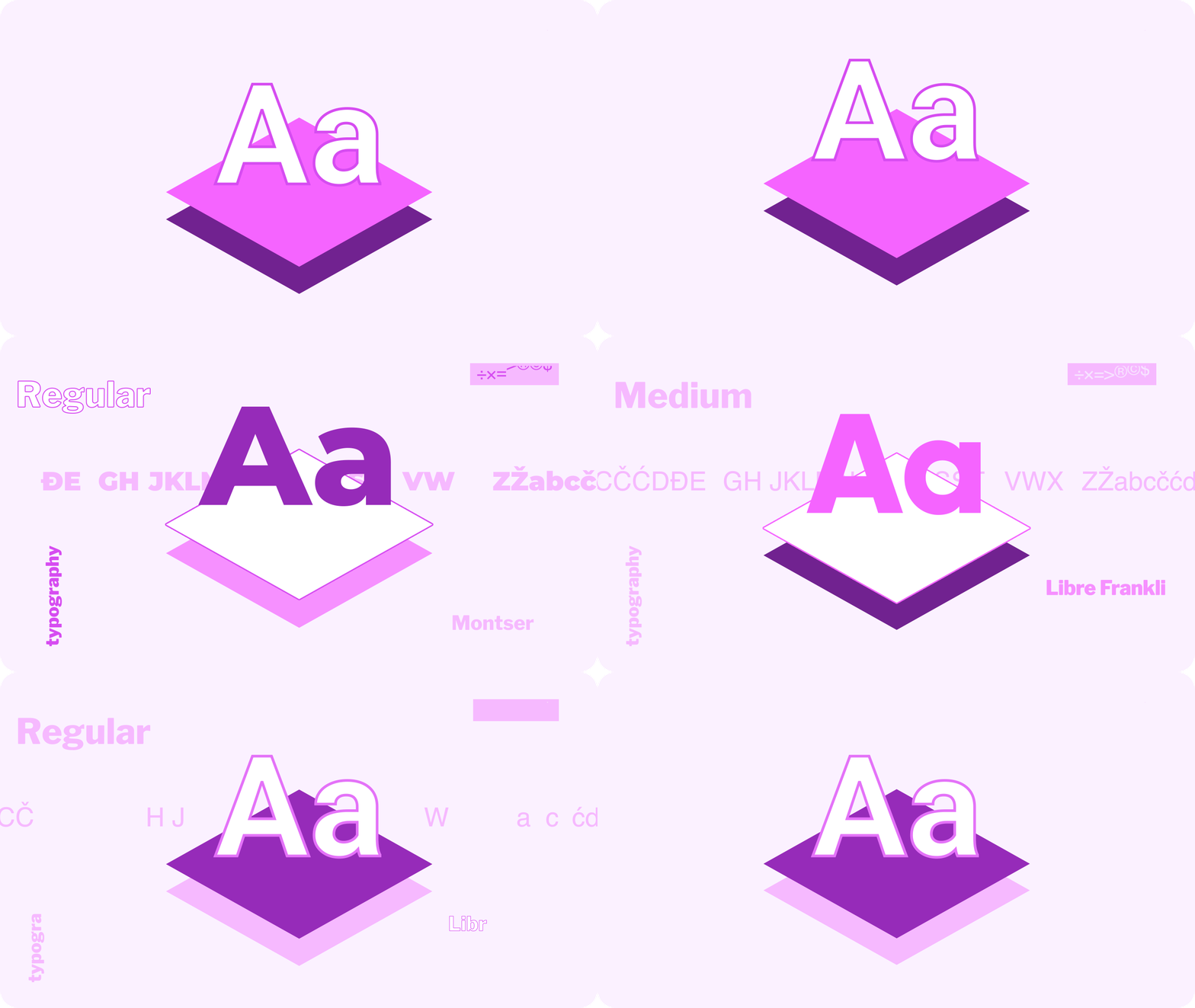
Typography is a core element of any design system. A typography system describes the main parameters of each font: name, size, height, color, weight, spacing, etc. Don’t forget to indicate how typography is used across your product and describe the purpose of each font.
When choosing typography styles, remember that their main task is to convey the content hierarchy, direct users to important and useful information, and make the product recognizable.
Sizing and spacing
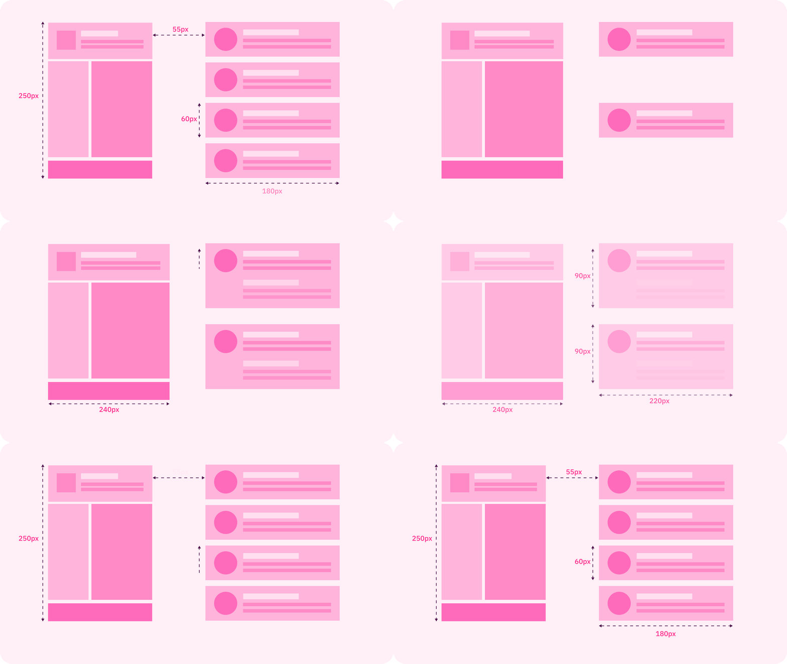
The sizing and spacing section describes the grid parameters, the spacing between the elements, component placing, etc. It makes the website design system more convenient to use and ensures the same style is retained on all pages. As a result, you define a design structure that will better reflect the web content and the product’s goals.
Graphics
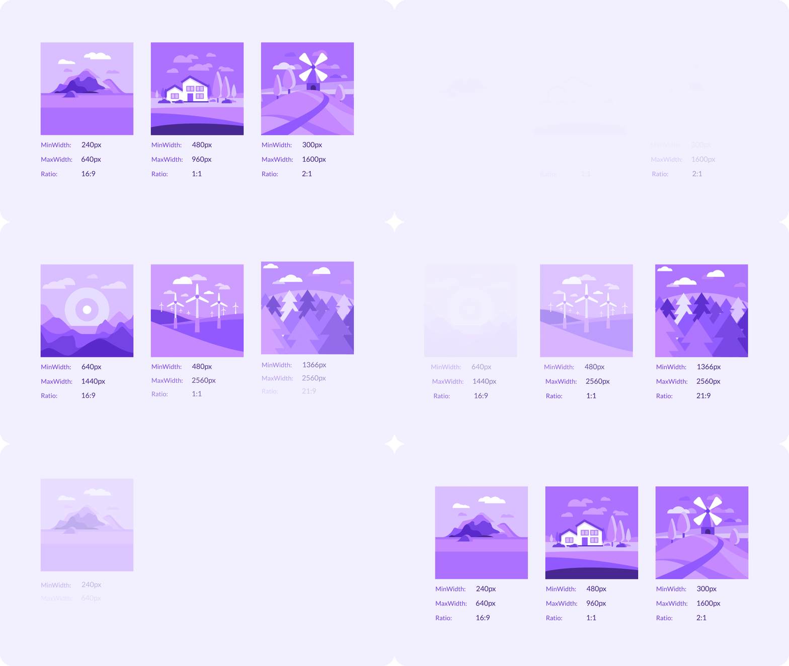
The graphics section is all about using graphics in your product. Describe the sizes and proportions of the images in the design, the do’s and don’ts of using graphics, and use cases of this or that graphic in the product and the messages they convey.
Library creation
Now it’s time to gather all the created elements into one library and remove the unnecessary elements and descriptions.
Now your design system is ready to go. Here are some tips that will make it more effective:
- Notify the developers about any changes to the library. The library is the only source of truth for the entire team. All team members should stay tuned for the latest versions of the interface elements and their descriptions.
- Give access to everyone on your team. All team members should be able to open the library at any time to find information they need.
- Convert elements into code. This will speed up product development and further growth.
- Support a design system. Provide a detailed description of the design system and its elements so everyone can stay up to date with any changes. This description will also help with the onboarding of new team members.
Read more: 3 Key Roles in the SDLC Process
4. Define design rules
It’s essential because a design guide often takes hundreds of pages. International brands make them as detailed and comprehensive as possible. However, if a designer strictly adheres to the terms, it significantly affects the creative process.
That’s why design rules often have different priorities. For example, the highest priority rules are obligatory. For instance, a creator can’t pick other colors or shades if a design system defines a brand’s strict color scheme.
Some rules are just recommendations. It means that creators decide how to improve the user experience and can even bypass the restrictions. If a brand guideline allows using a few different fonts, a designer may take any of them to create a banner or an illustration for some article on the website.
5. Establish a strategy of changes
The brand design needs updating from time to time. We recommend reconsidering it every five years. Managers must develop a straightforward step-by-step process of when and how brand guidelines should be changed.
Here are the questions:
- Who is responsible for changes in the guidelines? It may be the Chief Editor, Head of design, CMO, or CEO. In some companies, it requires a collective decision of top managers.
- How often must the design system be revised? We recommend doing it every five years, but it’s up to the business style.
- Who makes and tests a new design system? Companies can create them in-house or hire a team of experts. Remember that a design system is a technical document, so it usually can’t be developed only by designers. Also, it must be carefully tested.
Main Mistakes in Design System Development

To make your design system a success and improve the transition between design and development, you should make it work for everyone on your team. Here are the biggest mistakes in design system development to avoid:
- Adopting overly complex elements for design system components
It should be easy to use each component of the design system to build more complex UX blocks. It will make the system scalable.
Also, remember that the design system is not only about images and code. It also facilitates communication between designers, developers, and product managers.
- Ignoring feedback from other team members
Before investing your time and effort in creating a design system, talk to each member of your team and discuss their needs and expectations. This will help avoid roadblocks in the workflow and create a consistent experience for every user of the design system.
To make your design system serve the needs of multiple product teams, you need to outline the main design principles. Convene a short meeting, write down all these principles, and make them the foundation of your design system concept.
- Incompatible standards
Designers or developers often use their own mini version of components. Though it can bring value in the short term, later, as the product grows, it will result in inconsistencies and inefficiency.
The Main Benefits of a Design System for Your Product
To wrap up, let’s review the main benefits of design system development and implementation.
Product scaling and strategy development
With a robust design system, product teams can create consistent products, from idea to launch. A reusable structure will also help when it’s tIme to scale the product and improve strategies.
Time and cost savings
The design system speeds up the design-to-development cycle and helps conserve resources. Designers don’t have to start from scratch and can use pre-prepared components instead. They can also save time on creating components and concentrate on more complicated tasks.
Faster changes
Front-end developers don’t have to make changes in different app screens; instead, they can change only one component.
Product design consistency
The design system makes your product look consistent, improves brand awareness, simplifies product support and testing, and enhances the user experience.
Real-time changes in design versions
Having a single source for the design elements simplifies the life of developers, designers, and other team members, as any changes can be seen in real time.
Design documentation also simplifies the onboarding of new members and keeps everyone on the same page. Frontend developers can easily use and copy the component styles, and QAs can find all the interface elements they need in one place, together with their descriptions. No one is losing out.
Conclusion
Each design system creates a set of limitations, as you can’t deviate from them when creating new elements. That’s why, in design system development, it’s important to make it not only robust but also scalable, so that it can grow together with the product.
A design system is not just a group of elements. Each page, screen, component, and element should have a unique purpose and goal. The overall system describes the main principles and approaches to design that support the overall product mission. By keeping this in mind, you’ll develop a design system that will work for your team and product.
- What are the design system goals?
- The main goals of creating a design system are developing a recognizable visual for a brand, saving time and money on various design processes, and decreasing onboarding time for new employees in the design department.
- Is it possible to build a design system from scratch?
- Sure, it’s possible. But this process needs complex audience research, A/B testing, working with colors and shapes, and combining everything in a single set of rules. Moreover, a final system must be developed as a technical document, not a creative one.
- What is the difference between a design system and a style guide?
- Style guides set the rules for using logos, fonts, visuals, and color combinations for the creative process. In addition to all this, the design system also regulates the general principles, methods, communication tools, and user experience measurements to create a solid and recognizable brand image on the market. Usually, a style guide is just a part of a design system.


